Nisf A Matrimonial App, Redesigned
Nisf is a matrimonial app for practising Muslims: no photographs, a profile read across five tabs, and a filter layer no general matrimonial site has any reason to build. This is the redesign, starting with the app as it stands.
It is live, with a real user base across Kerala. That is the constraint behind most of what follows: the redesign lands on people who already know their way around, so it has to be recognisable on the first open.
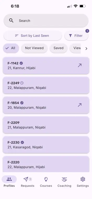
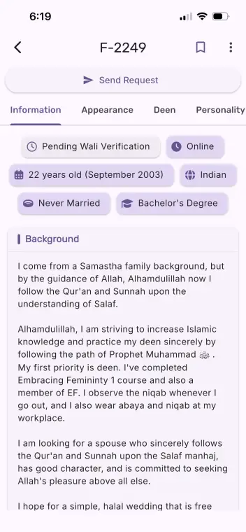
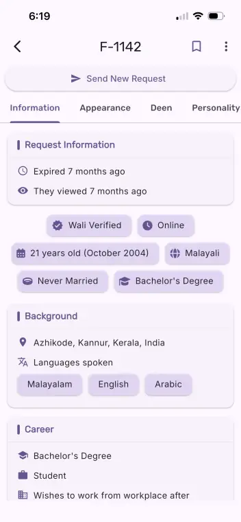
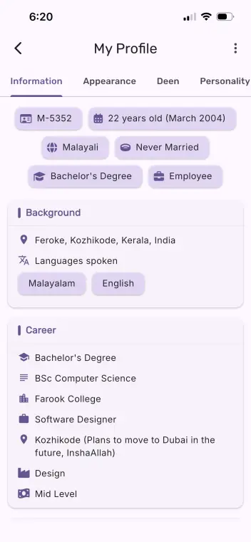
A profile is a code, F‑2249, with an age, a district and a line about how the person covers. No photograph. So the work of the app is helping you decide who is worth a request from that alone.
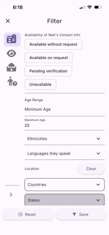
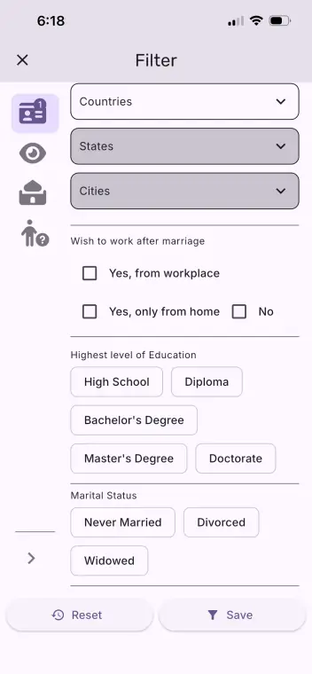
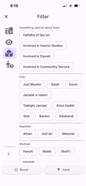
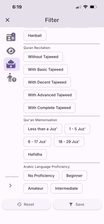
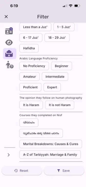
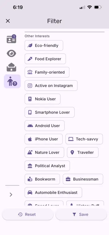
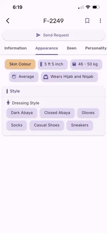
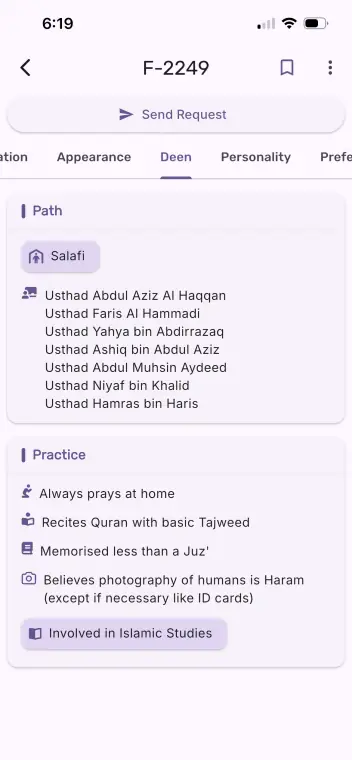
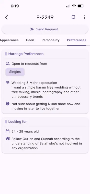
That decision is where the app is unusual. Under the filters any matrimonial site has (age, location, education, income, height, language) sits a second layer that a general one has no reason to build: path and aqeedah and madhab, how much of the Qur’an someone has memorised in juz, the level of their tajweed, their Arabic, their view on photography of people, the courses they have finished inside the app itself. A profile is read across five tabs, and one of them is Deen.
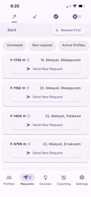
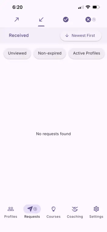
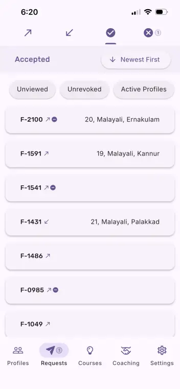
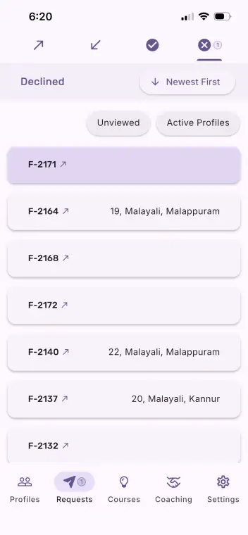
Around that sits the machinery: a wali’s verification as a status you can see before you write, requests that live in four states, and a purchase wall somewhere in between.
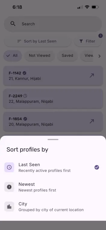
The app as it is today
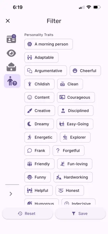
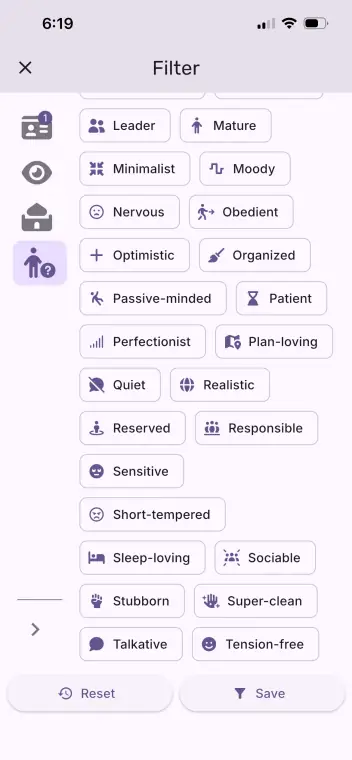
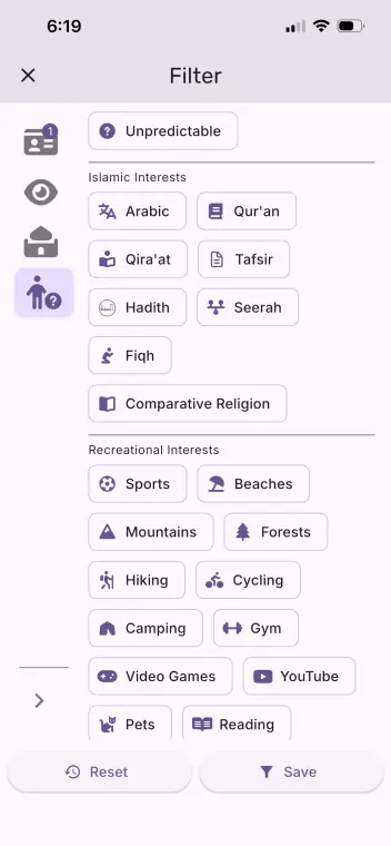
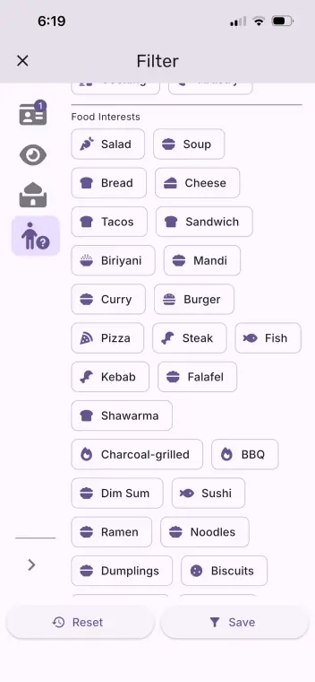
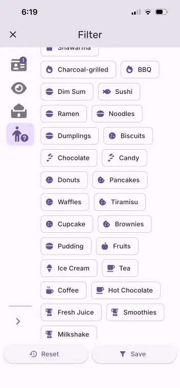
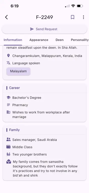
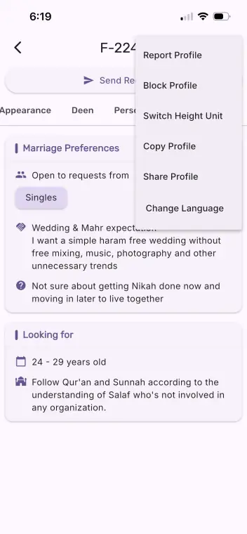
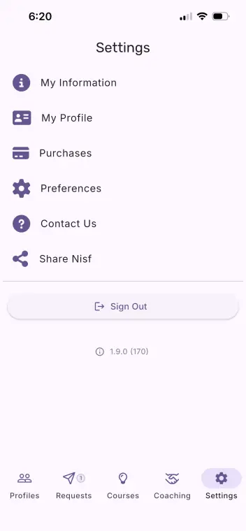
Thirty-one screens of the live app, running now on real phones. This is the thing being redesigned, not the redesign. Almost every decision further down this page is an answer to something in here.
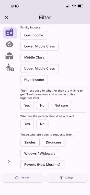
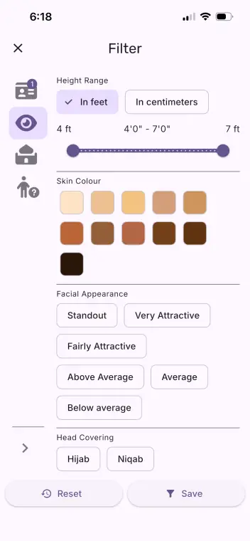
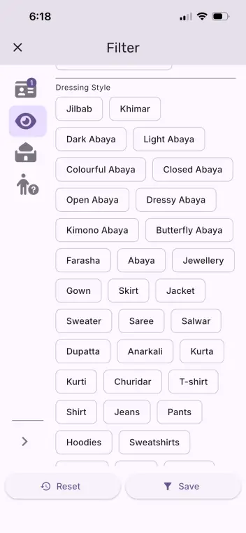
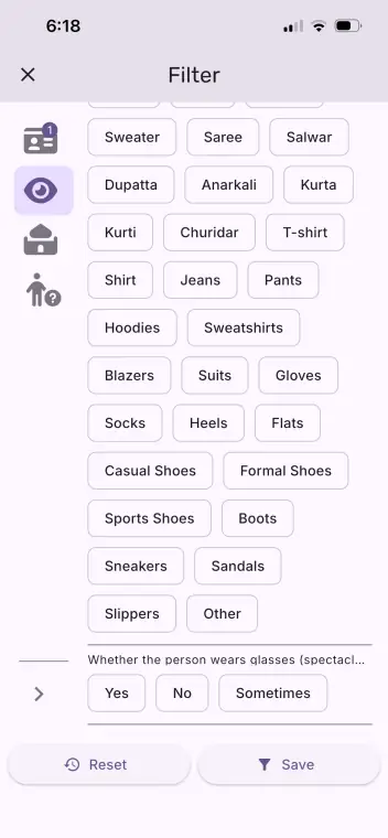

Before any screen
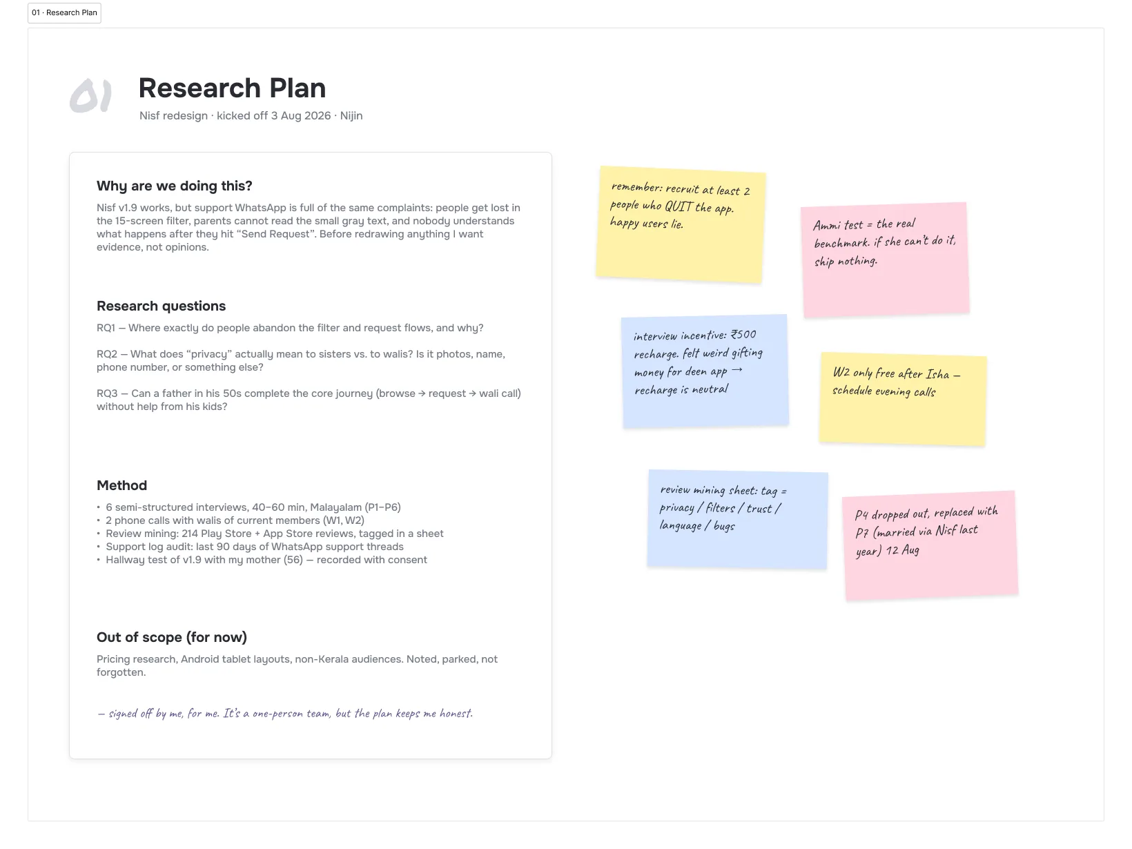
The redesign did not start in the design file. It started with the complaints: the support WhatsApp, the store reviews, and the people around the app itself. Sisters who use it with a sister beside them, a brother browsing after night duty in Riyadh, and a father in Malappuram who runs his daughter’s account because the deen knowledge is hers and the phone is his problem.
So the first artefact is not a wireframe, it is a plan. Three questions, written down before anything else so the answers could not drift: where exactly do people give up in the filter and request flows, what does privacy actually mean to a sister as against her wali, and can a father in his fifties finish the core journey without one of his children sitting next to him.
What people actually said
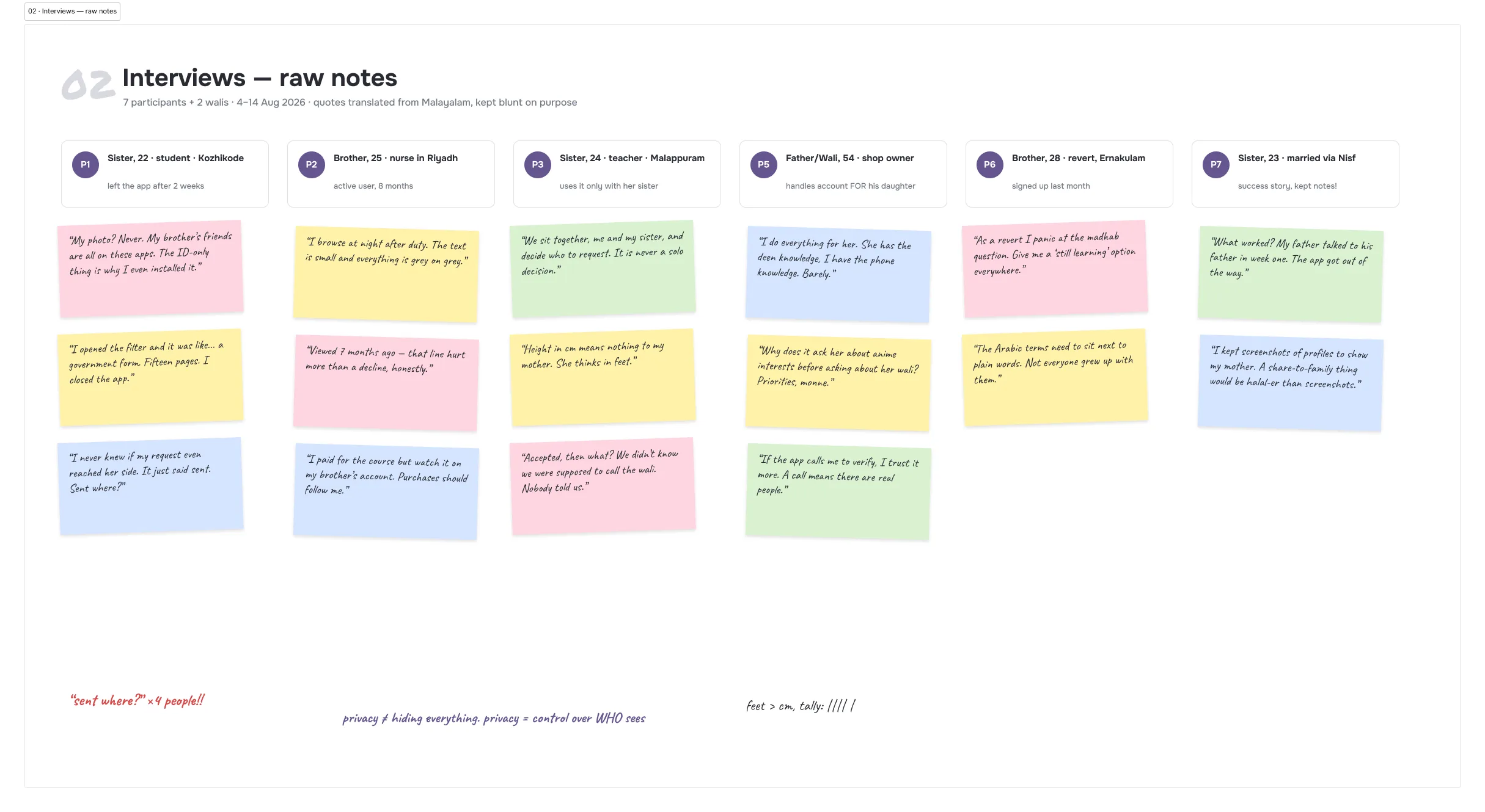
Seven people, plus two walis on the phone, in Malayalam. The notes keep the lines blunt because the blunt lines are the useful ones. My photo? Never. My brother’s friends are all on these apps. I opened the filter and it was like a government form. Viewed 7 months ago hurt more than a decline.
One line came back four times in different mouths: the app says the request was sent, but sent where? Nobody could describe what happens on the other side. That single unanswered question does more damage than any broken screen, because silence reads as rejection.
The same person, from four sides
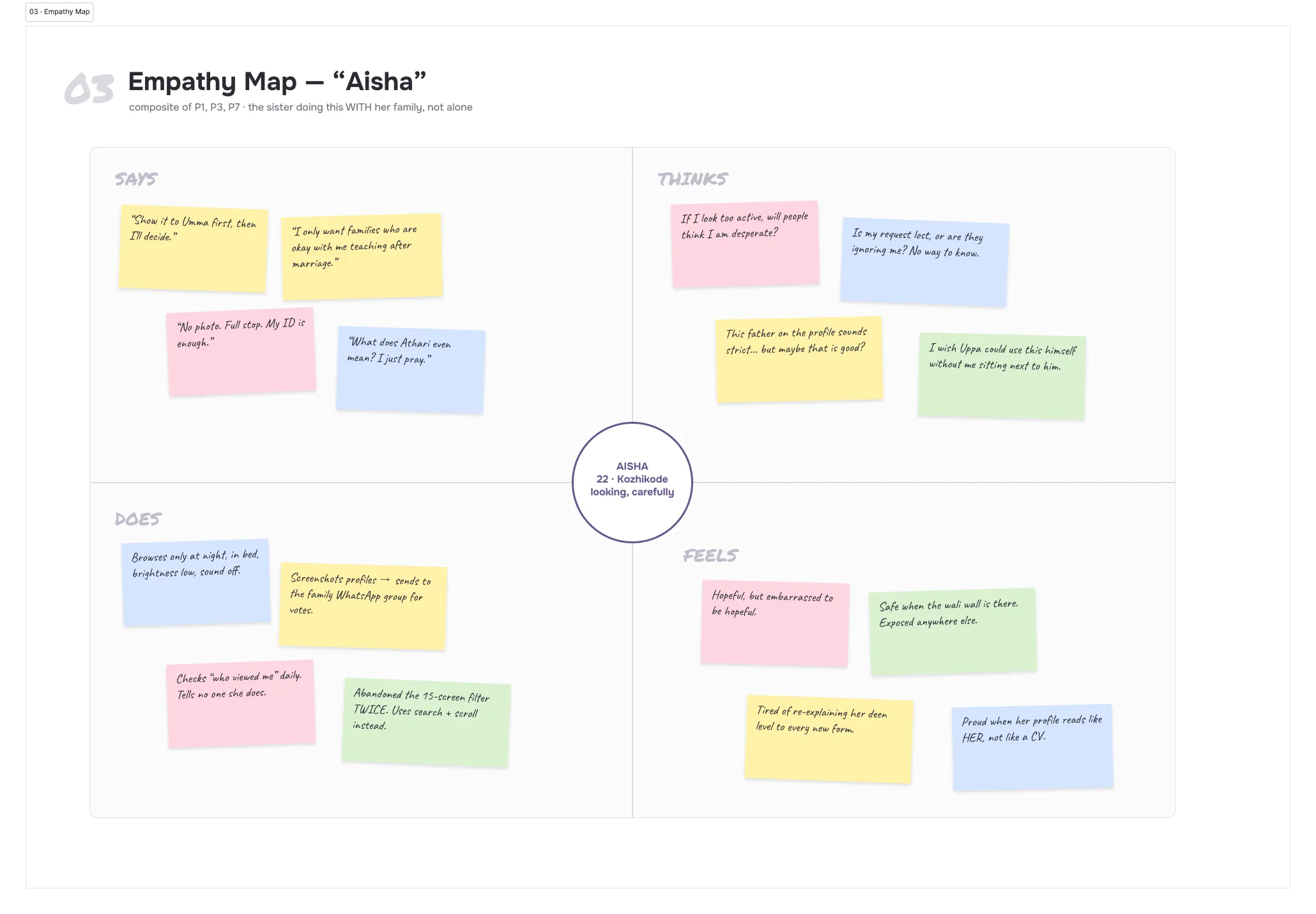
The empathy map is a composite of the three sisters, and the gap it exposes is between what is said and what is done. She says the ID-only profile is why she installed it. What she does is screenshot profiles into the family WhatsApp group for votes, and check who viewed her every day while telling no one that she does.
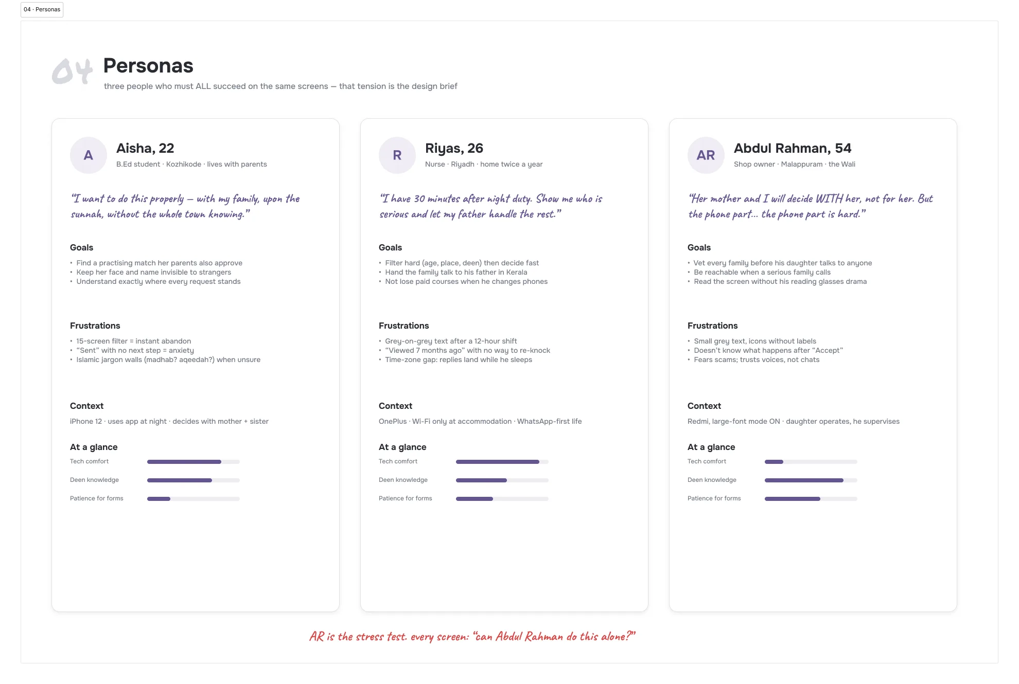
Three personas, and the point of them is that all three must succeed on the same screens. Aisha decides with her family. Riyas has thirty minutes after a night shift and a father in Kerala to hand things to. And Abdul Rahman, 54, is the stress test: large-font mode on, icons meaningless without labels, and full authority over the outcome. Every screen in the redesign got asked one question: can Abdul Rahman do this alone?
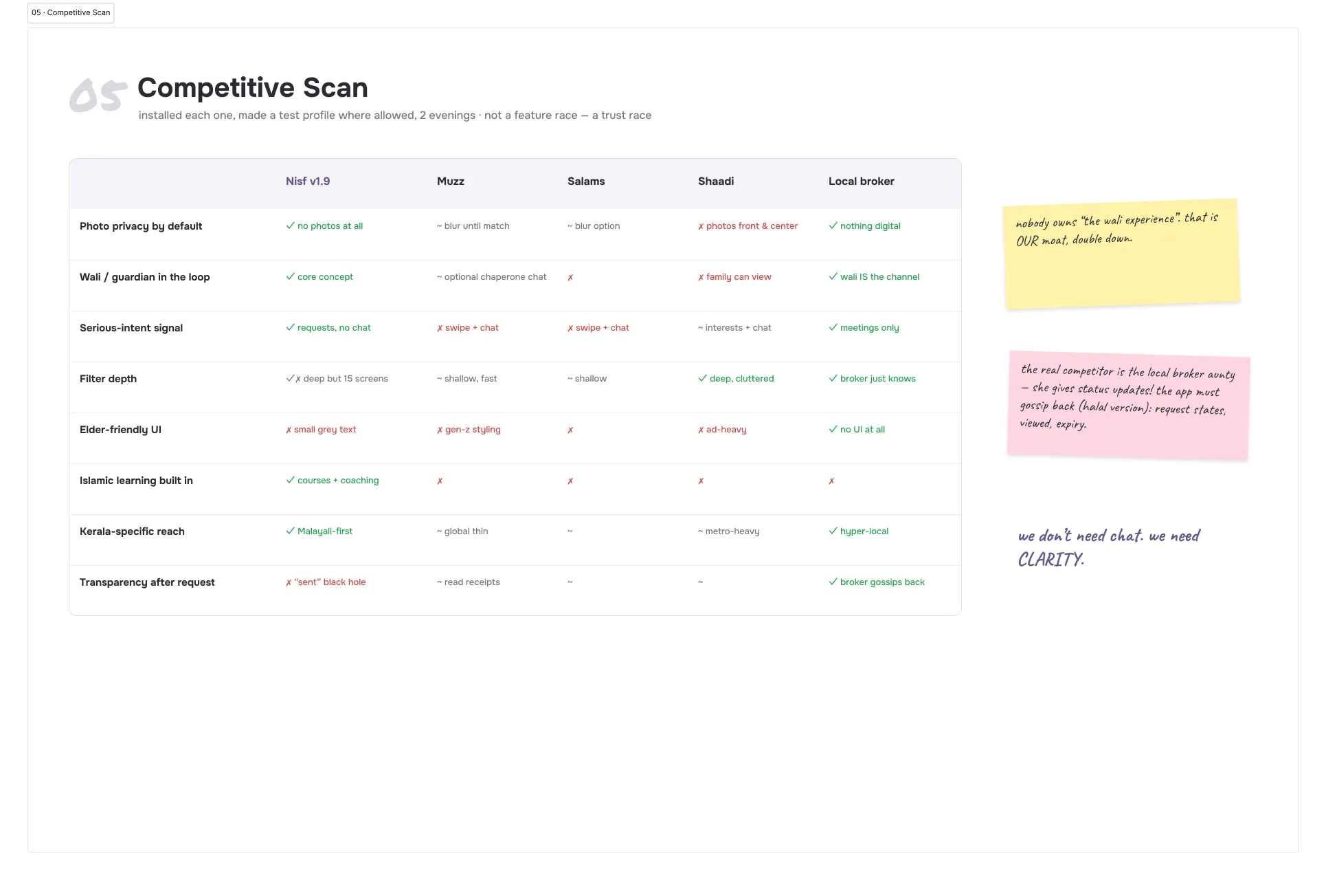
The real competitor is not an app
The matrix has the apps you would expect in it, and none of them owns the thing Nisf is actually for: a guardian in the loop. The column that mattered was the last one. The local broker aunty gives families something no app in the row does, which is news. She reports back. Who saw the proposal, who is thinking, who said no.
That reframed the work. The app does not need chat to compete. It needs to report back the way she does: honest states on every request, viewed and expired written in plain words, and a next step at every dead end.
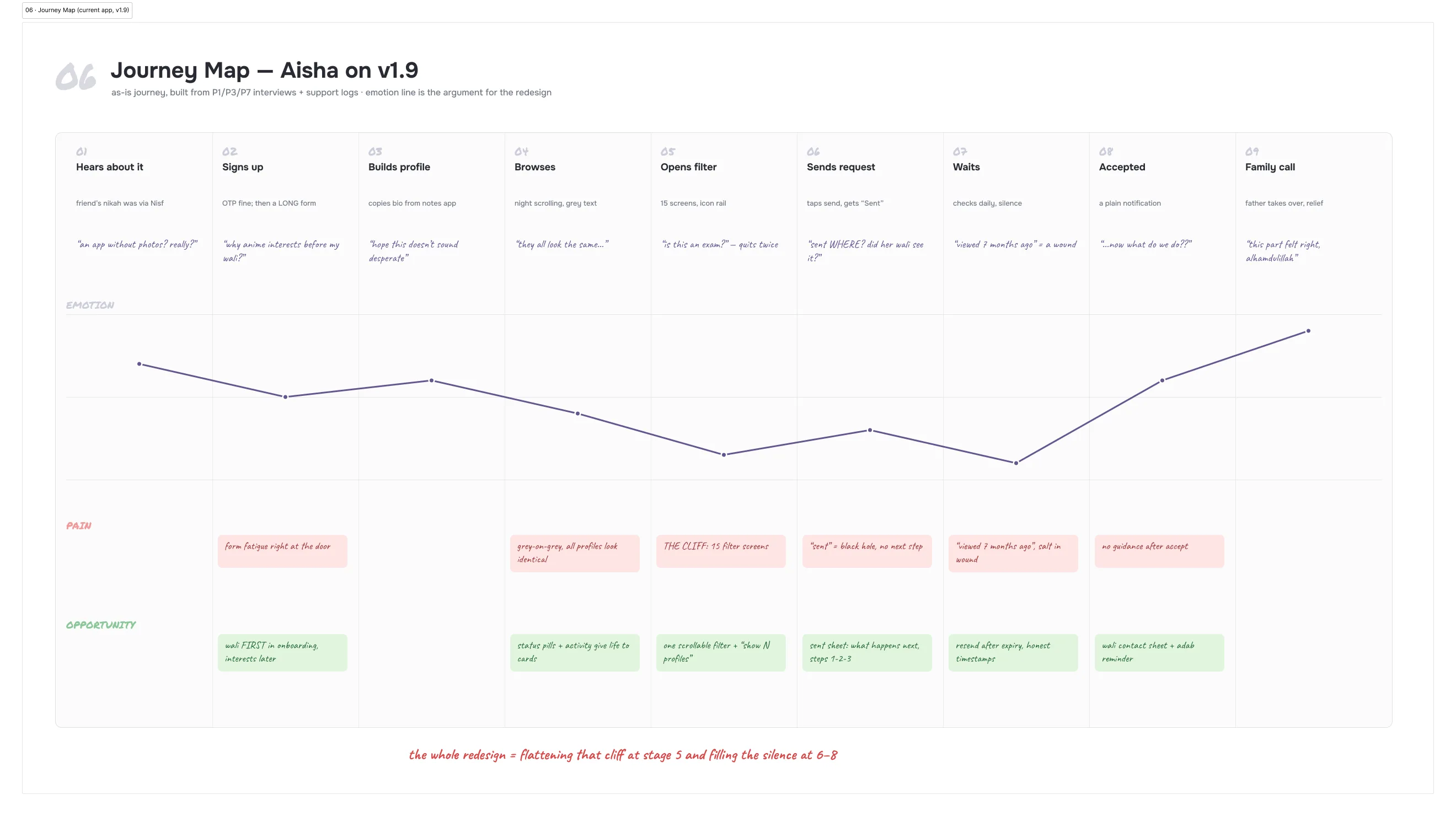
Where the journey breaks
Aisha’s journey through the app as it ships, with her mood drawn as a line. It falls off a cliff twice, and neither cliff is a visual problem. The first is the fifteen-screen filter, abandoned twice by someone who wanted to use it. The second is the wait after sending a request, where the app goes quiet and she fills the silence with the worst interpretation.
The line only climbs at the end, when a father picks up the phone and the app gets out of the way. Which is the finding in one sentence: the product is at its best exactly where it stops being a product.
What the notes add up to
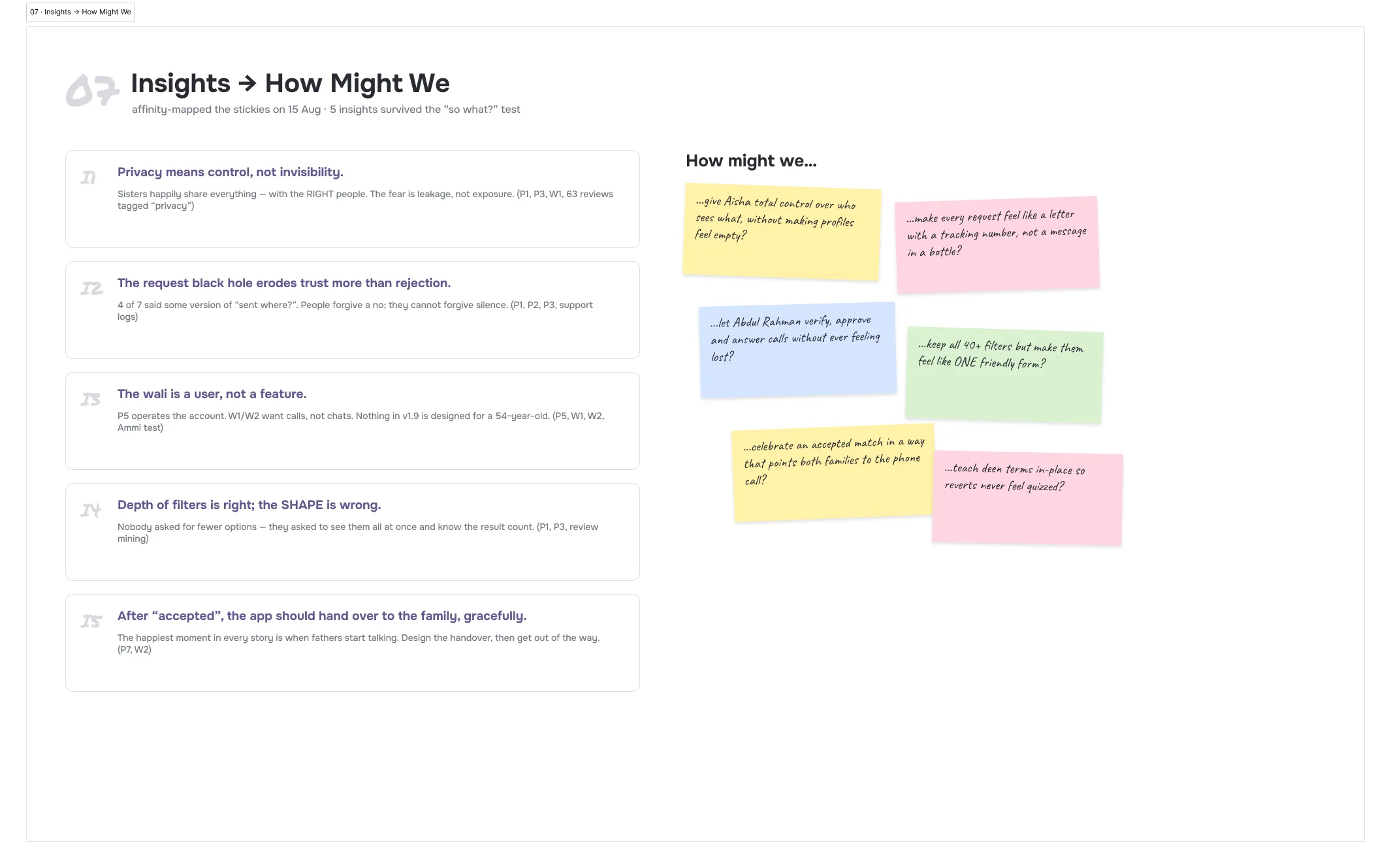
Five insights survived the so-what test. Privacy means control over who sees, not hiding from everyone. Silence damages trust more than rejection does. The wali is a user, not a feature. The filters have the right depth in the wrong shape. And after an accept, the job is a graceful handover to the families, not more app.
The map, then the paths
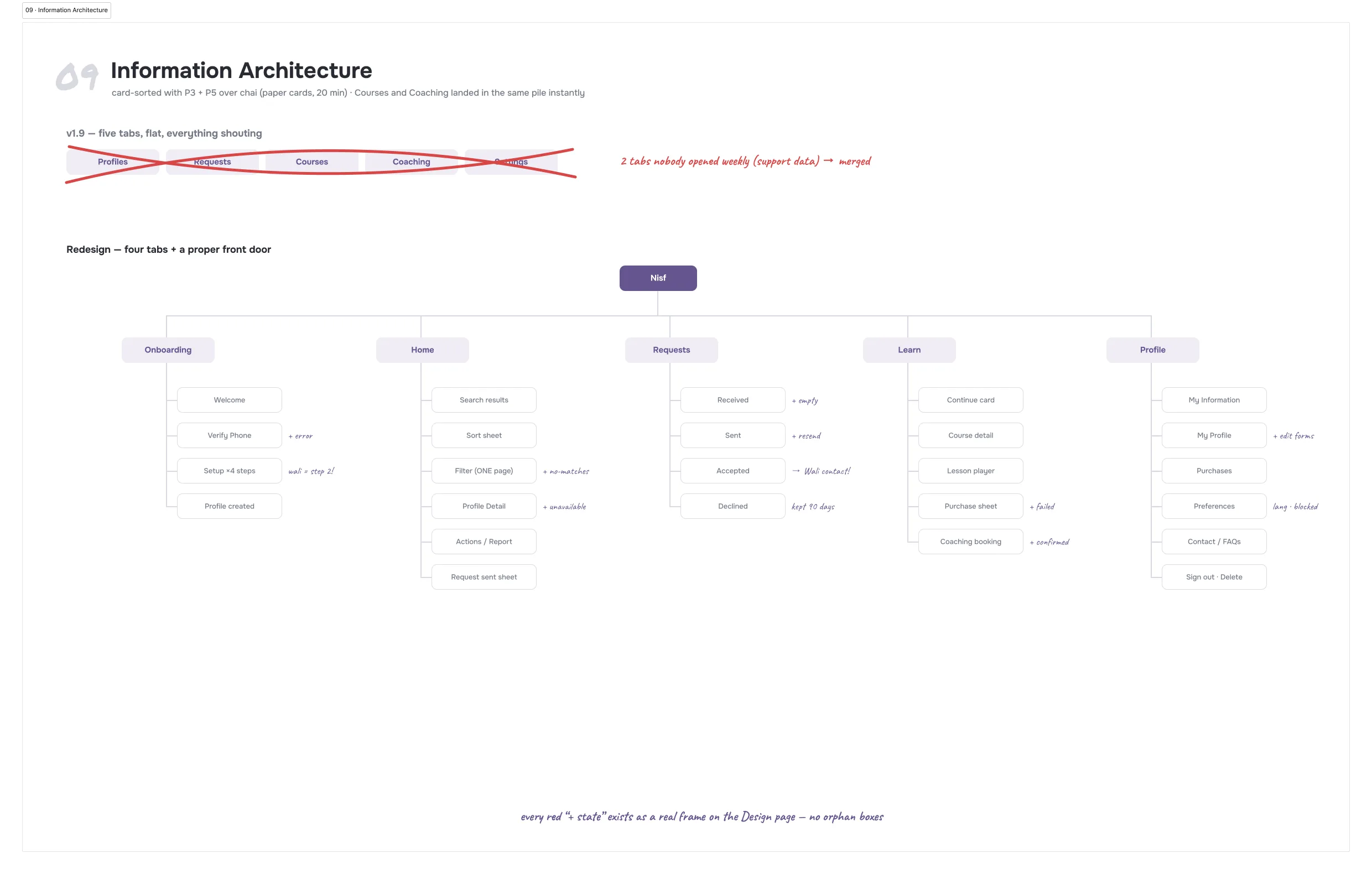
The structure was sorted with paper cards over chai, and the first thing that happened is that Courses and Coaching landed in the same pile without a prompt. So five tabs became four before any screen was drawn, and the sitemap grew a rule the old app never had: every state gets a real screen. Empty, expired, declined, failed, offline. If a branch can happen, it has somewhere to land.
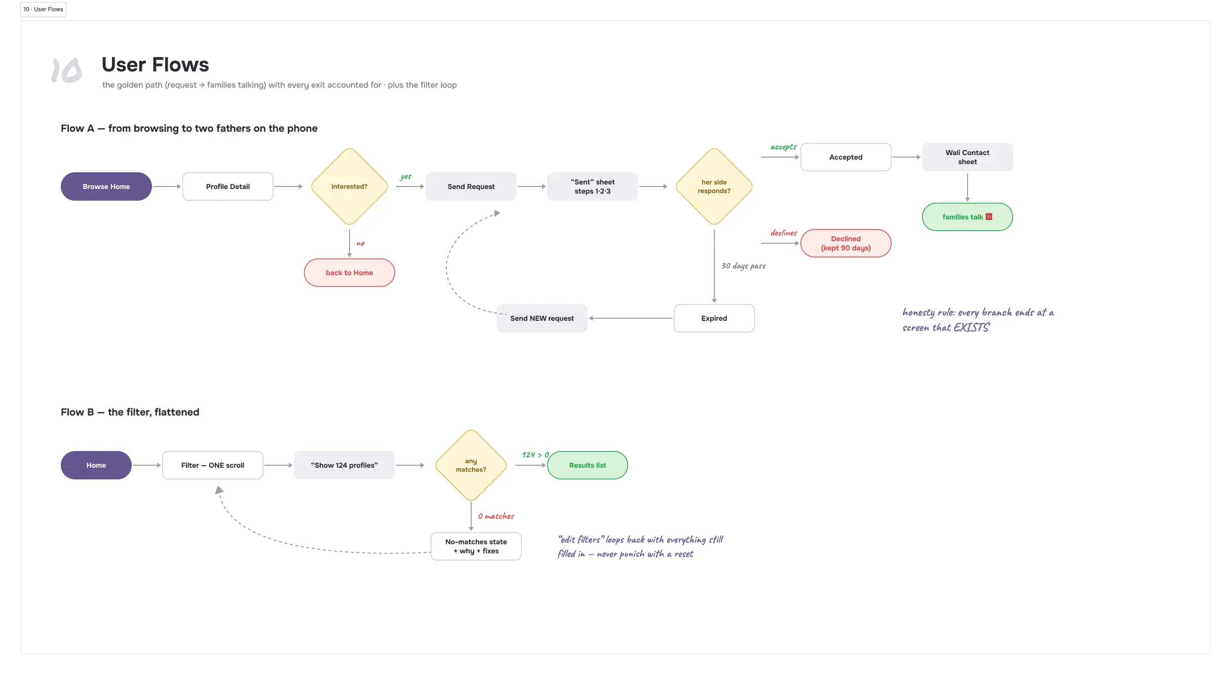
Then the two flows that carry the product. The golden path runs from browsing to two fathers on the phone, and every exit from it (declined, expired, resend) ends at a screen that exists. The filter flow is a loop on purpose: no matches leads to why, and editing the filter brings everything back still filled in, because a reset is a punishment.
Paper before pixels
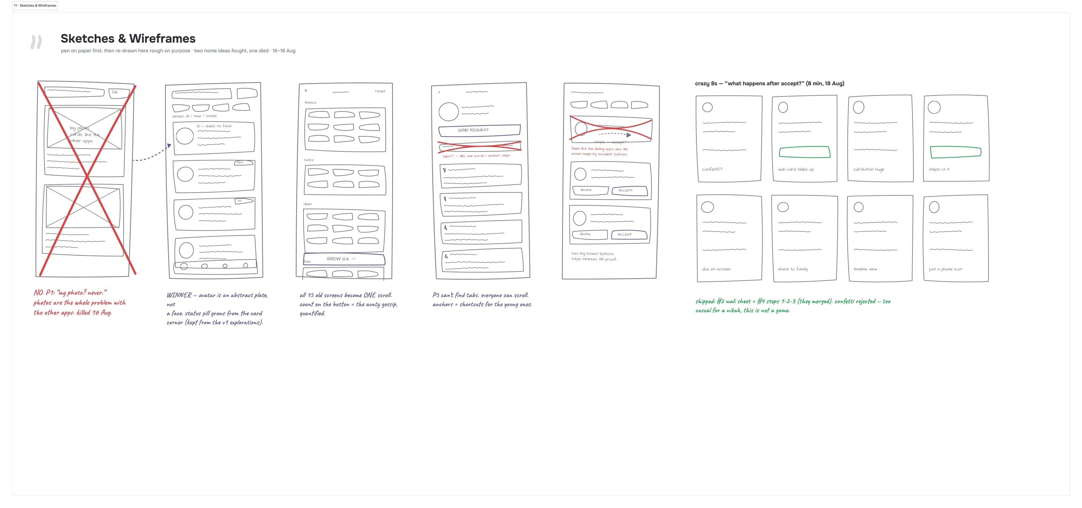
The first Home sketch had photo cards, because that is what every reference looks like. It is the only sketch with a red cross through it. The research killed it in a day: photos are not a missing feature of this app, they are the whole problem with the other ones. The winner keeps the card, swaps the photo for an abstract plate with the ID and the shield, and lets the status pill grow out of the card’s corner.
Two more fights happened on paper, which is the cheapest place to lose them. Tabs on the profile were crossed out mid-sketch for one scroll with anchor chips, because Abdul Rahman cannot find tabs and everyone can scroll. And requests answer with two big honest buttons, not swipe gestures, because a swipe is a dating-app verb and an accident waiting for a man with large-font mode on.
Decisions, dated
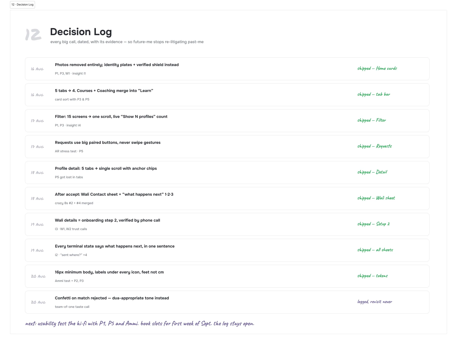
Every call that shaped the redesign is in a log with its date and its evidence, so future me stops re-arguing with past me. Photos out. Five tabs to four. Fifteen filter screens to one. Buttons, never swipes. The wali moved to step two of onboarding, verified by a phone call. And confetti on a match rejected, because this is a nikah, not a game.
Where it starts
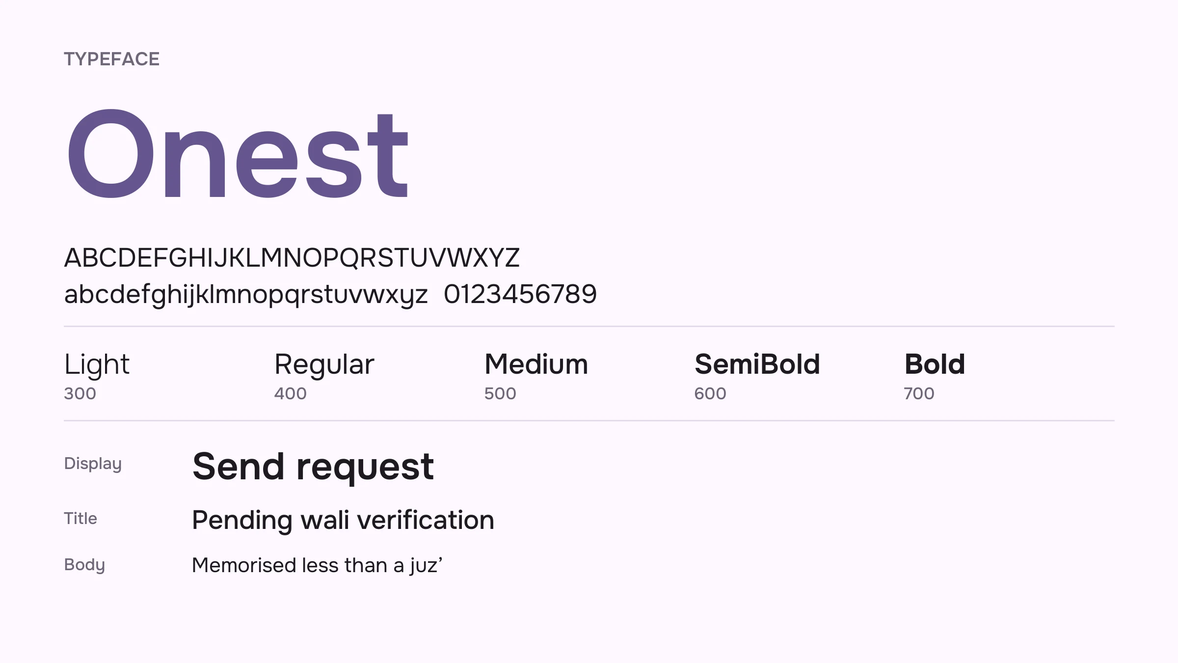
Two decisions come before any screen gets drawn: what it is set in, and what colour it is. Every screen after them inherits both, so they are cheap to change now and expensive to change later.
Onest, for three reasons. Its letters are open and its x-height is tall, which is what keeps small type legible, and this app is mostly small type, since a filter is a wall of chips. It ships as one variable file covering 100 to 900, so the whole hierarchy comes out of a single download instead of five. And it is friendly without being childish, which matters in an app that is asking people personal questions.
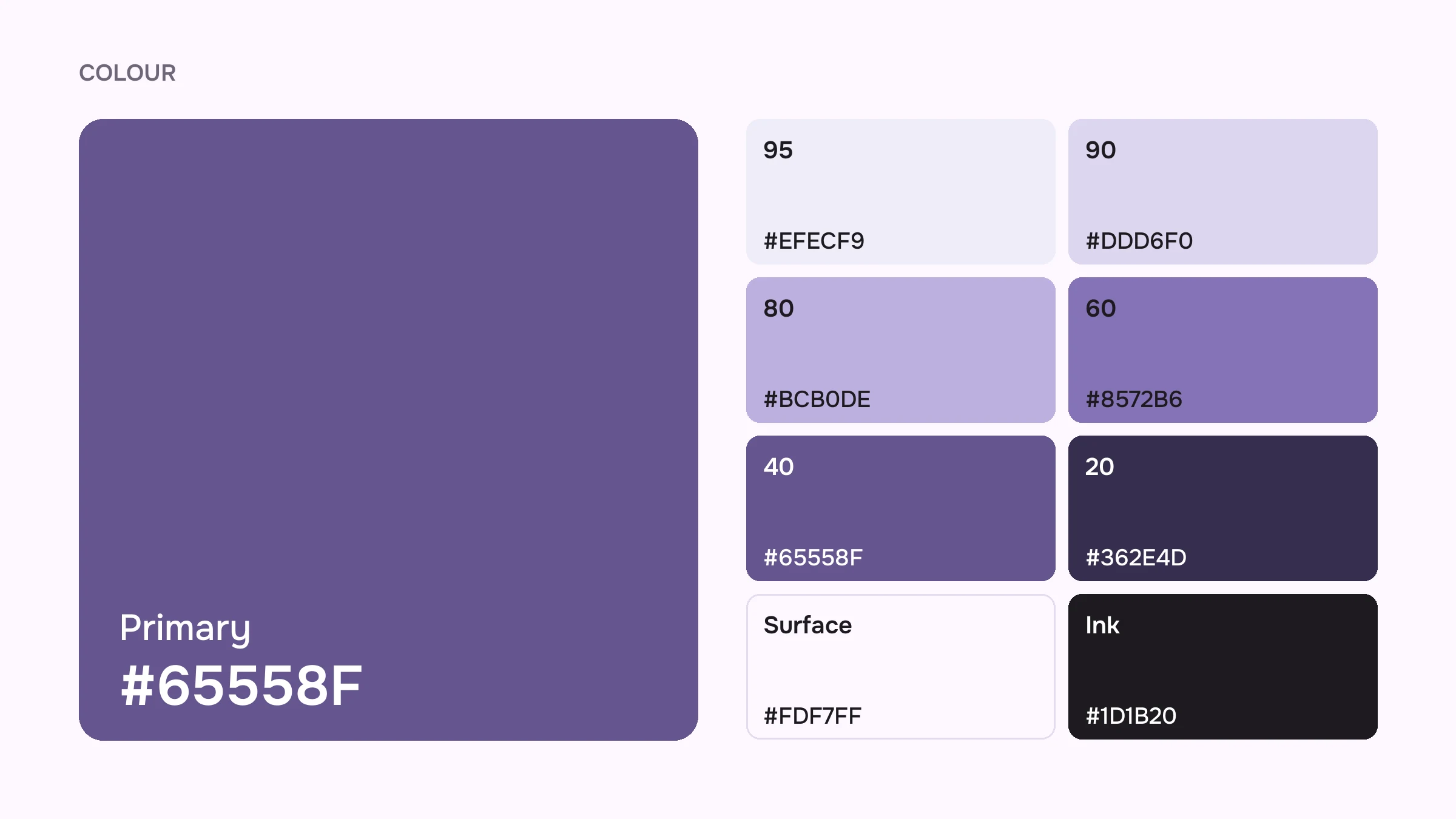
#65558F is not a new colour. It is the purple the app already wears (the icon is that colour), and keeping it means the redesign arrives as the same app rather than a different one that took the name.
It also sits at a useful lightness. White on it clears AA at 6.5:1, and it clears AA again as text on the near-white surface, so one colour does both jobs: the fill of a button, and the ink of a link. A system that needs a second, darker purple for text has two colours to keep in step forever.
Everything else is that colour at another tone. On a near-white surface the tones do the separating, so a card can sit apart from what is behind it without a border drawn around it.
The navigation
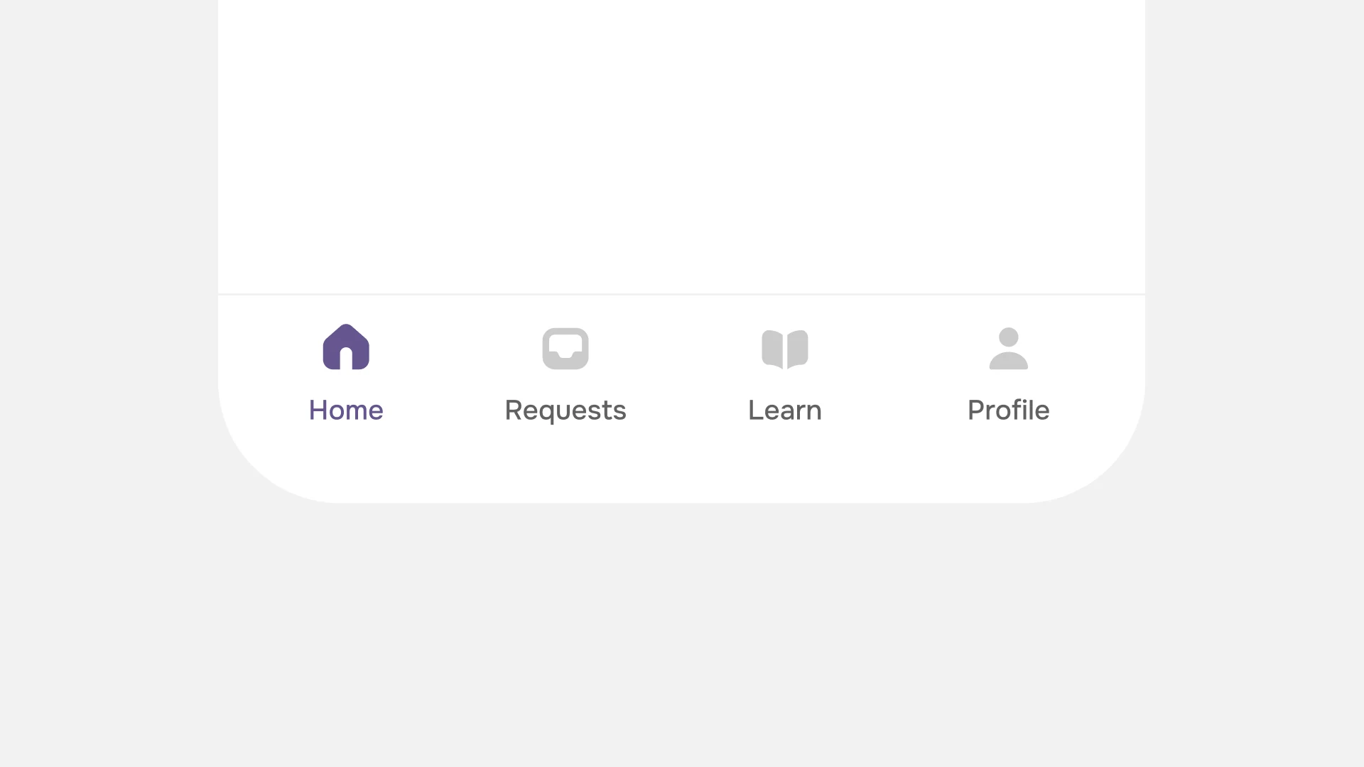
The old bar was Material’s own: five tabs with a pill sliding in under the active one. The reason to leave it is that the app ships on both platforms and that bar is Android’s. What replaces it is the shape iOS and Android already agree on, so neither side has to learn anything.
Five tabs became four. Courses and Coaching were one intent wearing two names (somebody who wants to learn does not care which shelf it is filed on), so they are a single tab called Learn. Four tabs also give each one a wider target than five did.
Every icon keeps its label. An icon on its own has to be learned first; a word does not.
And the icons are drawn for this app rather than lifted from a set, so their weight and their corners match everything around them. A borrowed icon set is the usual reason an app looks slightly assembled.
The top of the list
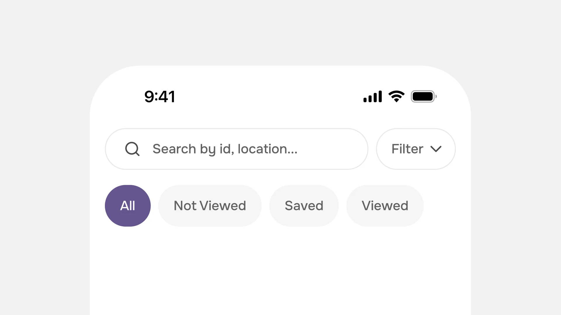
Search, filter and the status chips are all doing one job: narrowing a list of strangers down to a few worth reading. The old screen spread that job over three rows, put sort in the middle of it, and left the last chip cut off behind a scroll arrow.
So filter moves up beside the field it belongs to, and the chips get the width to all fit. Everything that narrows the list is now one tap away, and none of it is hidden.
The placeholder does a quiet job as well. It names what the field takes, id or location, because a box that only says Search has to be guessed at, and a guess that returns nothing reads as an empty app rather than a wrong query.
The study goes under here.