Kcalo A Calorie Tracker, Designed End to End
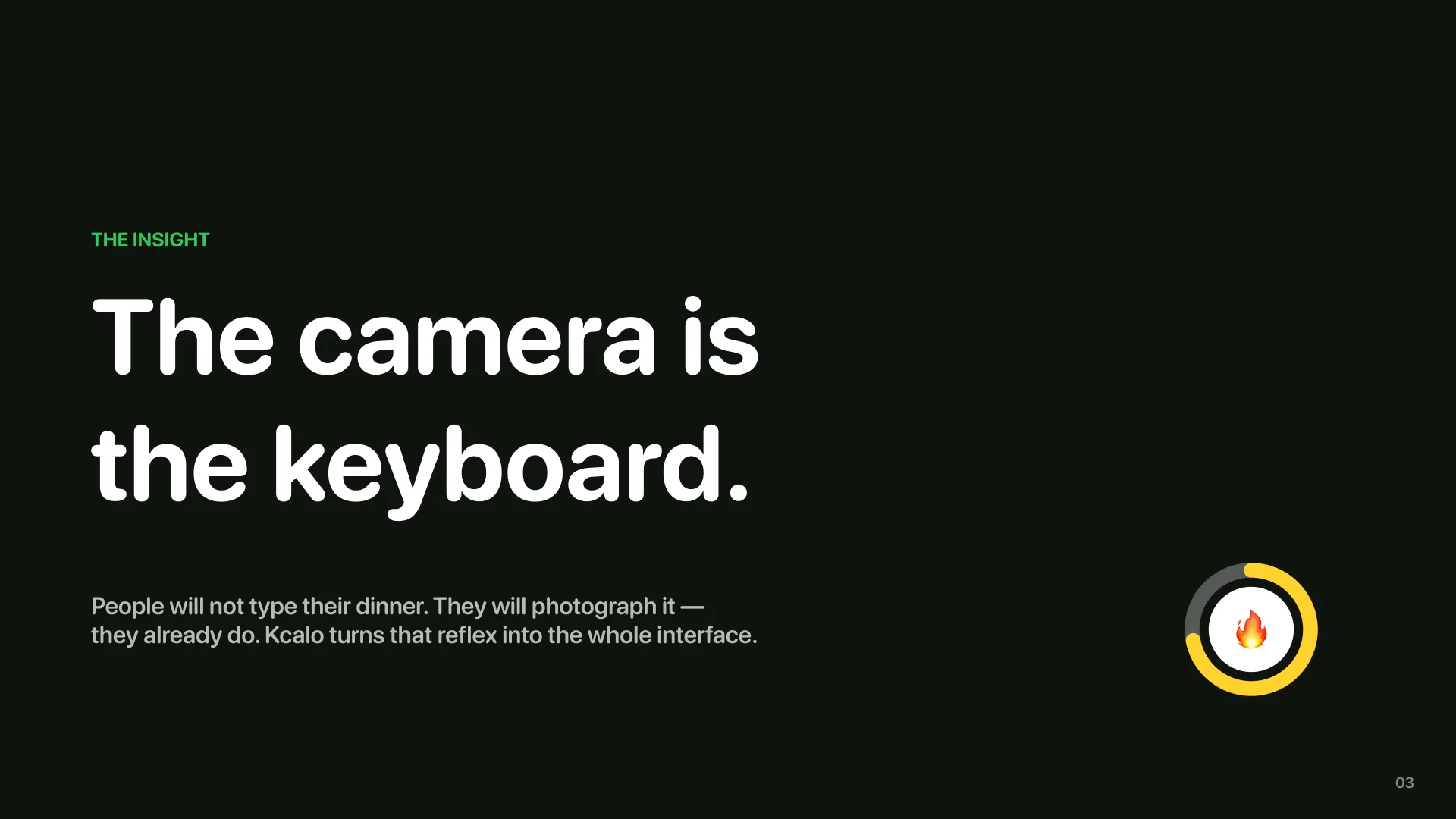
Kcalo is a concept calorie tracker built end to end, from research boards to App Store screenshots. The premise fits in a sentence: people will not type their dinner, but they will photograph it. So the camera is the keyboard, and everything else is designed around the five seconds that follow the shutter.
This one has no client and no users, and says so up front. The brief was mine: take one sharp idea and carry it the whole distance a real product goes. Research, flows, wireframes, a token system, a component library, thirty-one screens with their empty and error states, motion, a brand, six posters, an App Store listing and a ten-slide pitch. One Figma file.
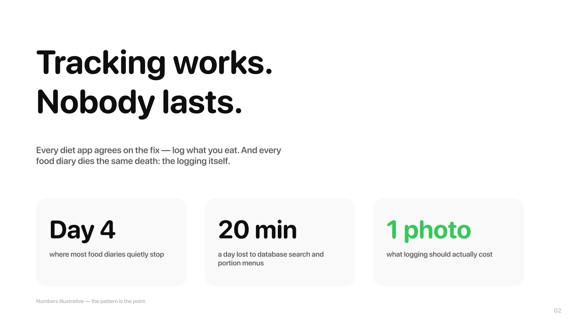
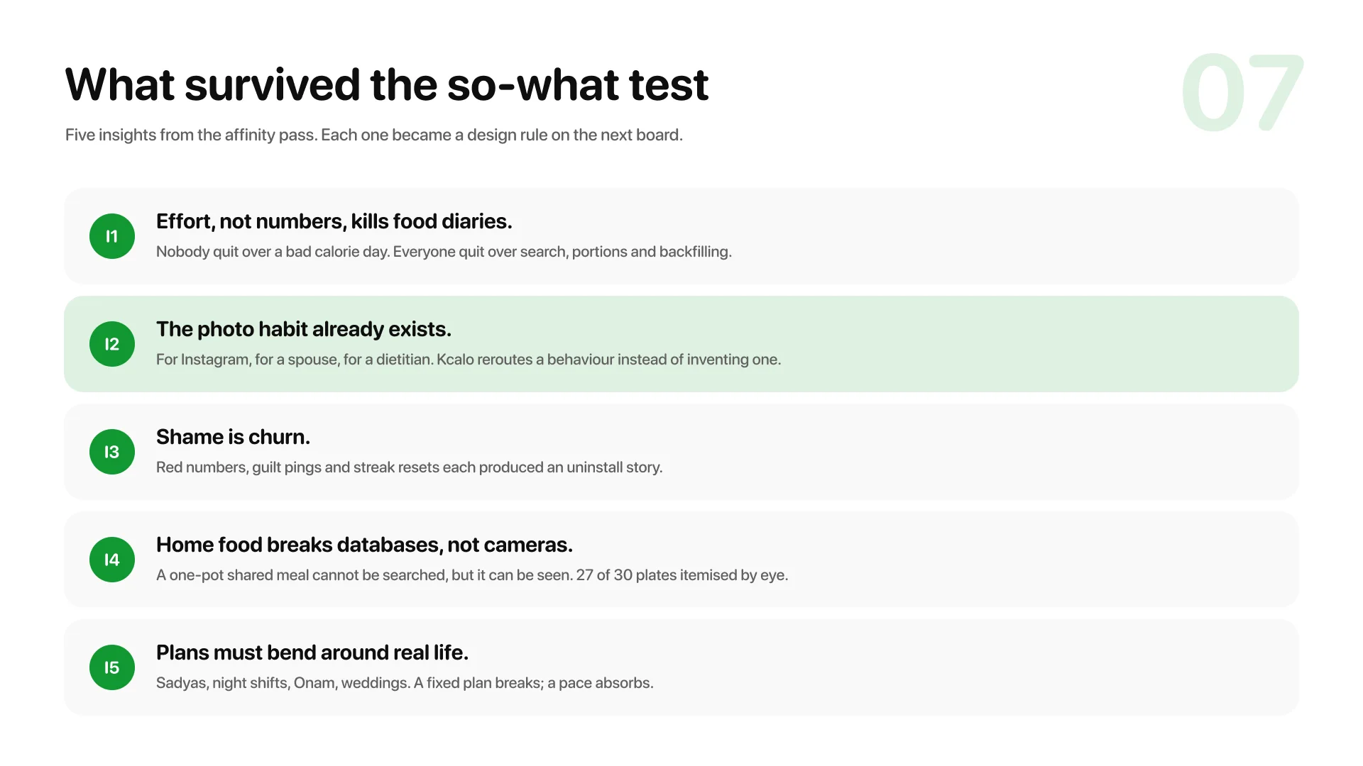
It started as a single screen, one day of eating on one page, designed before any of the rest existed. This study is that screen carried the whole distance, and it kept the test the screen was built for. Everyone has installed a calorie tracker; nobody still uses one. The apps work. The logging is what dies. And the same people who will not type a meal photograph their meals constantly. The behaviour already exists. Kcalo reroutes it.
The short version first. Ten slides carry the whole argument. Scroll through them, tap any to zoom. The rest of this page expands each one.
The homework
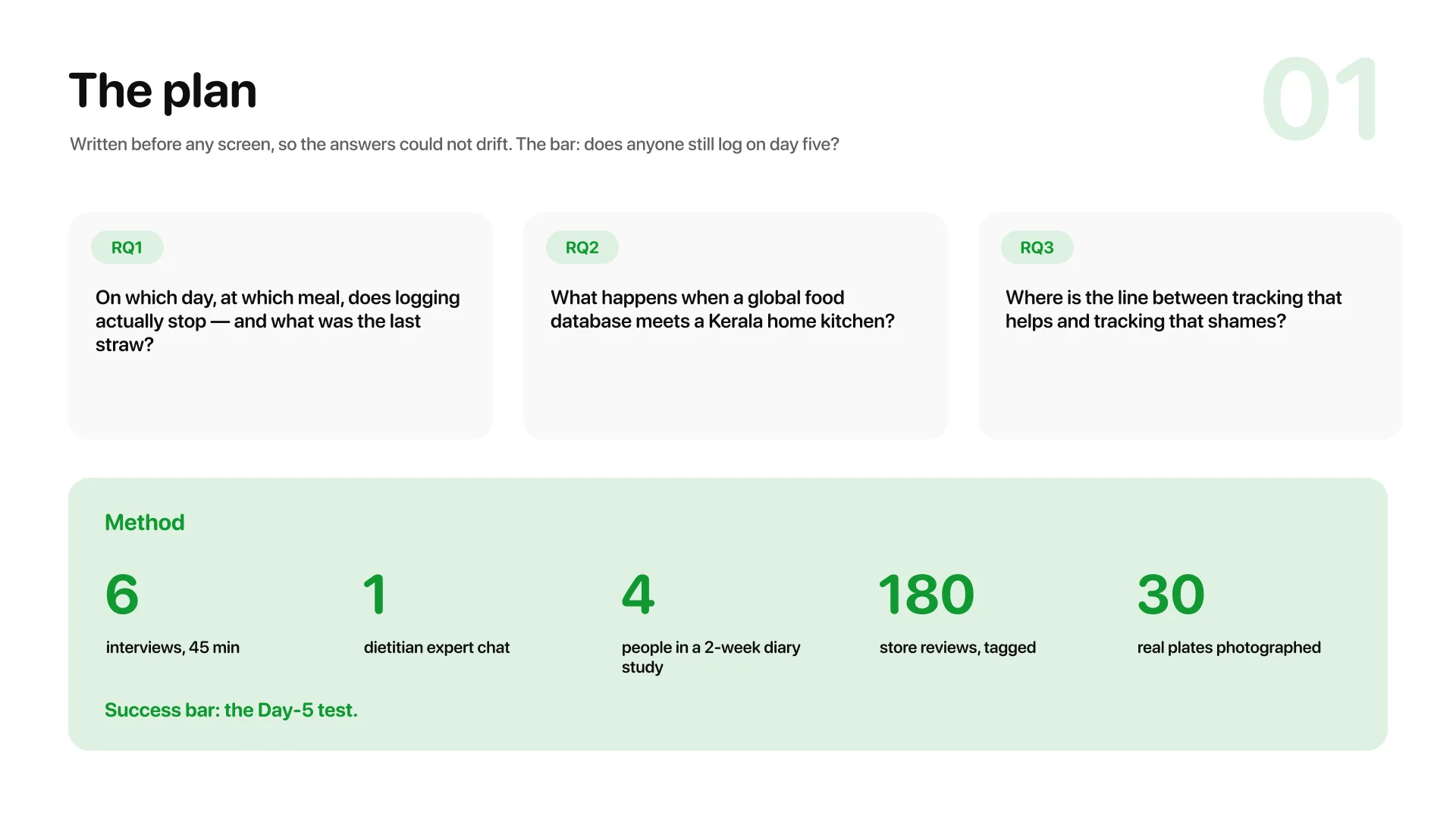
The plan asked three questions and named the bar: does anyone still log on day five? Six interviews, a dietitian, a two-week diary study where four people re-tried their old trackers, 180 store reviews tagged, and thirty real mixed Kerala plates photographed to see if a photo can even be itemised by eye.
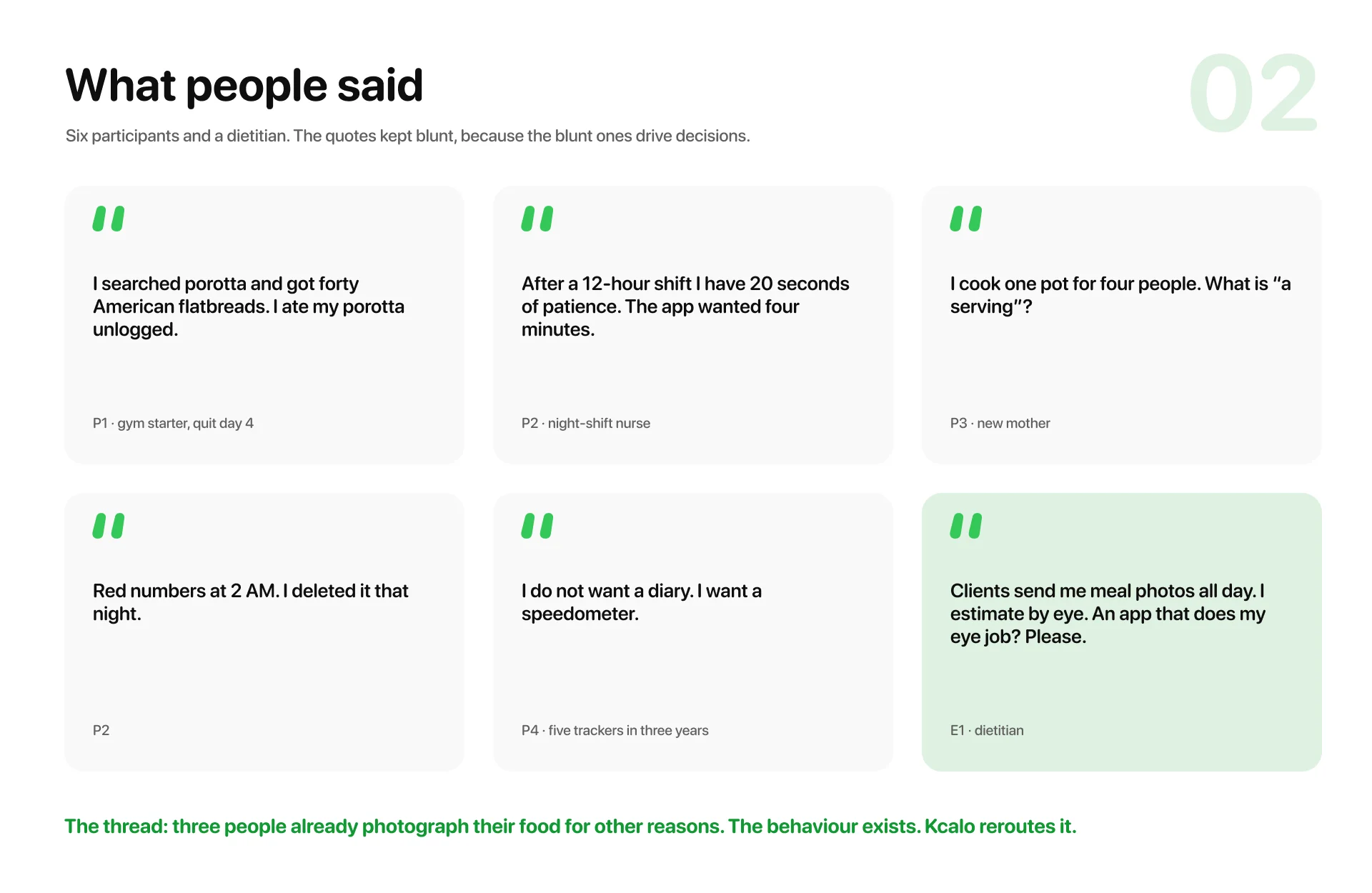
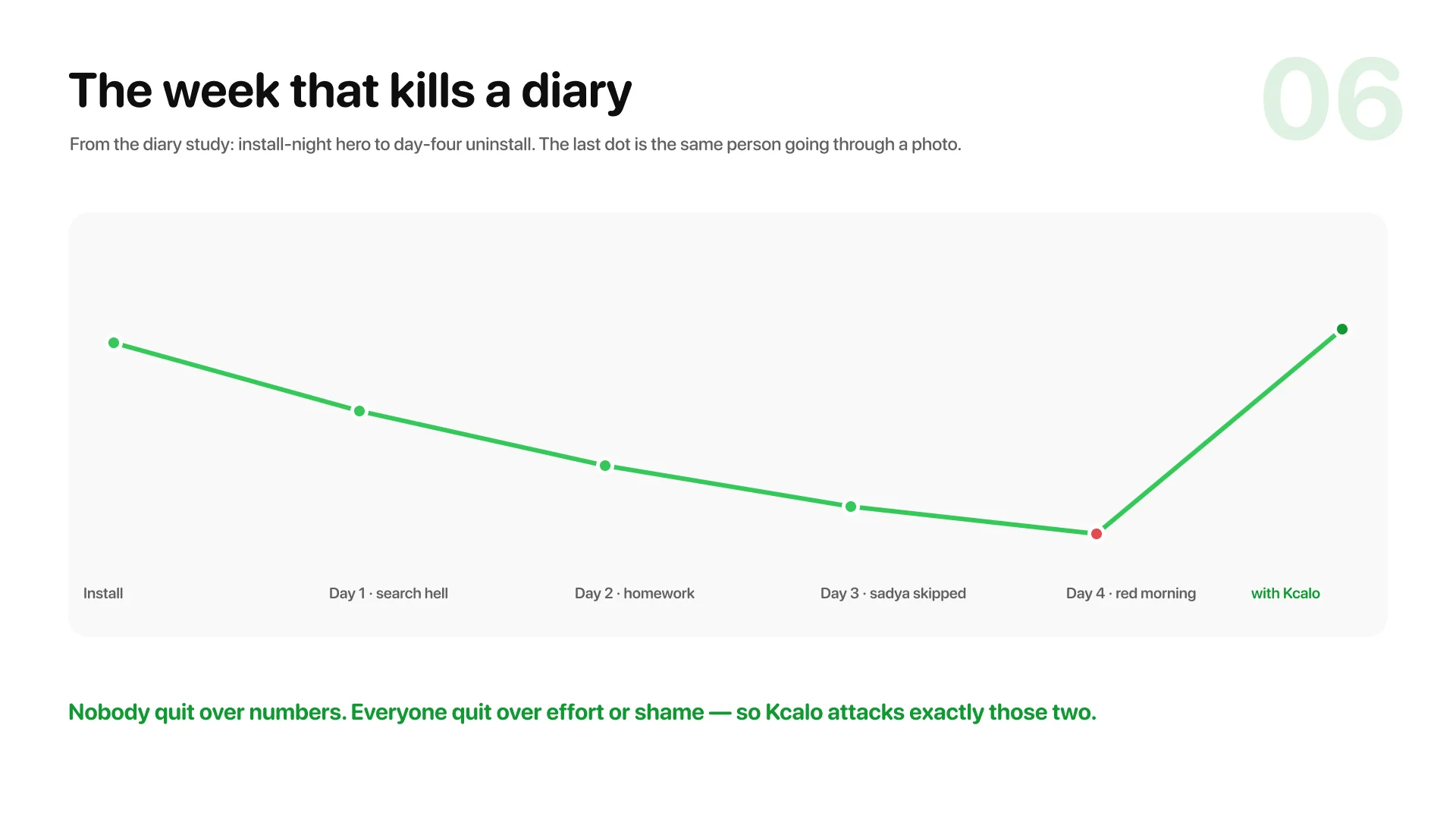
The interviews kept landing the same two blows: effort and shame. Nobody quit over a bad calorie day. And the thread that became the product came from three people describing the same interface without knowing it — a nurse photographing dinner for his wife, a mother photographing the pot, a dietitian estimating calories from client photos on WhatsApp all day.
Who it has to survive
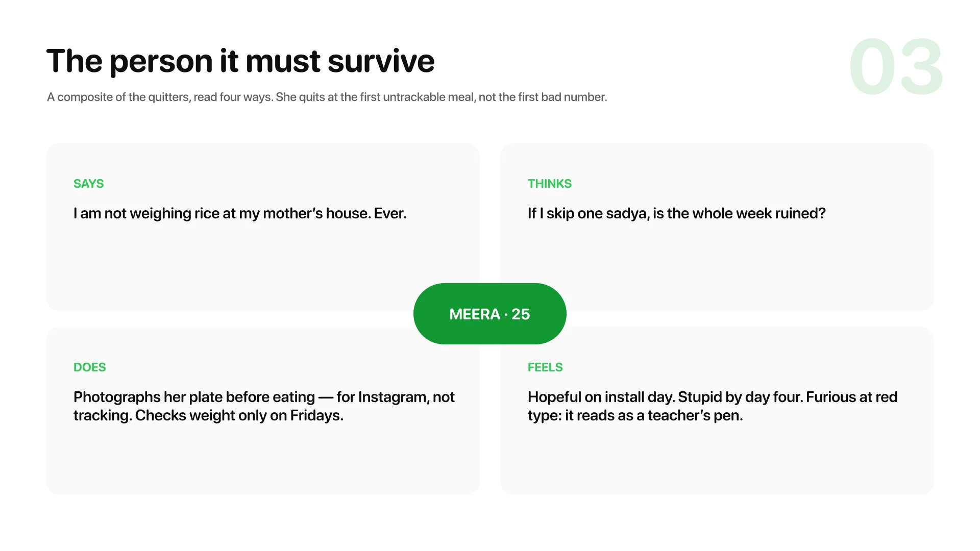
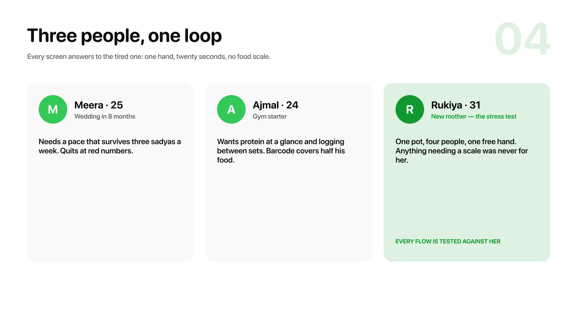
Three personas share the screens, and the third is the stress test. Rukiya cooks one pot for four people with one free hand and owns no food scale. Every flow got asked her question first: one hand, twenty seconds, no scale?
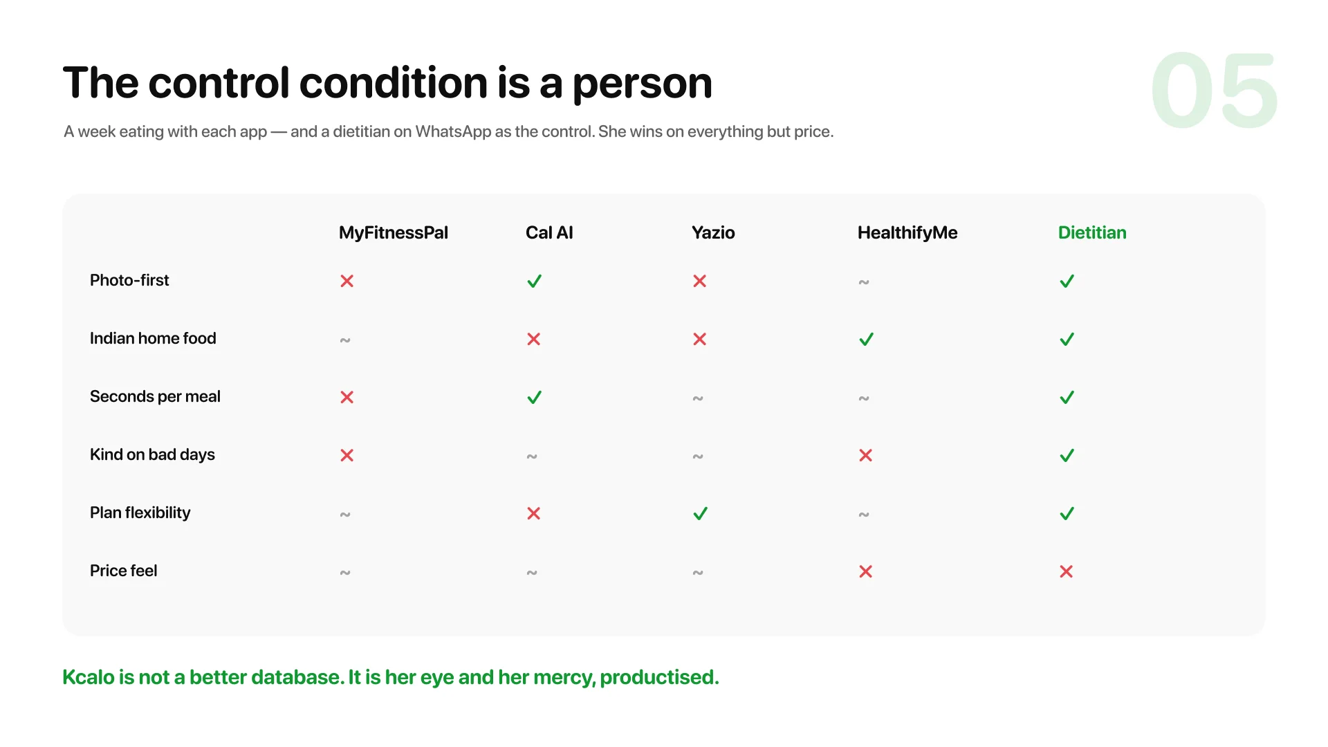
The control condition is a person
The scan put the usual apps in columns and a dietitian on WhatsApp as the control. She wins on everything except price and scale, because she takes photos, estimates by eye and answers with mercy. So Kcalo is not a better database. It is her eye and her tone, productised.
Structure before pixels
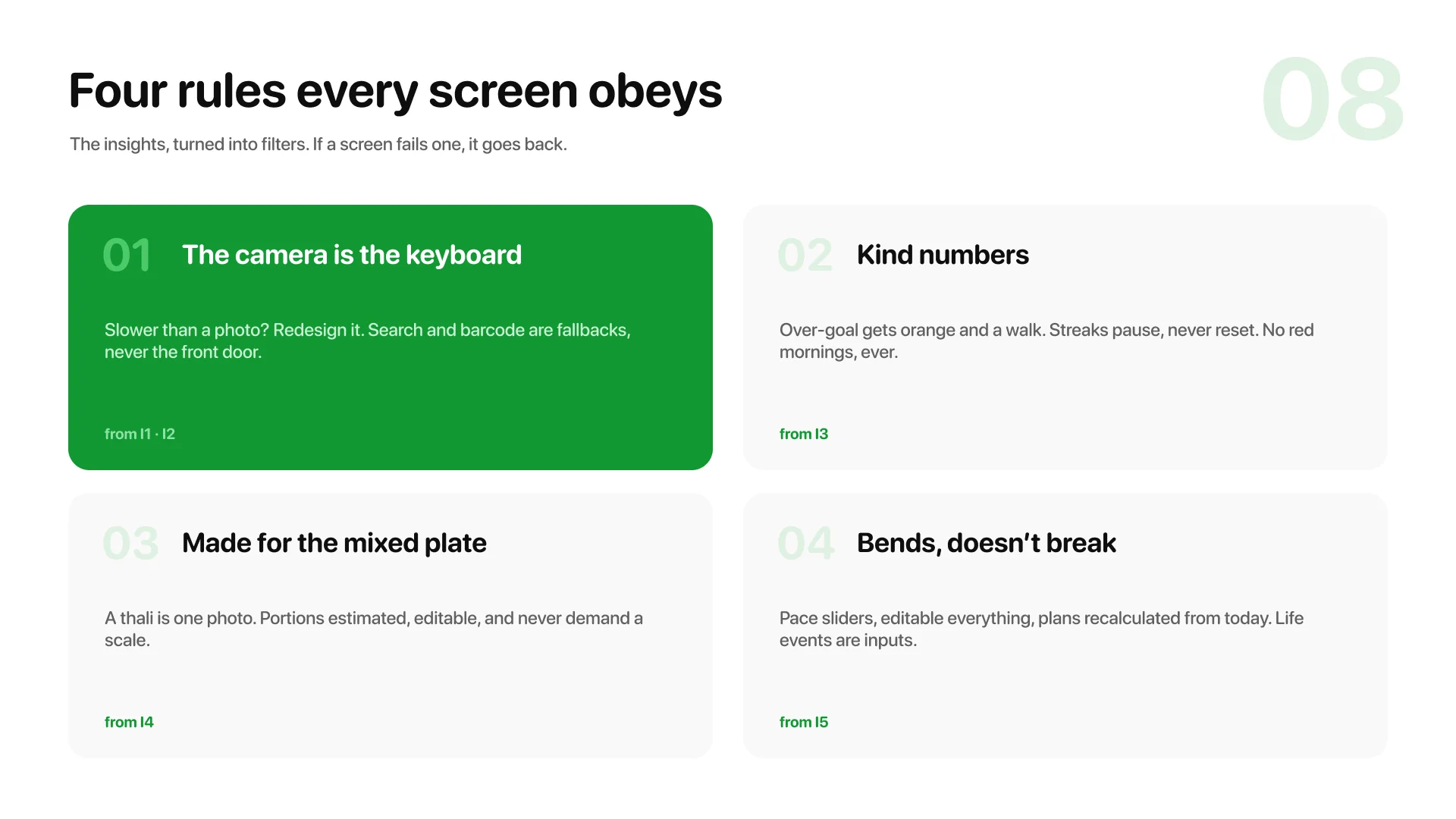
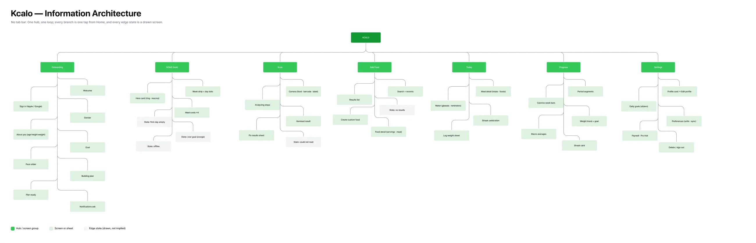
The architecture made one structural bet and it shows in the sitemap: no tab bar. A Diary tab makes logging a place you must go, and logging is a moment, not a place. One hub, one loop, every branch one tap from Home, and every edge state a drawn screen rather than a footnote.
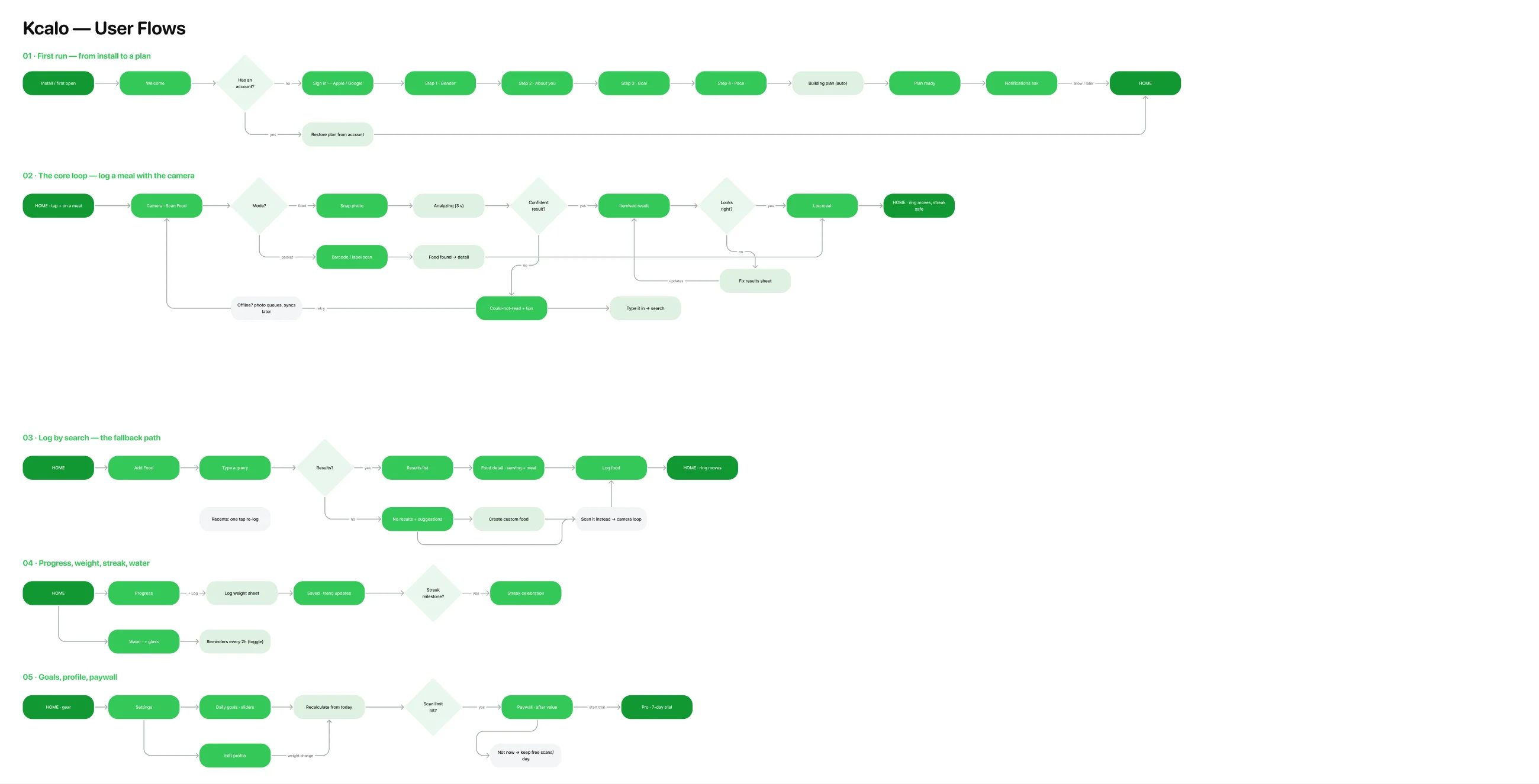
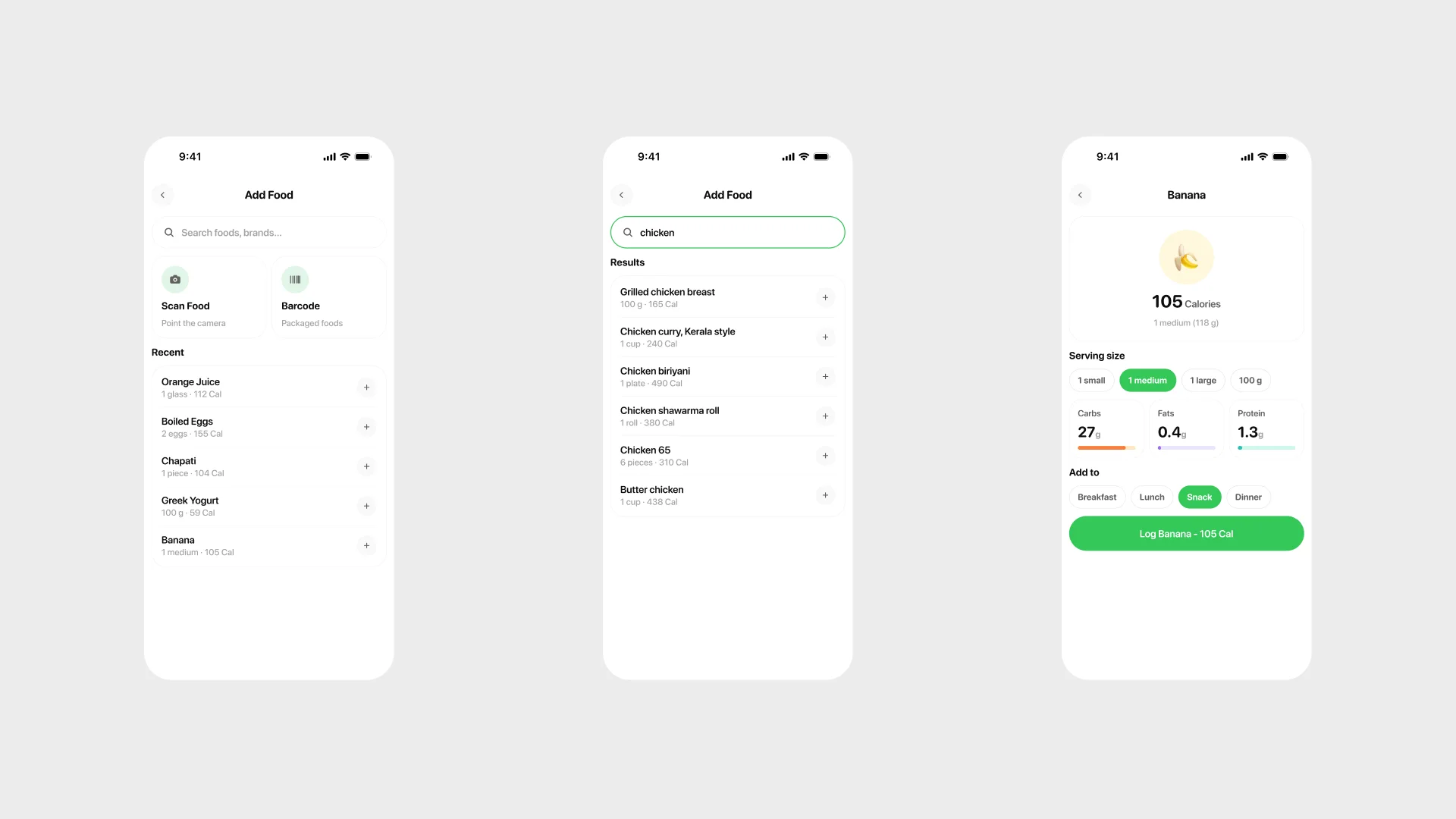
The flows cover the whole app in five rows: first run to a plan, the camera loop with its failure exits, the search fallback, progress and habits, and goals with the paywall. The honesty rule from Nisf carried over: every branch ends at a screen that exists.
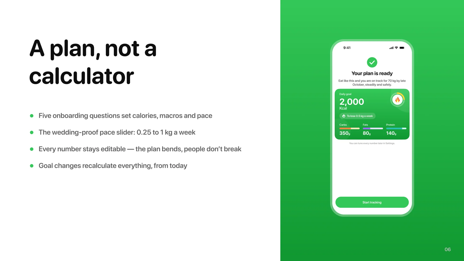
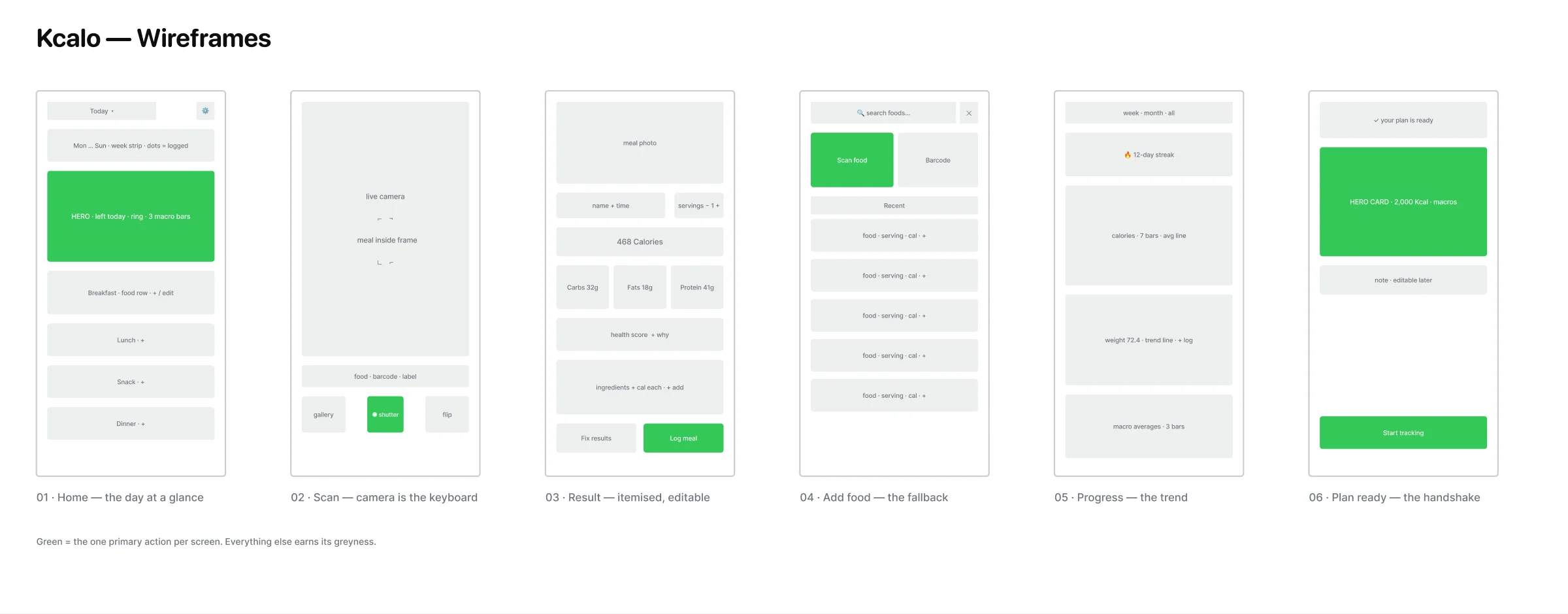
And the wireframes settle the layout fights cheaply: grey blocks, one green primary action per screen, six key screens from home to plan-ready.
Where drawing starts
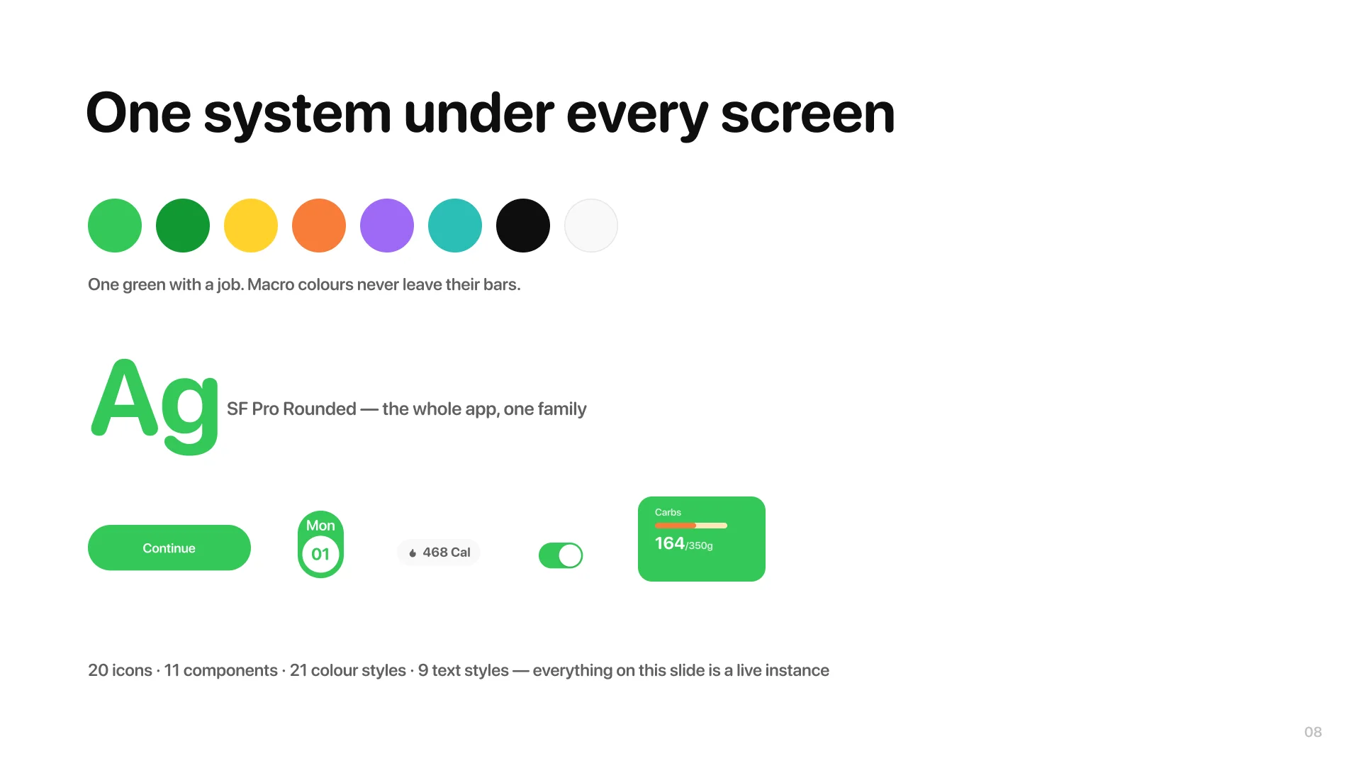
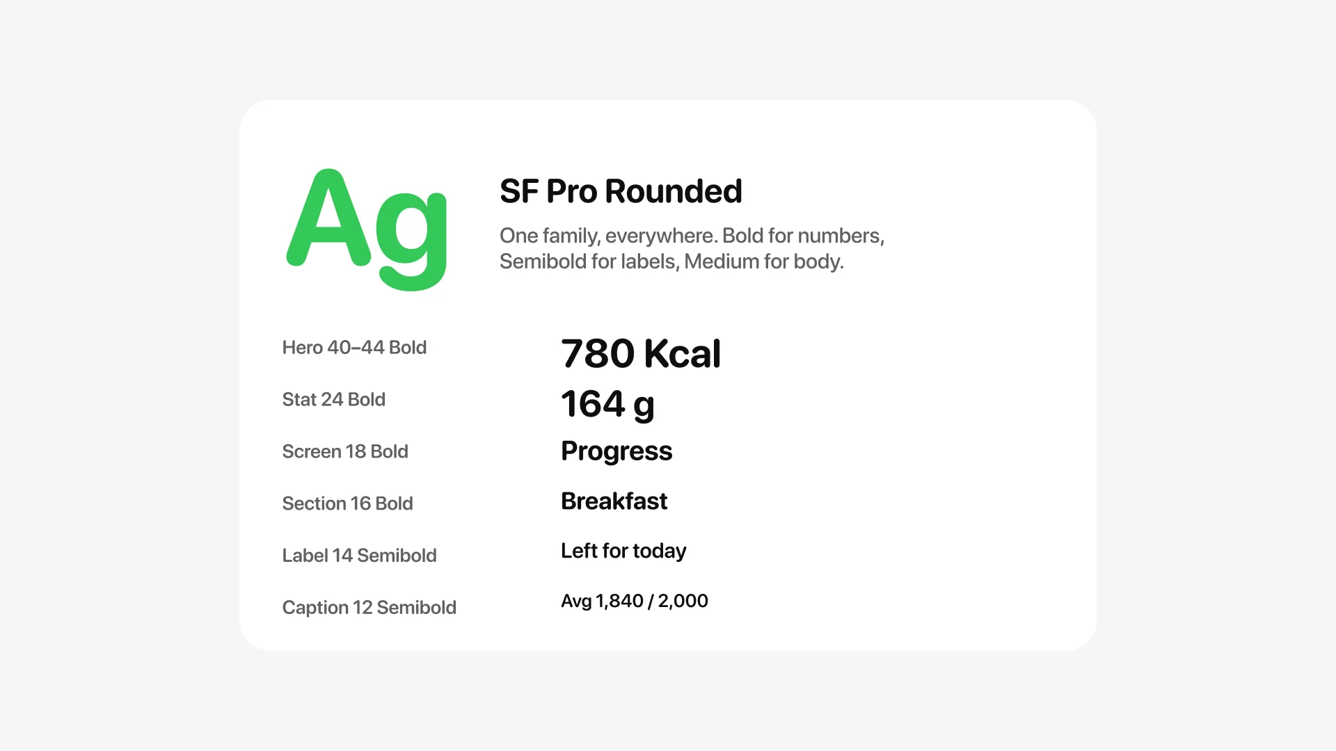
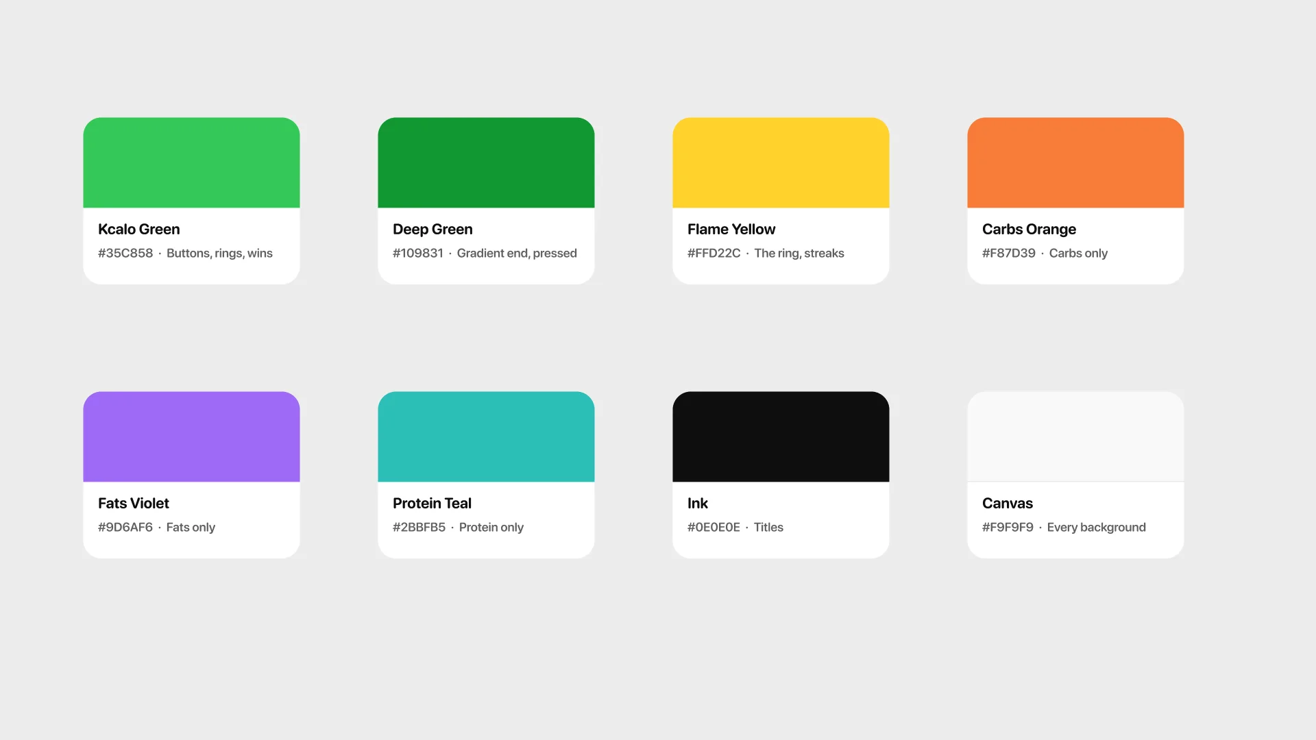
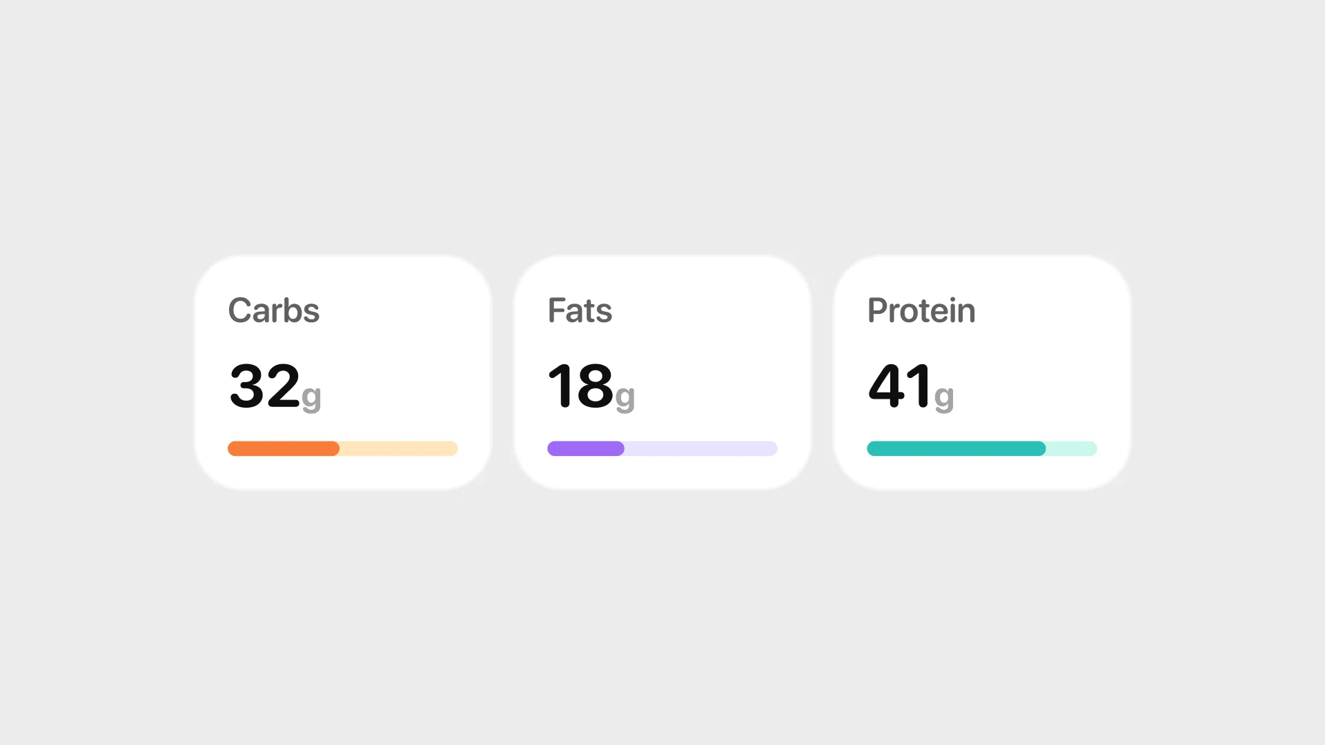
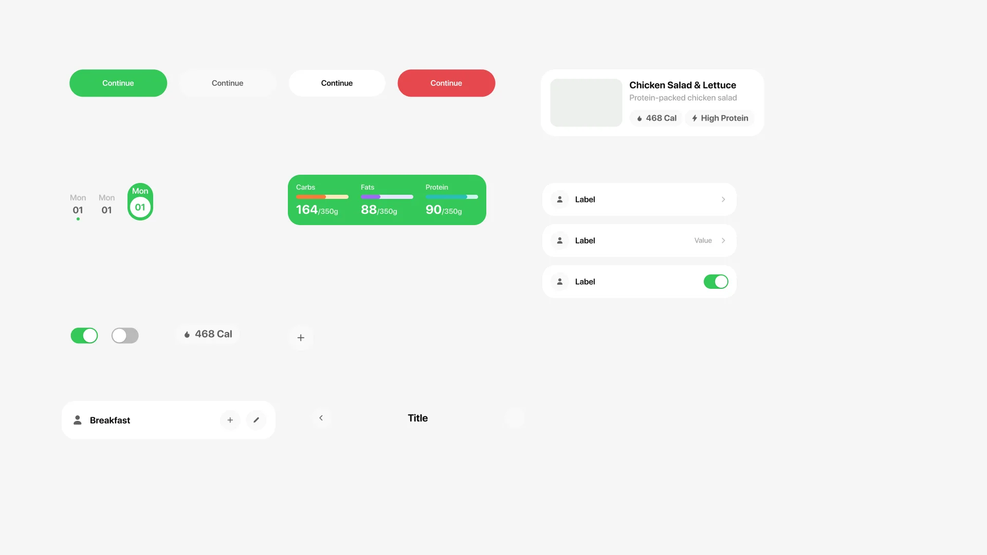
One family everywhere: SF Pro Rounded. The app is mostly numbers, and rounded numerals read as friendly where a grotesque reads as a lab report. One green with a job, three macro colours locked to their own bars, and yellow reserved for the flame ring alone.
The card the app hangs off
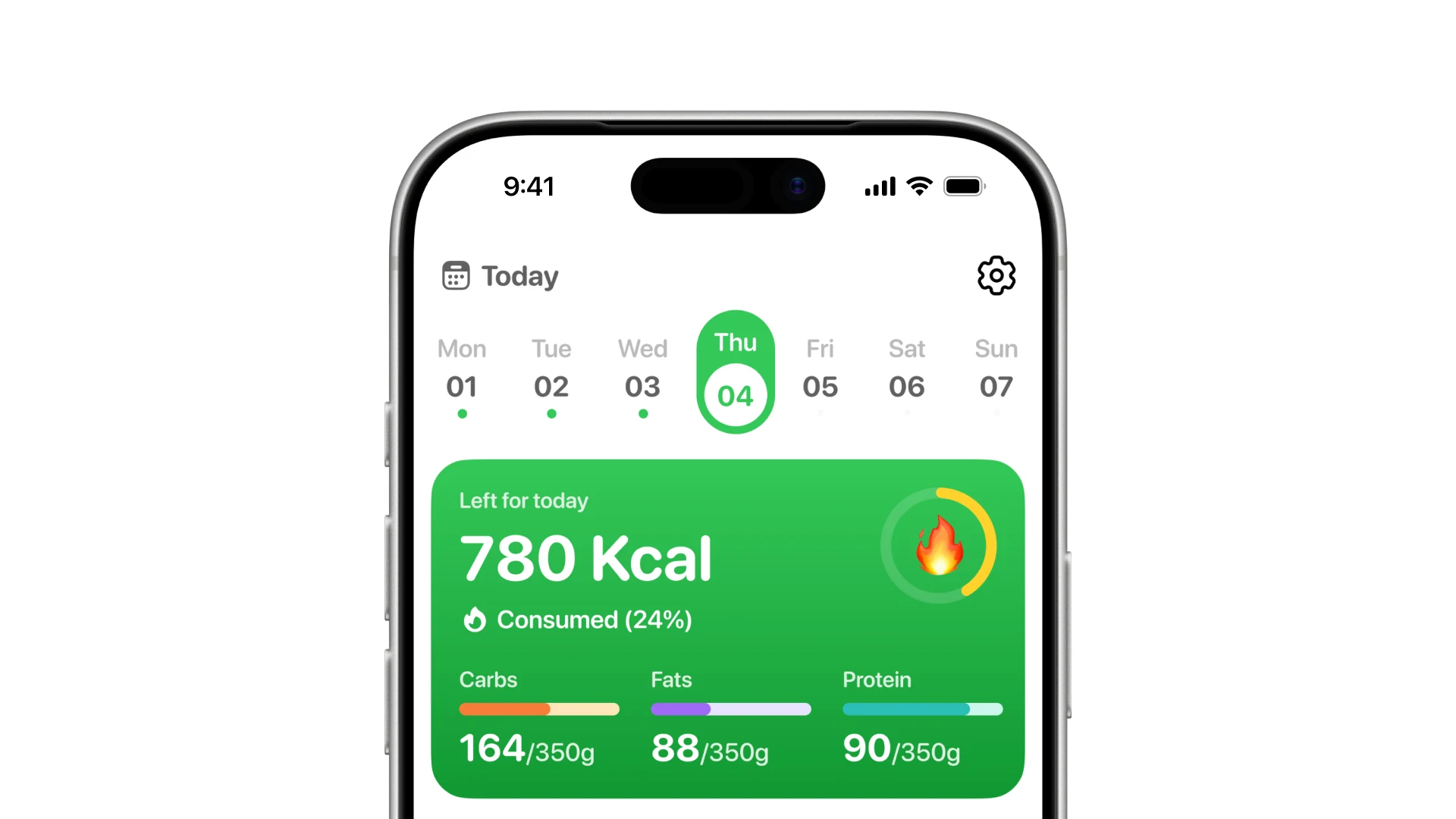
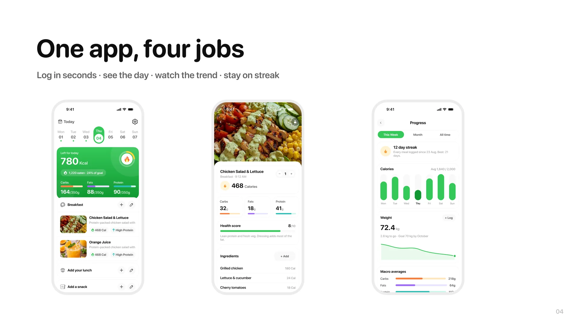
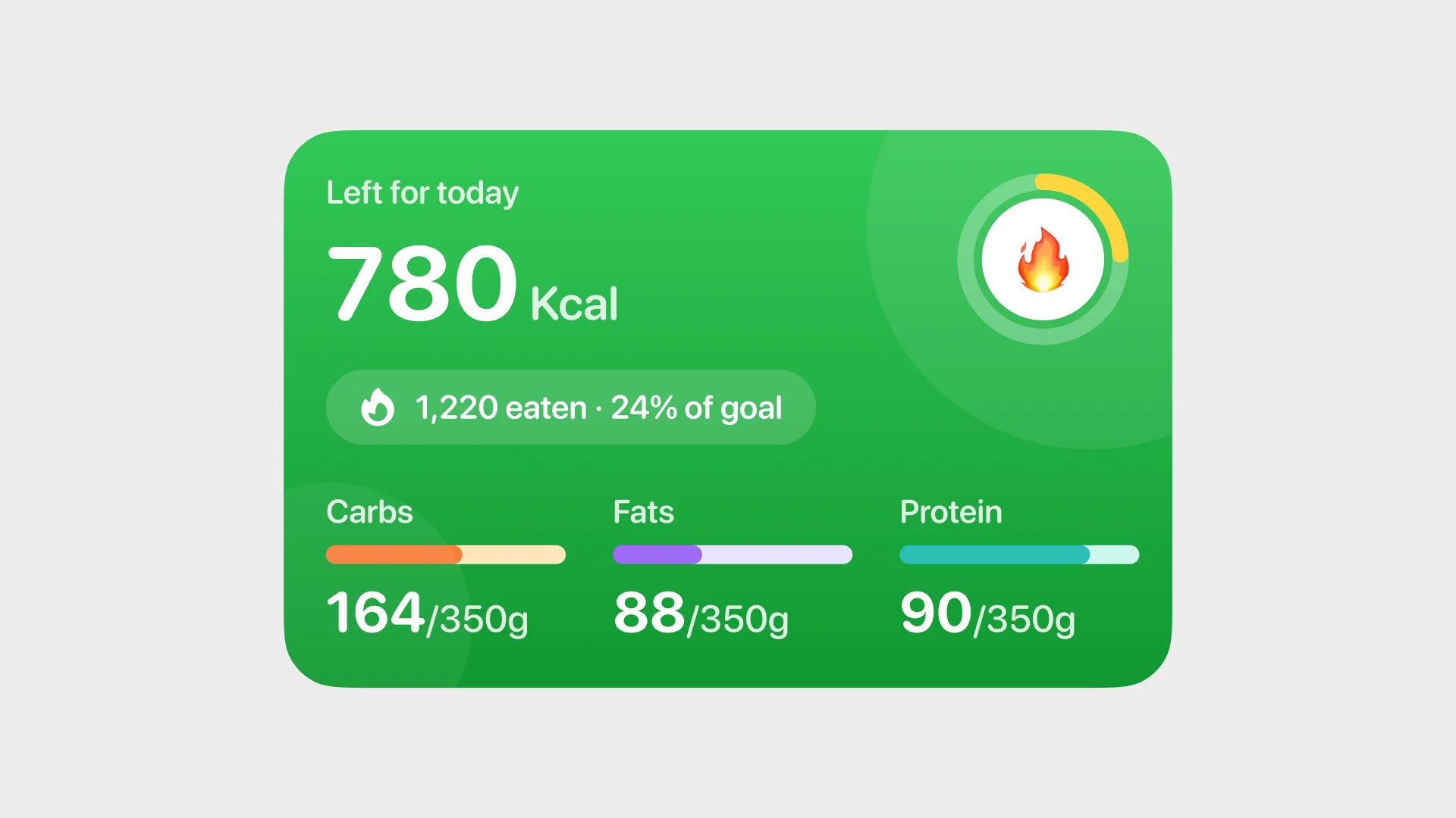
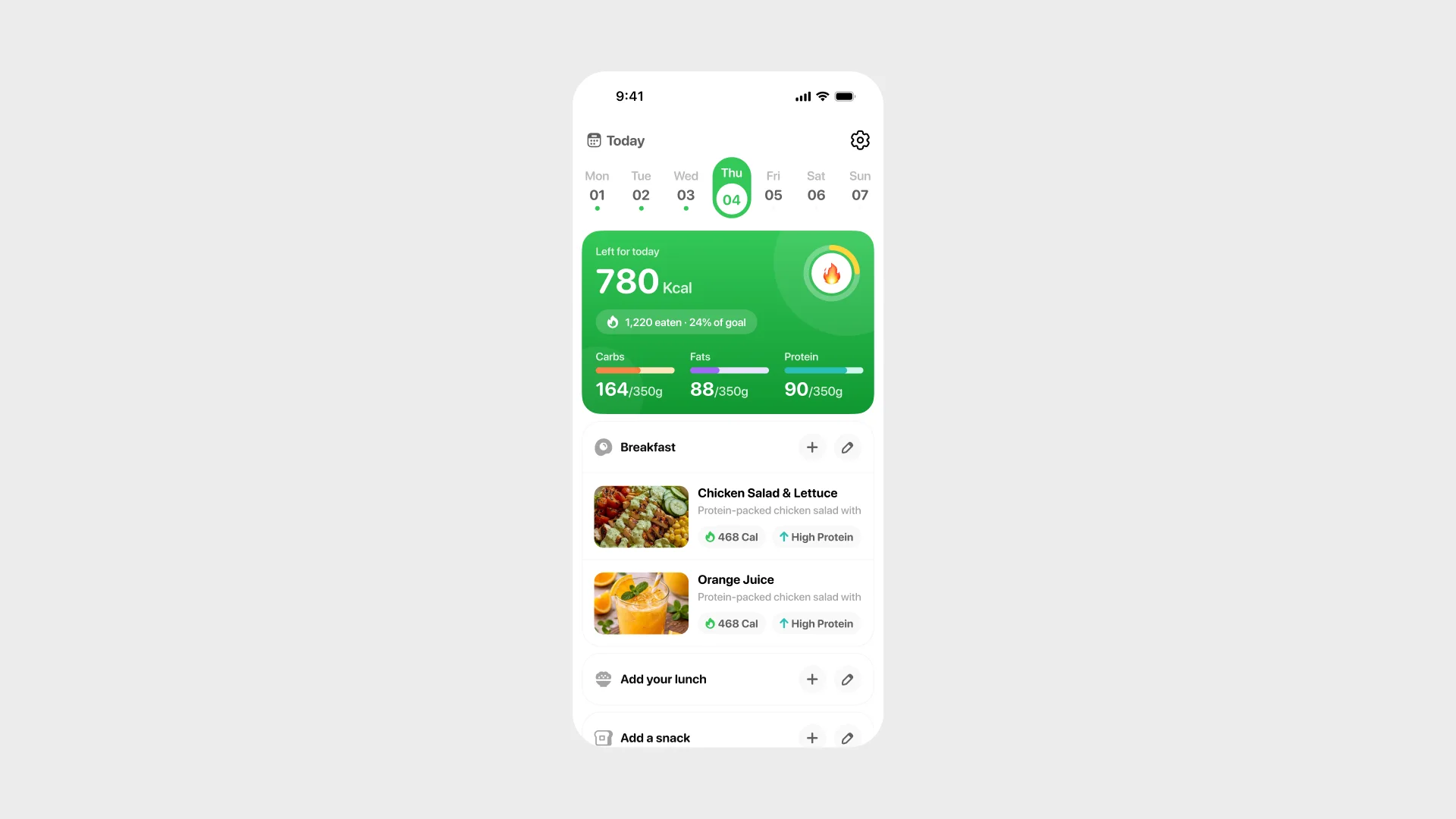
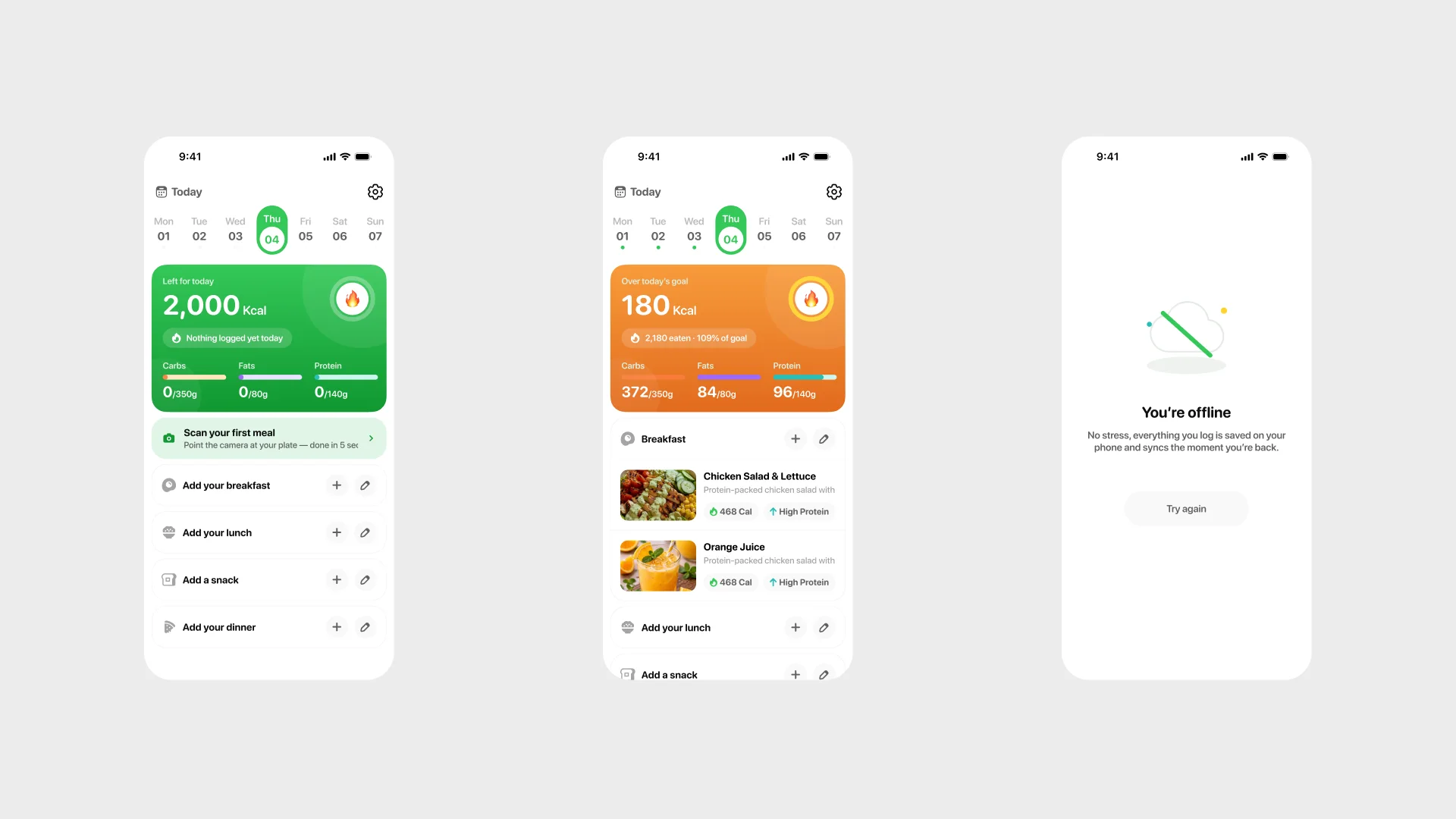
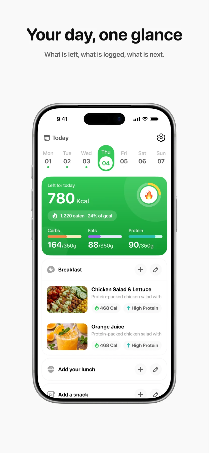
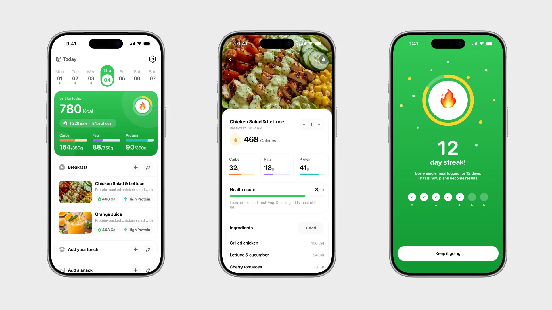
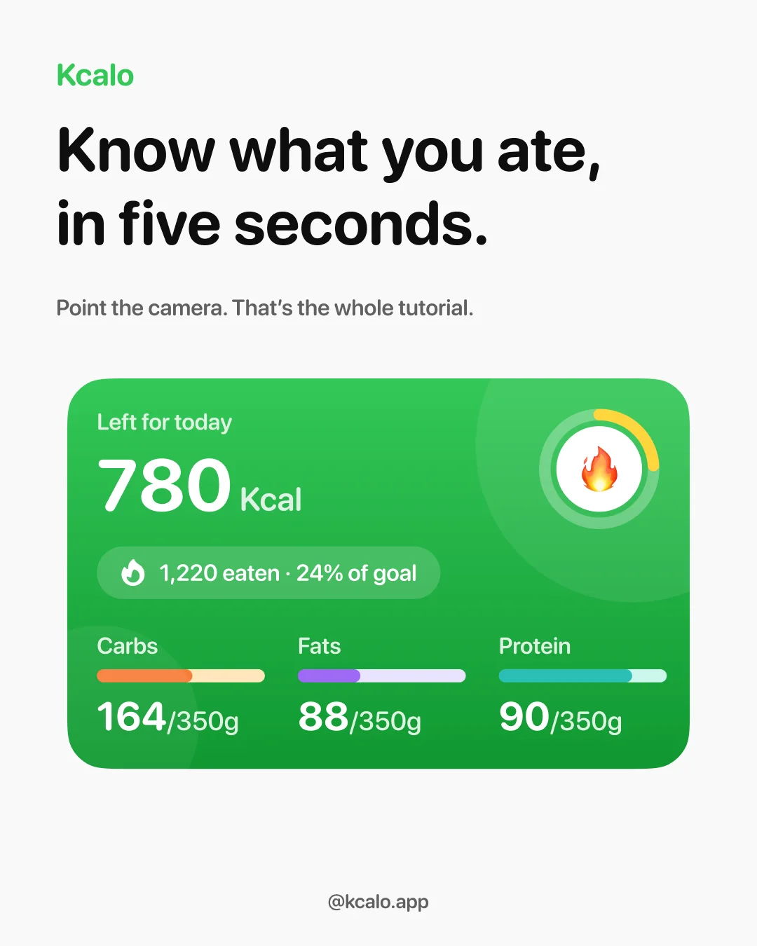
The hero card answers the only question that matters at a glance: how much is left today. And on open, it earns the glance — the card settles in, the ring draws itself to where the day stands, and the macro bars fill in turn. The load-in lives with the other clips in the motion strip further down; nothing moves that does not mean something.

The five seconds
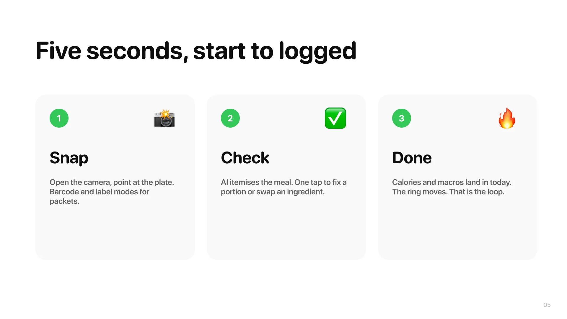
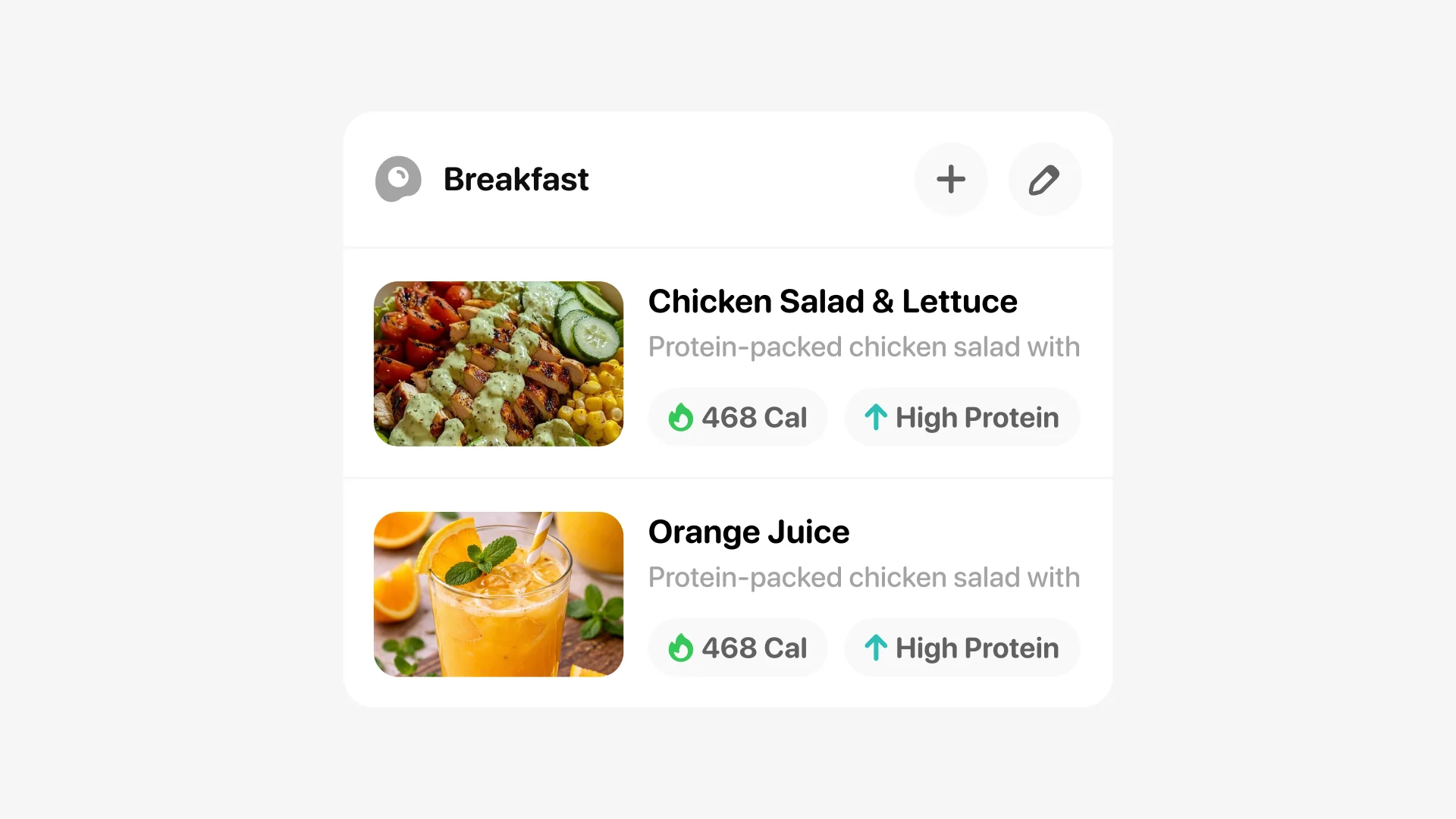
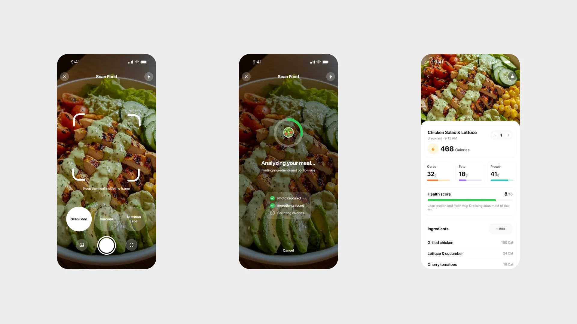
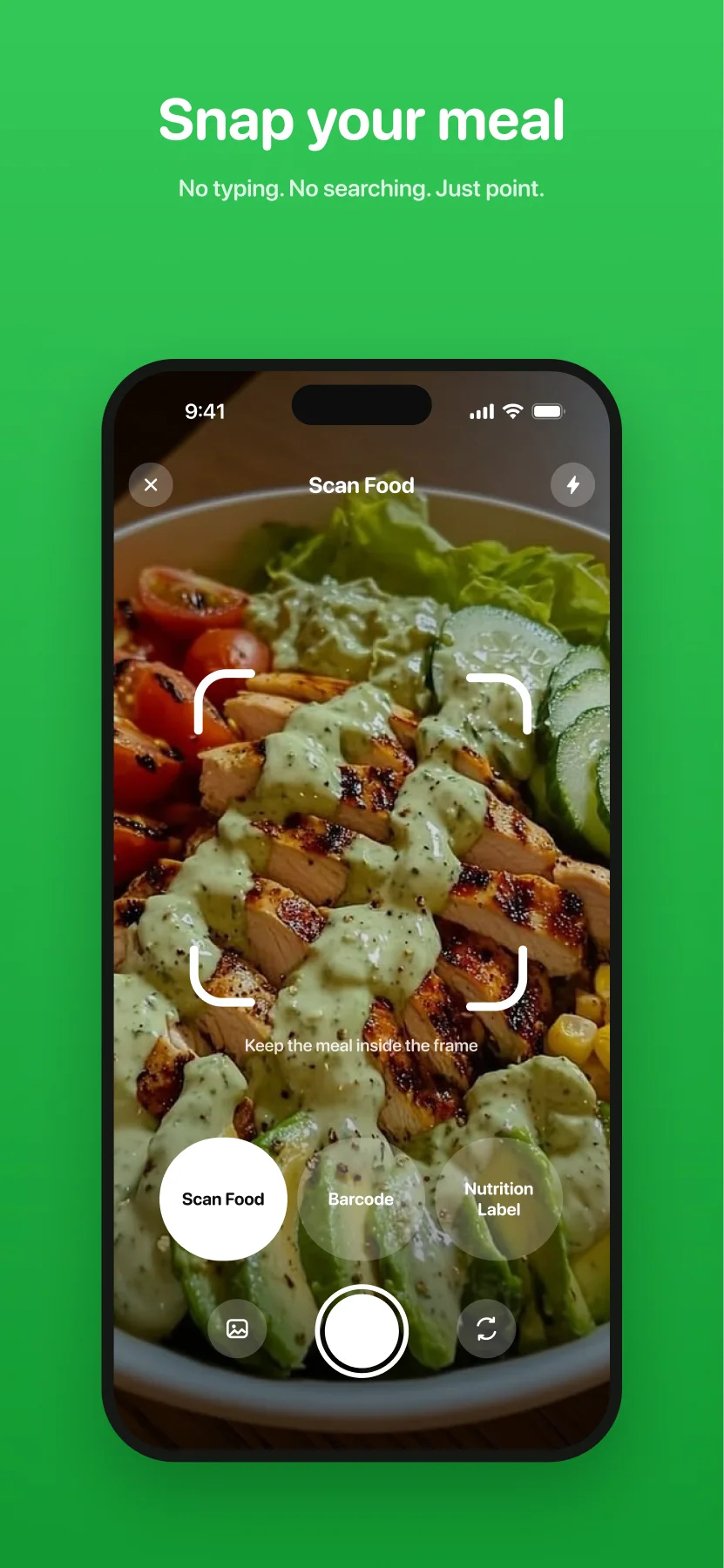
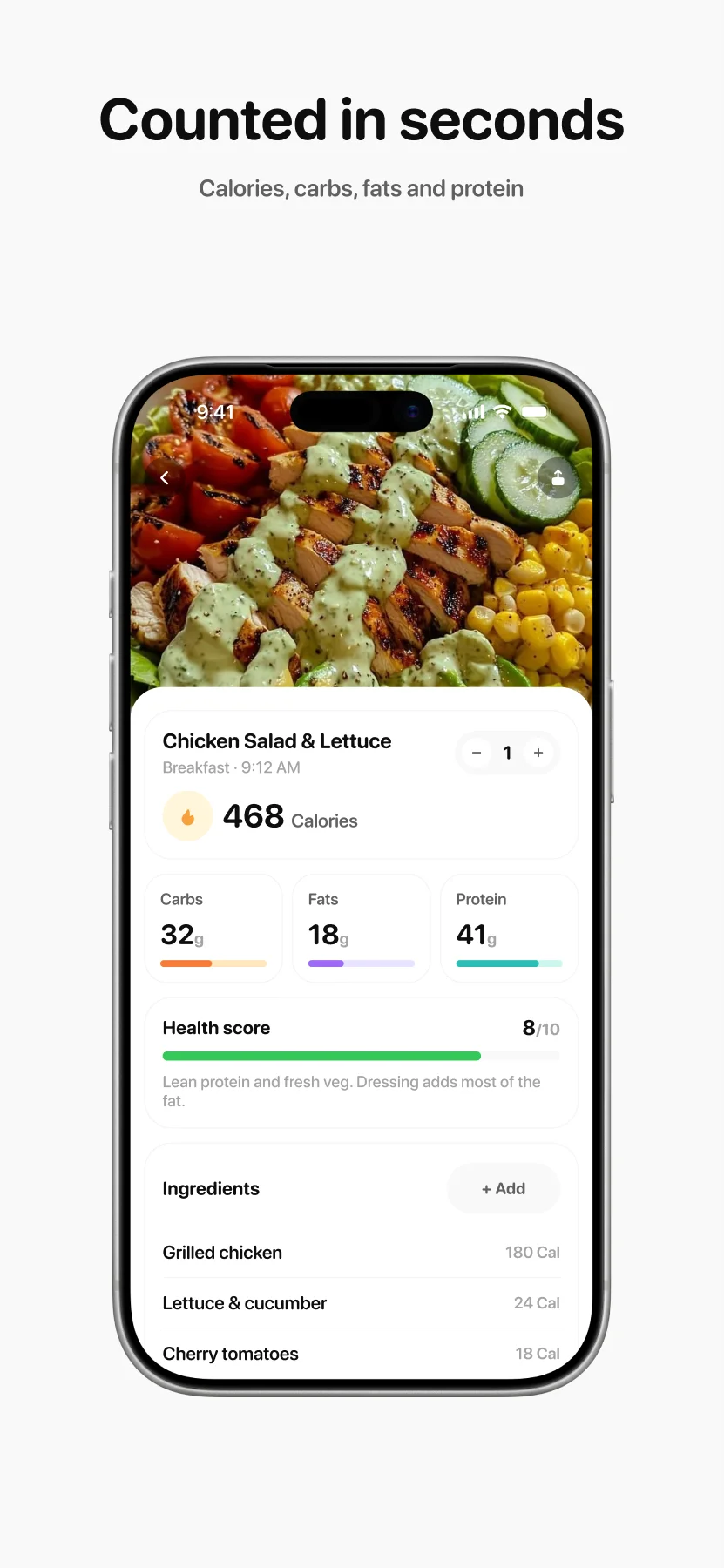
The scan flow is the product: camera, a three-second analyzing state that says what it is doing, and an itemised result. The result arrives as a sheet over the day; the transition itself sits in the motion strip, exported straight from the keyframes.
A plan, not a calculator
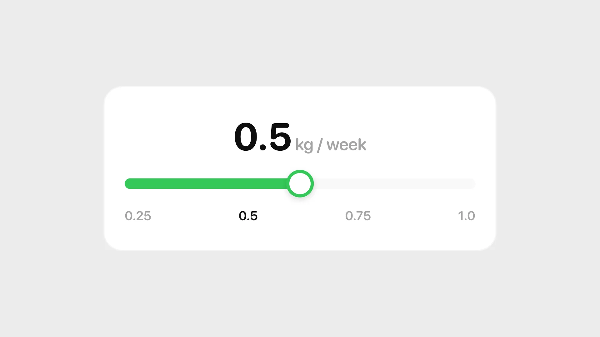
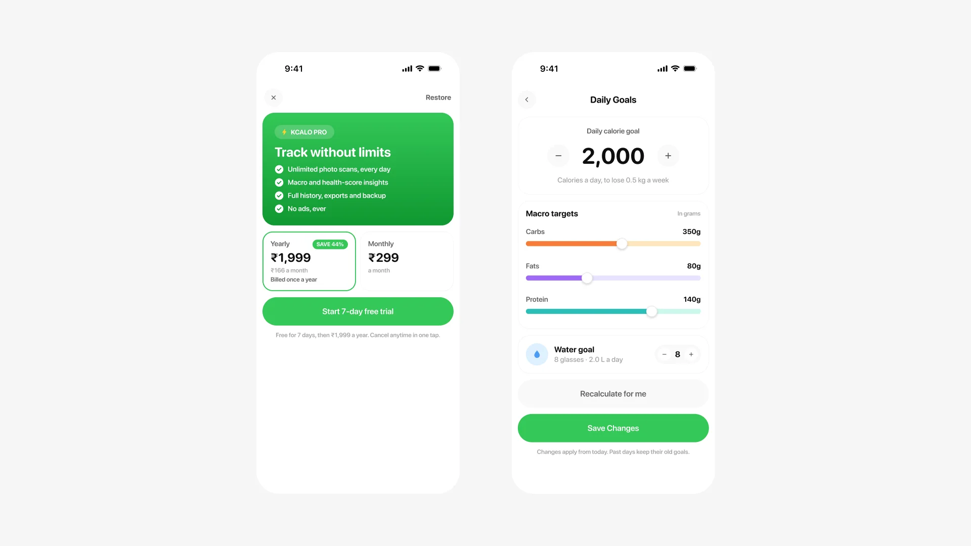
Built to be kept
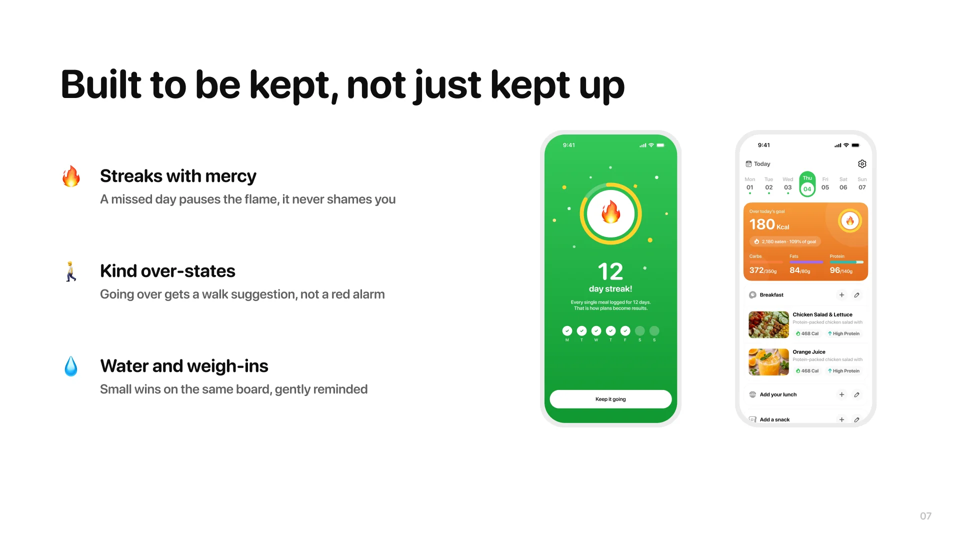
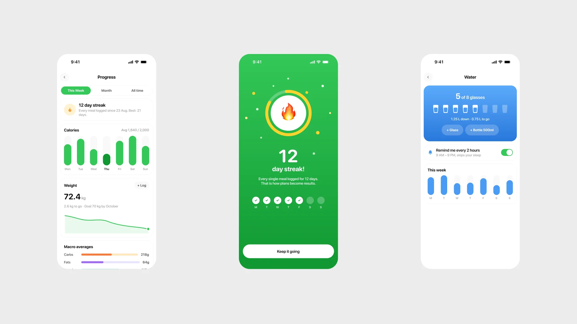
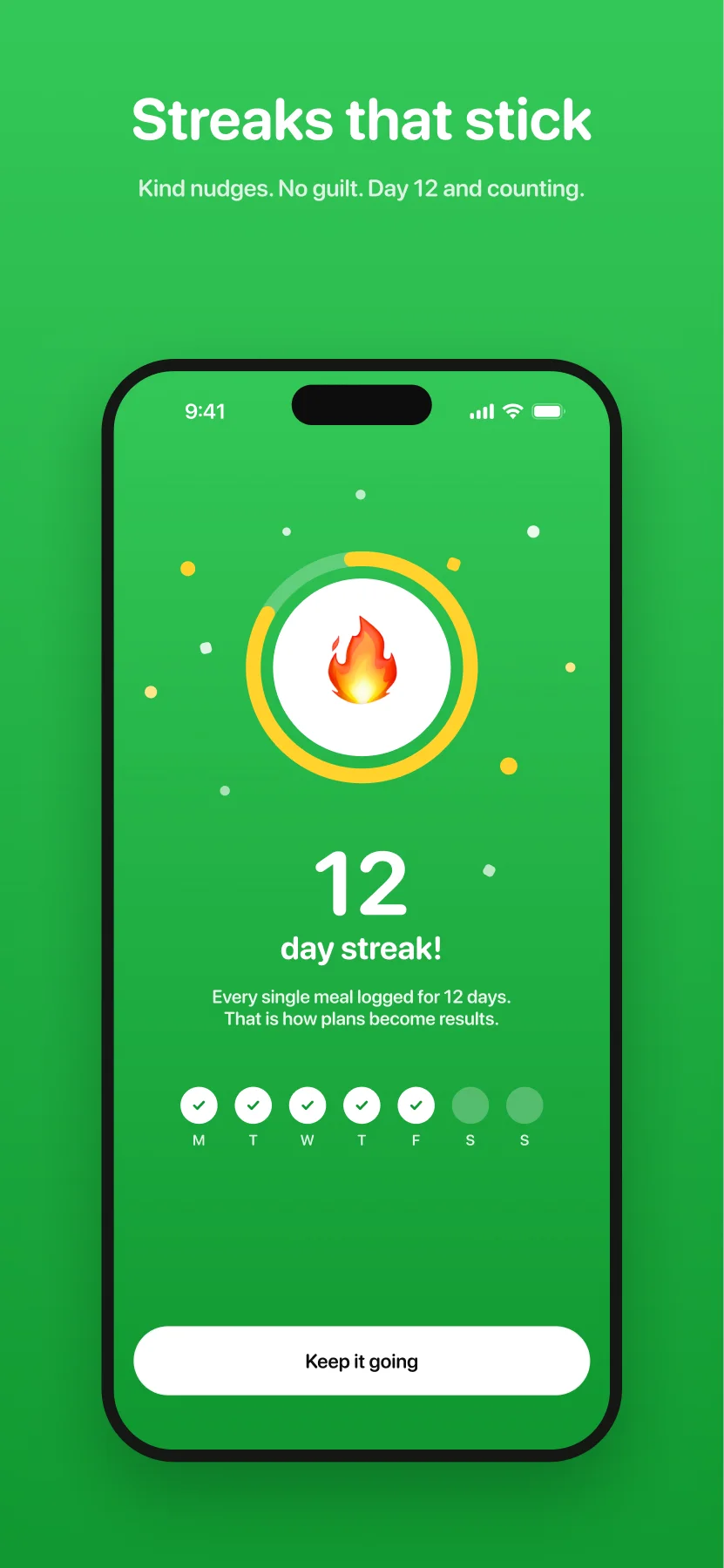
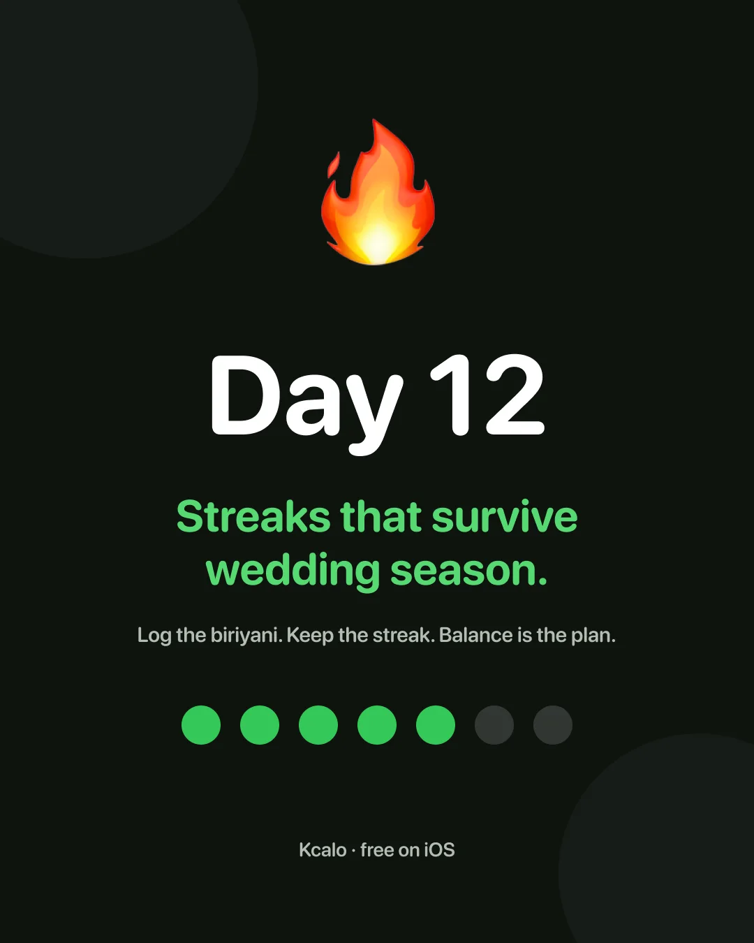
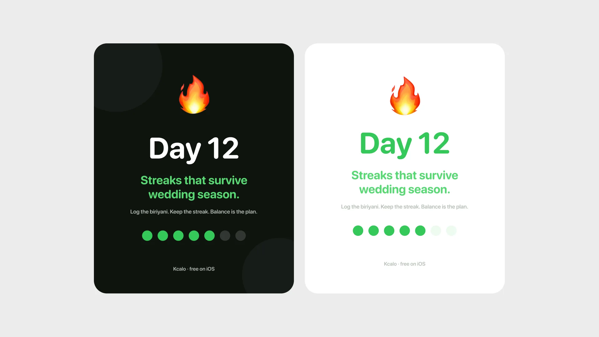
The habit layer works because it is merciful. Streaks pause instead of resetting, going over goal turns the card warm orange with a walk suggestion, and the reward for logging is the ring moving. Confetti is reserved for streak milestones, because this is dinner, not a casino.
The small movements
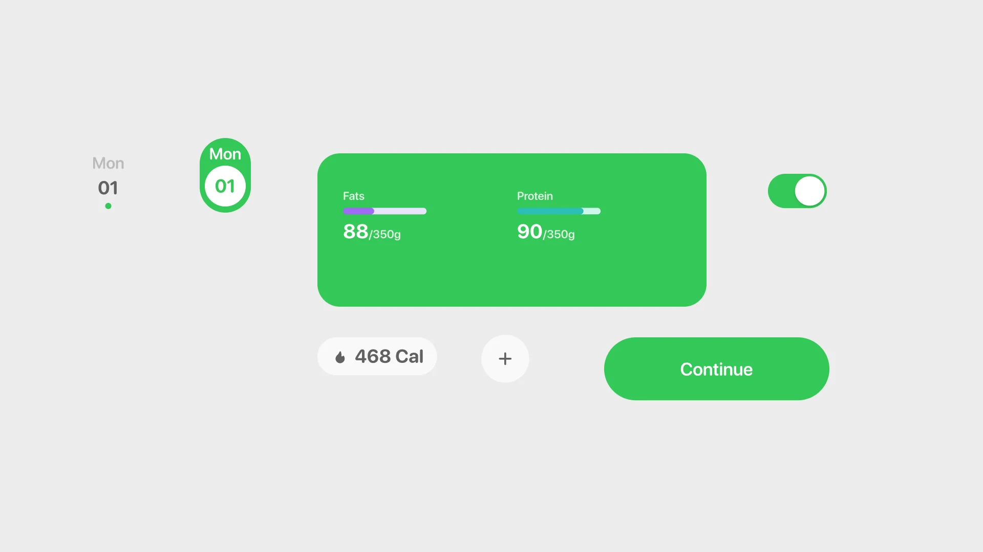
All six clips were built as real Figma motion, keyframe by keyframe, and exported straight from the file: the hero card load-in, the result sheet arriving, the day-12 streak, the analyzing state, a toggle that overshoots a little, and a button that gives under the thumb and ripples once. Small enough to miss, which is the point.
Six frames on the store
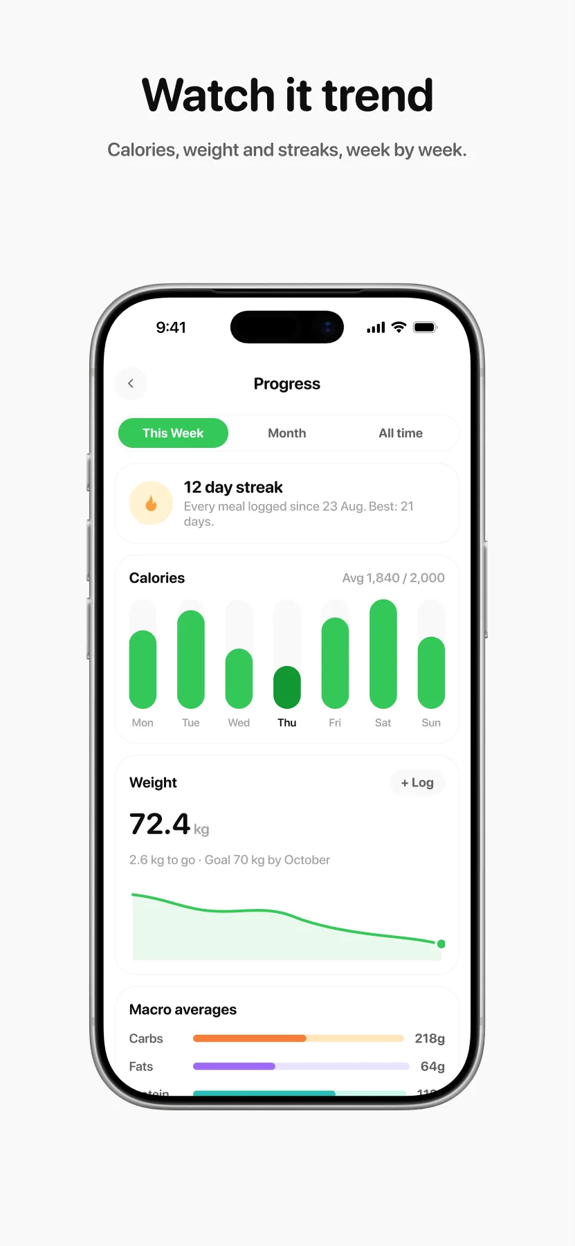
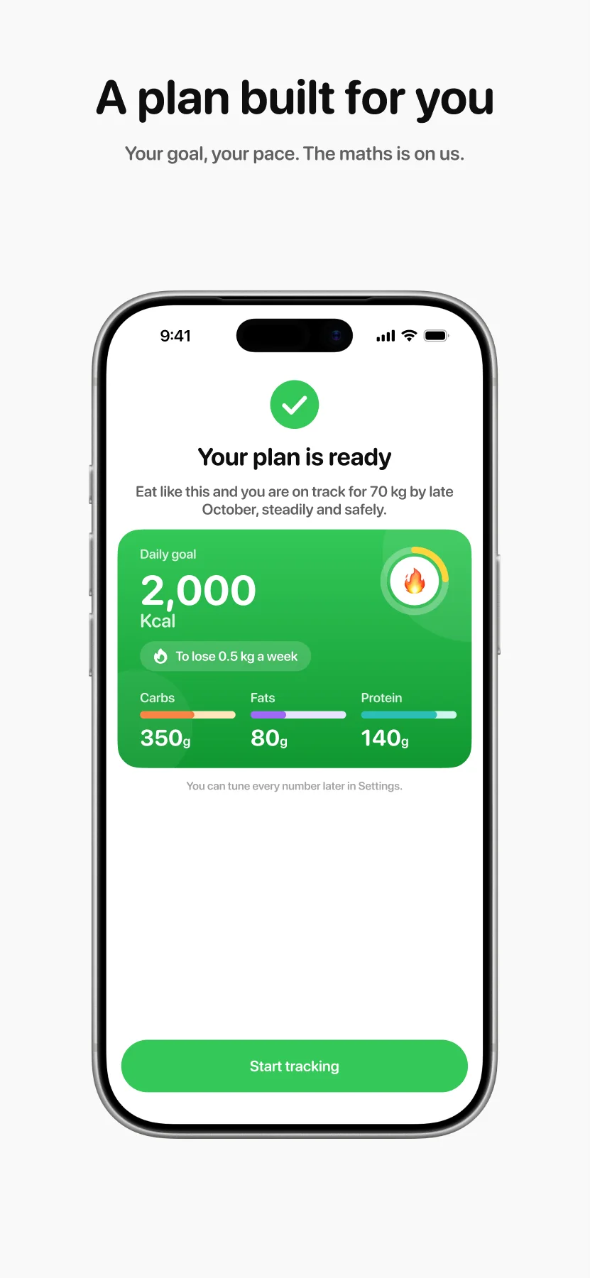
The store listing tells the loop in six frames. Scroll through them, tap any to zoom.
The system underneath
The brand, travelling
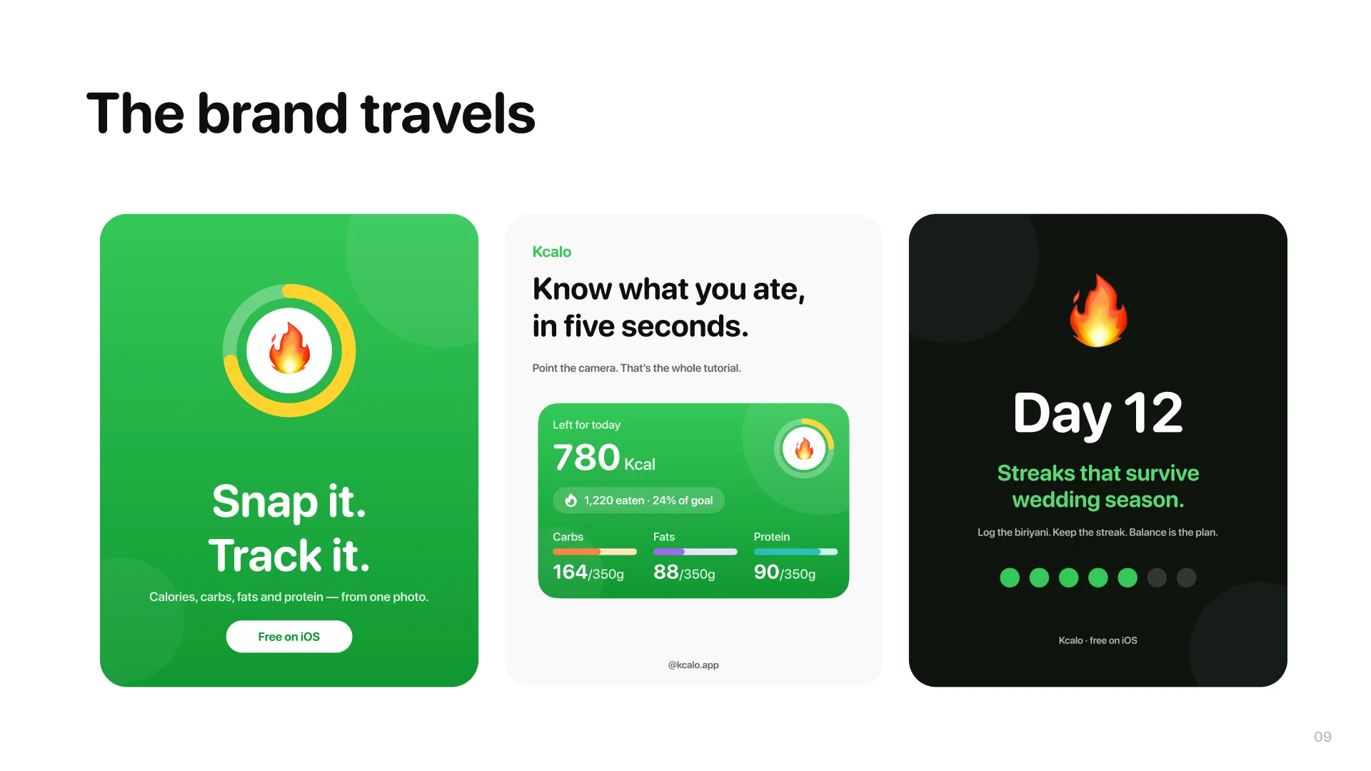
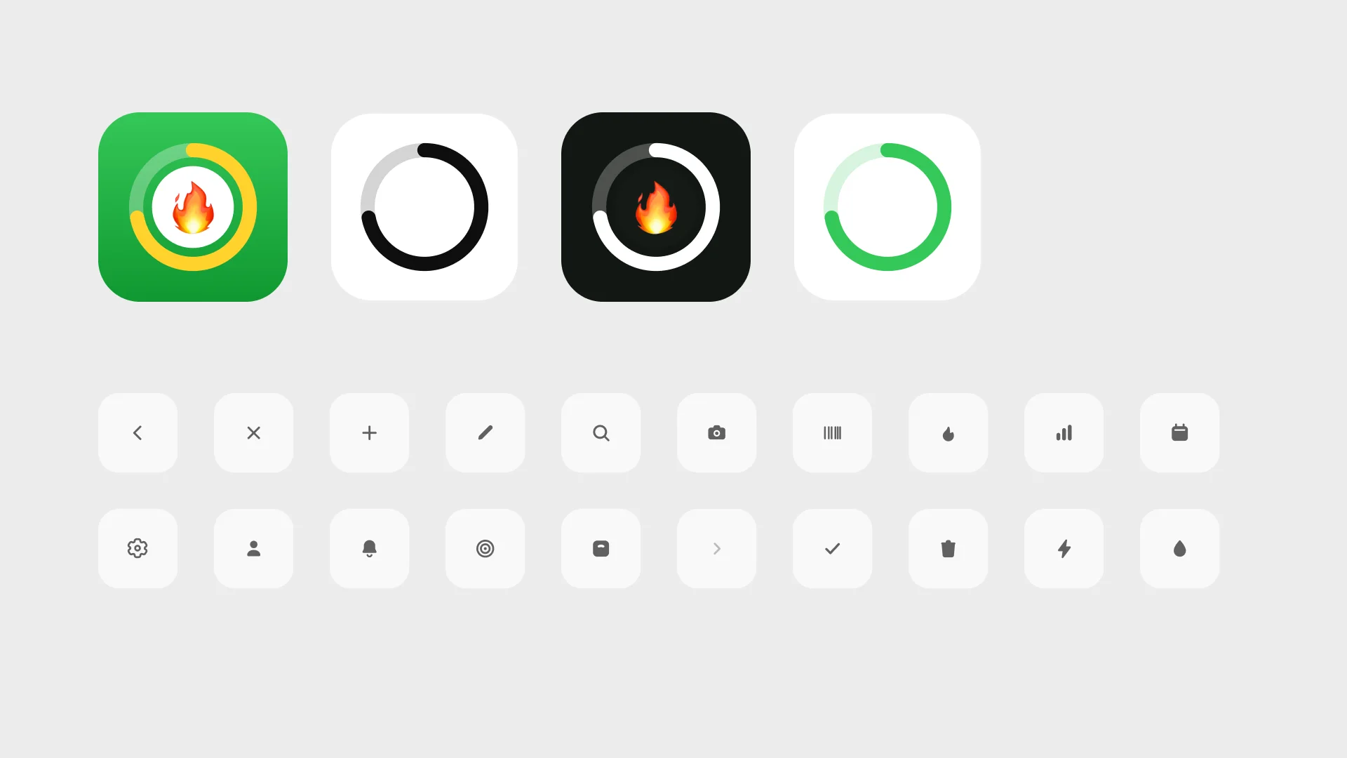
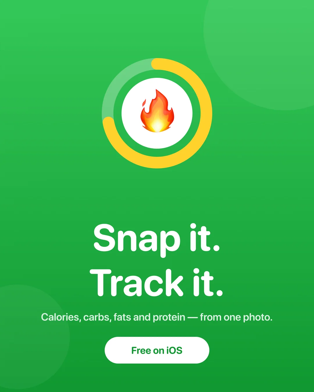
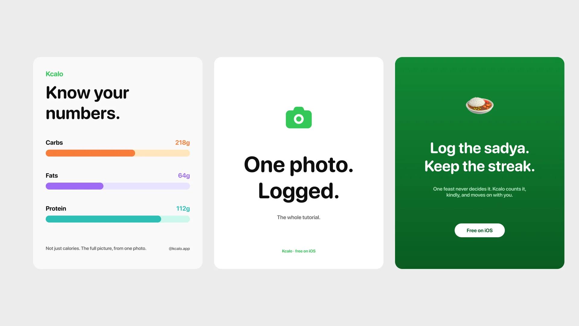
The mark is the product’s own progress ring with the flame inside; the brand work extracted it rather than inventing it. Four logo variants, the icon set, and six posters in three voices: launch, product, and the kind one about the sadya.
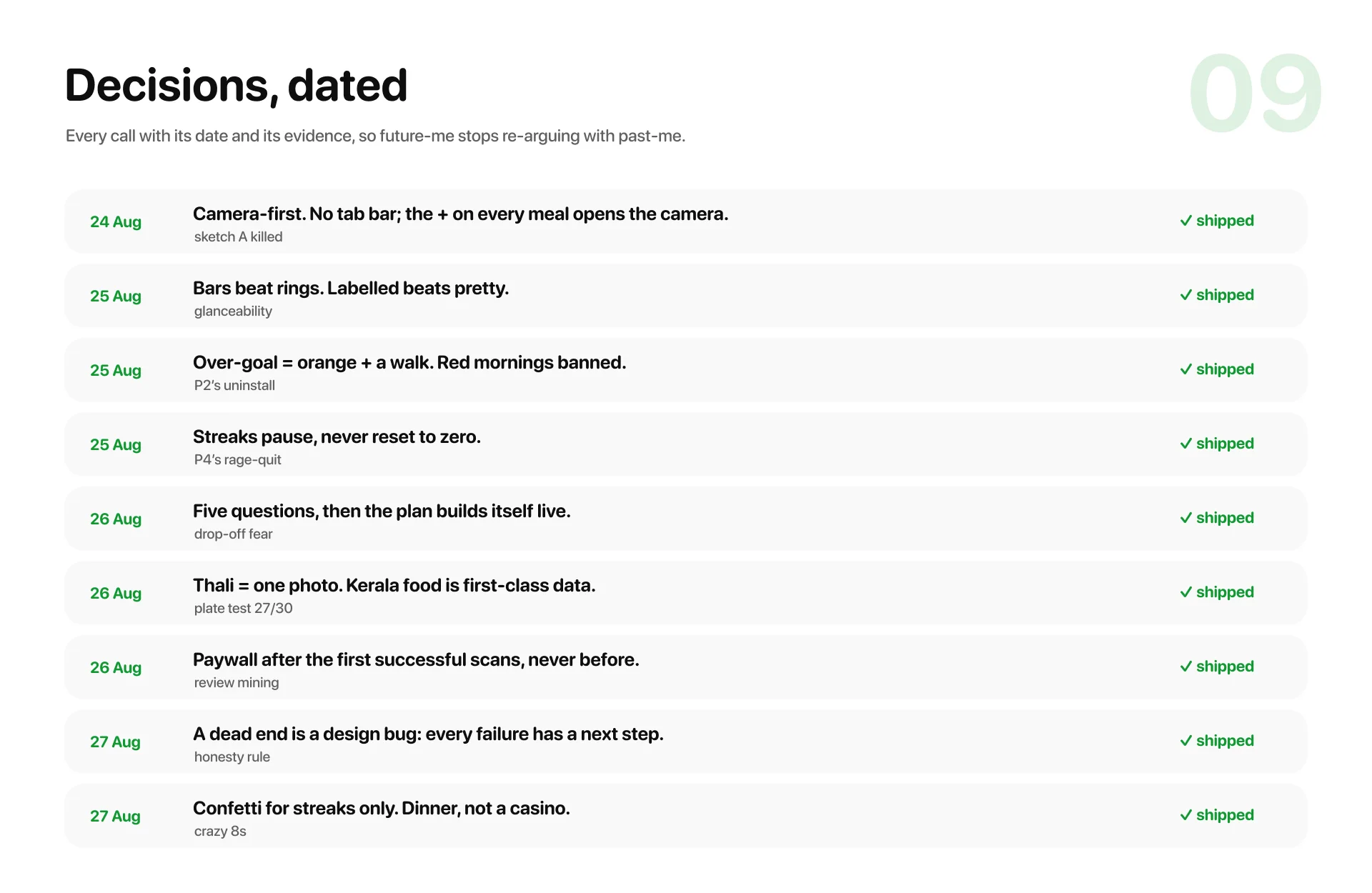
Decisions, dated
Every call that shaped the thing sits in a dated log with its evidence, from killing the tab bar to banning red mornings. The honest next step for any concept closes it: put the prototype in front of Meera, Ajmal and Rukiya’s one free hand, and run the Day-5 test for real.