KSRTC Booking A Platform Redesign
A redesign of the booking app for Kerala’s state bus network. The original gives every decision a page of its own; this one holds all five steps on a single surface.
A prototype build: a real iPhone app in SwiftUI, on mock data.
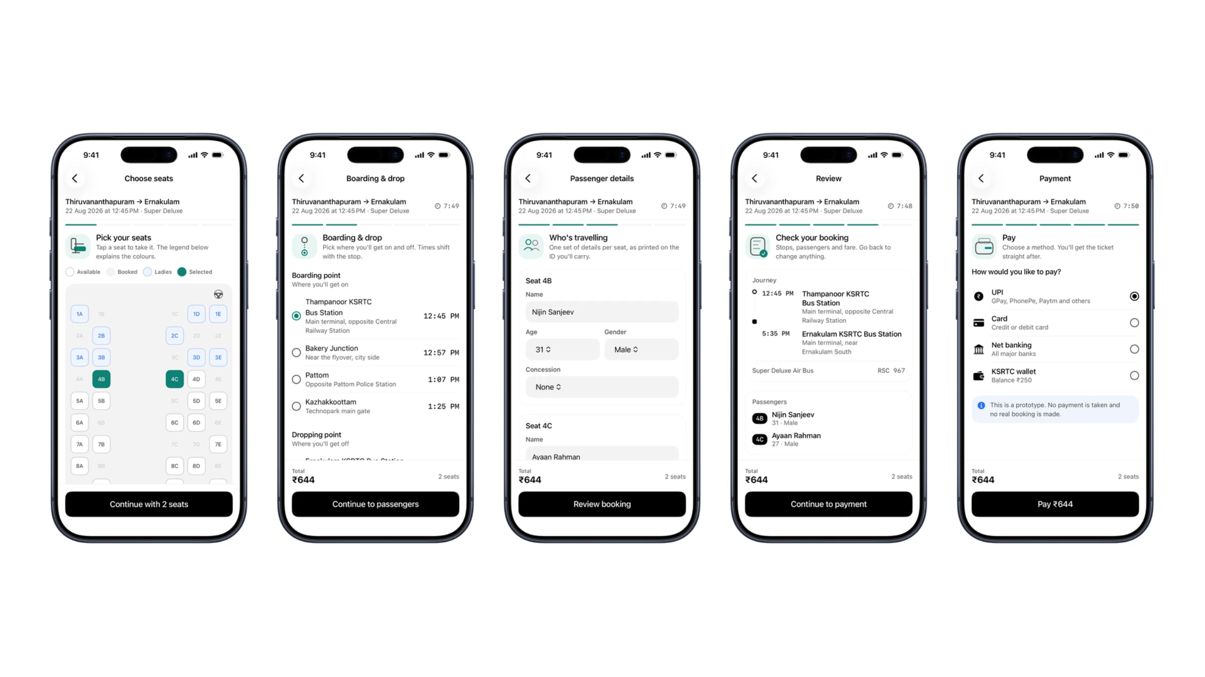
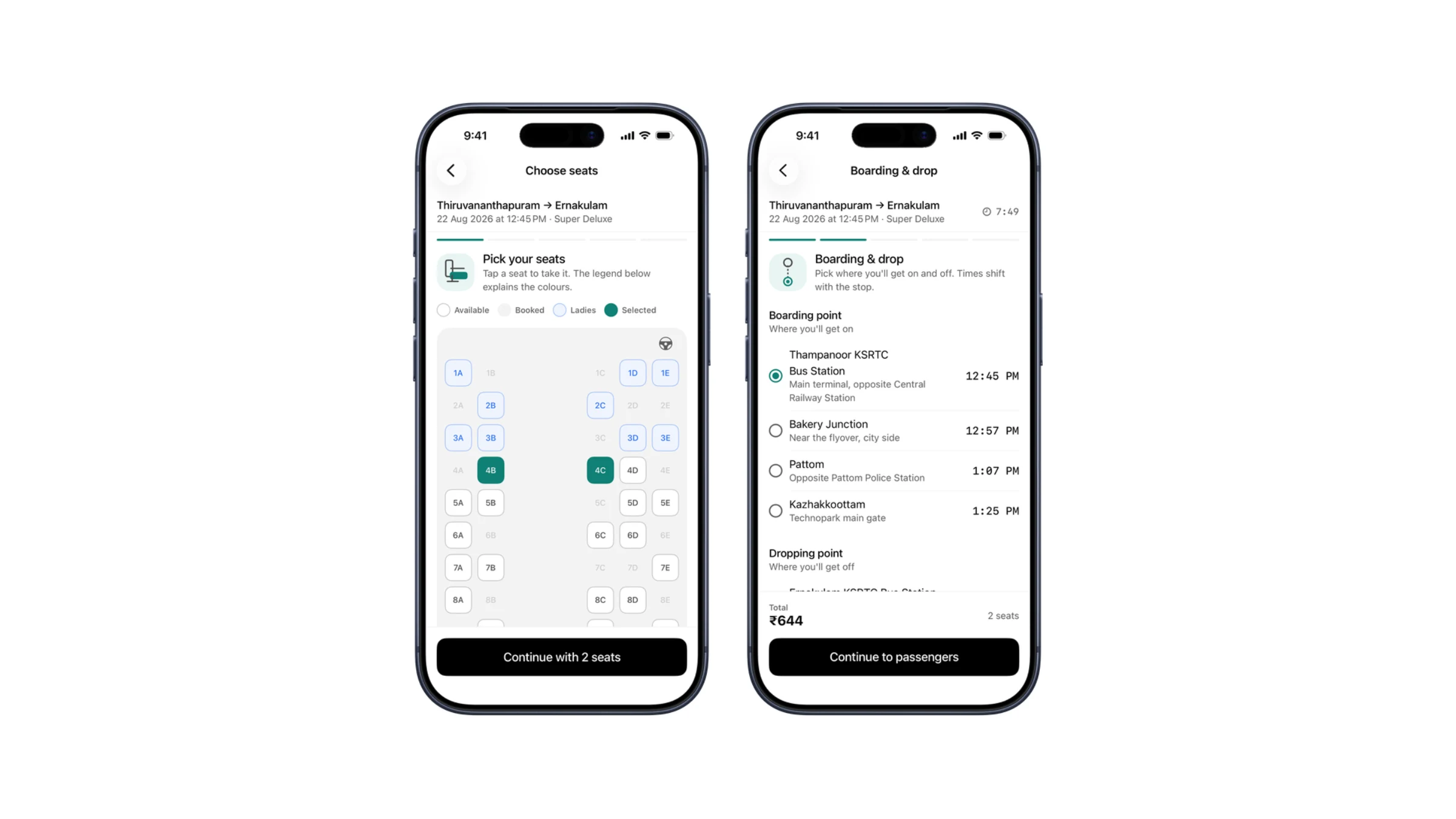
What matters here is what does not move: the trip summary, the progress rail, the total and the dock stay put the whole way down.
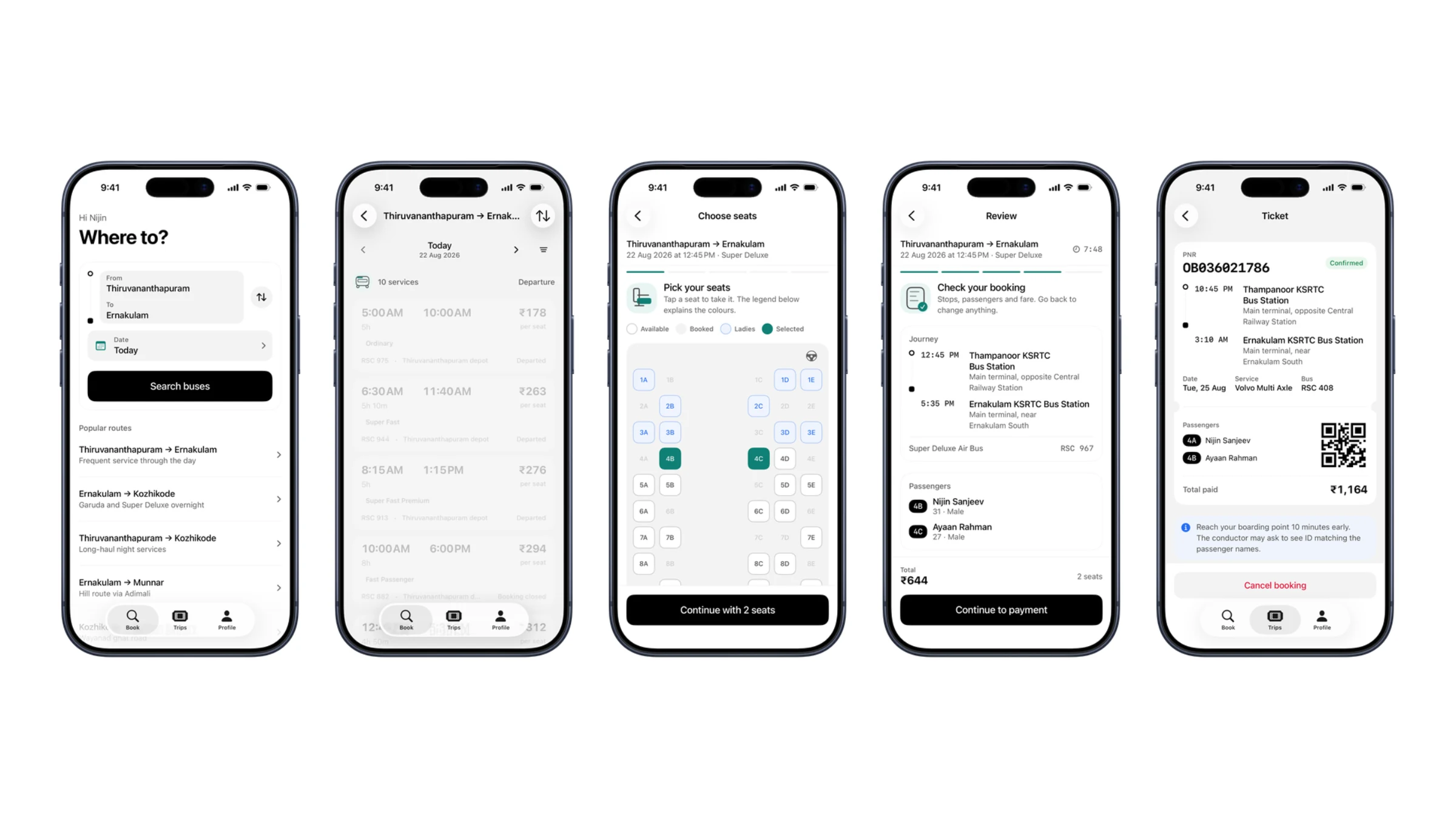
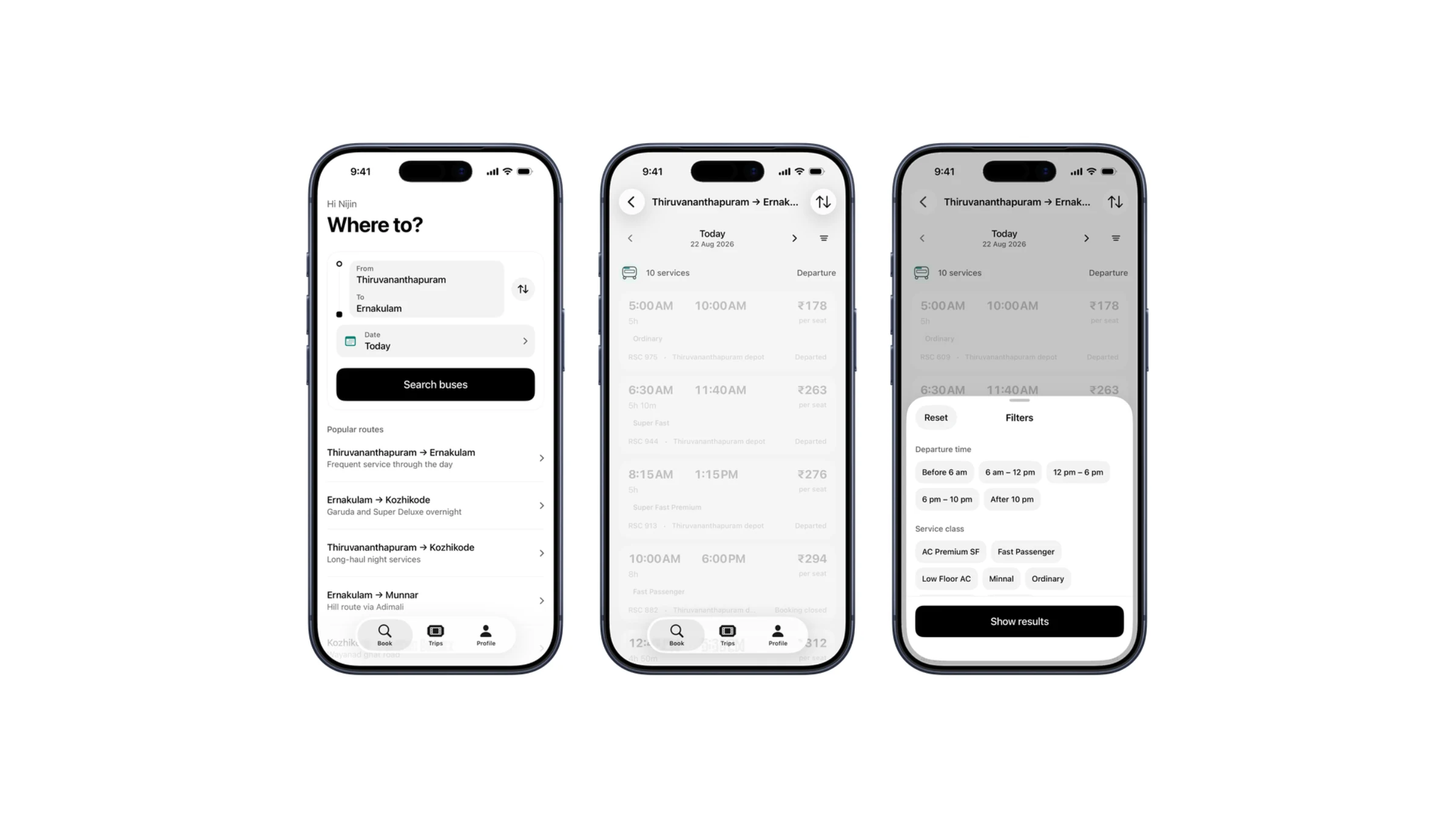
Recent searches and the routes people actually take make the common case one tap.
Boarding points are landmarks with real time offsets, because that is how you find a bus.
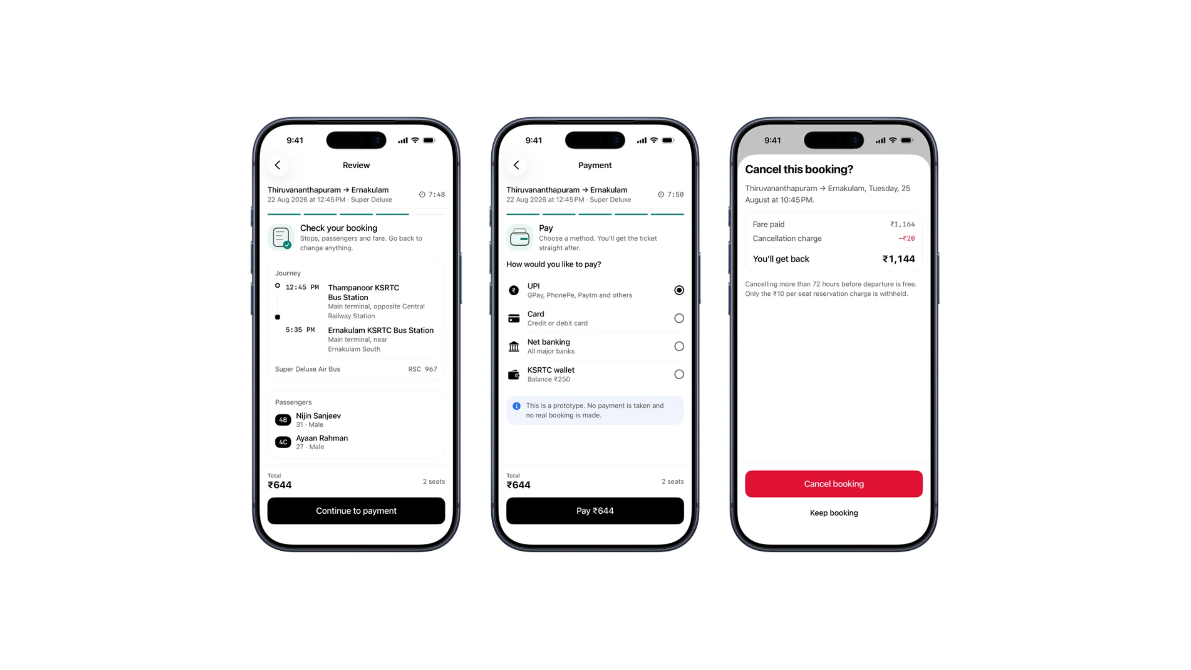
The fare is itemised, and what a cancellation gives back is shown before you cancel.
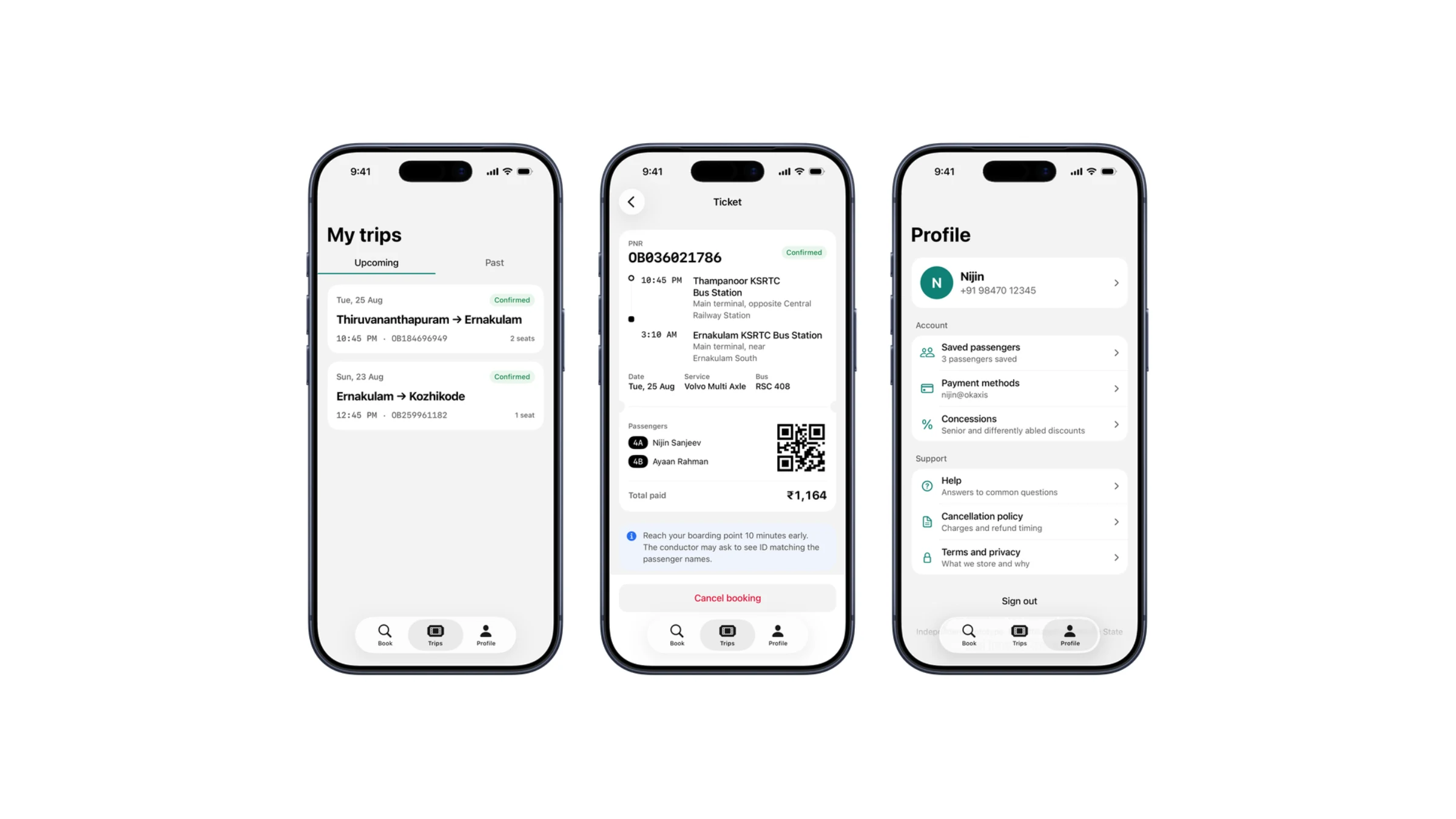
Row subtitles are real counts, so a row tells you whether there is anything behind it before you tap.
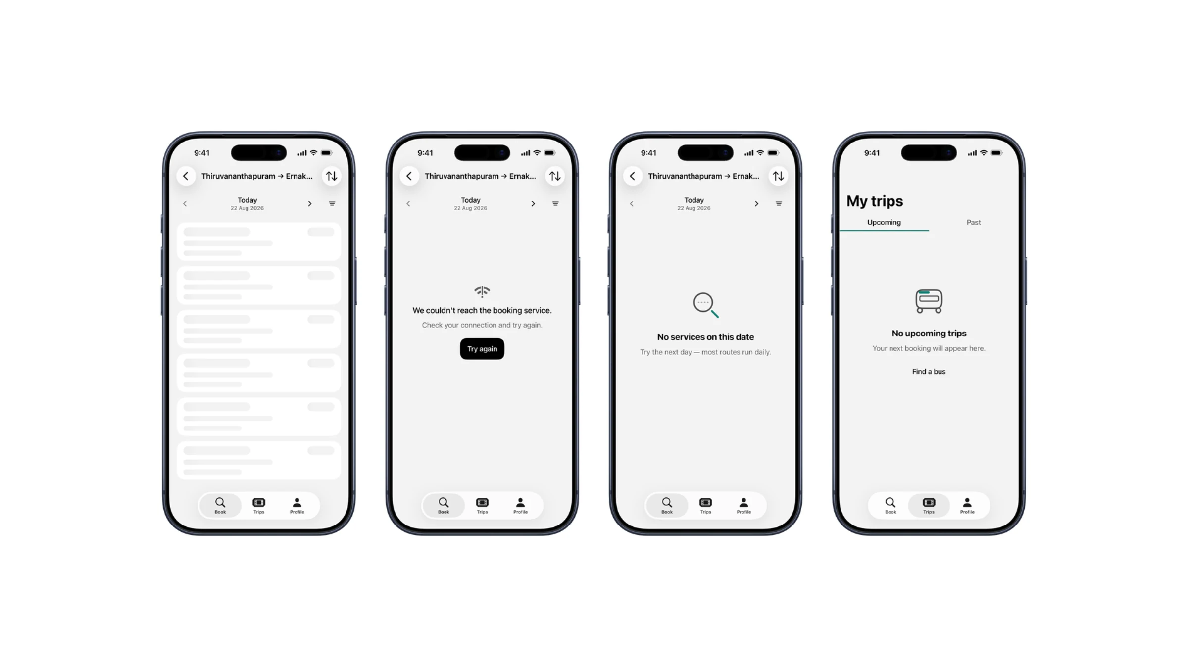
Loading, empty and error are drawn as screens too. Results needs two different empty states, because no service on a route and filters that excluded everything are different problems.
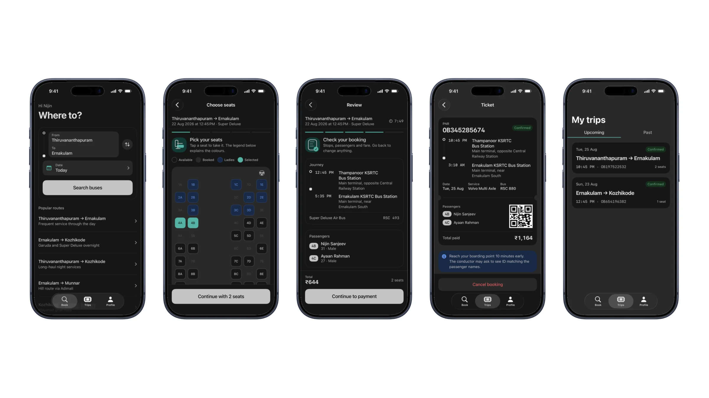
The same tokens on a separate ramp. The seat states have to keep their meaning in both, which is the real test.