Crate A Transfer You Can Brand
A service for sending files too big to email. The part it takes seriously is the page the person on the other end opens: you build that while you upload, and it stays on screen the whole time.
A concept, and not a built one: these are the screens as drawn.
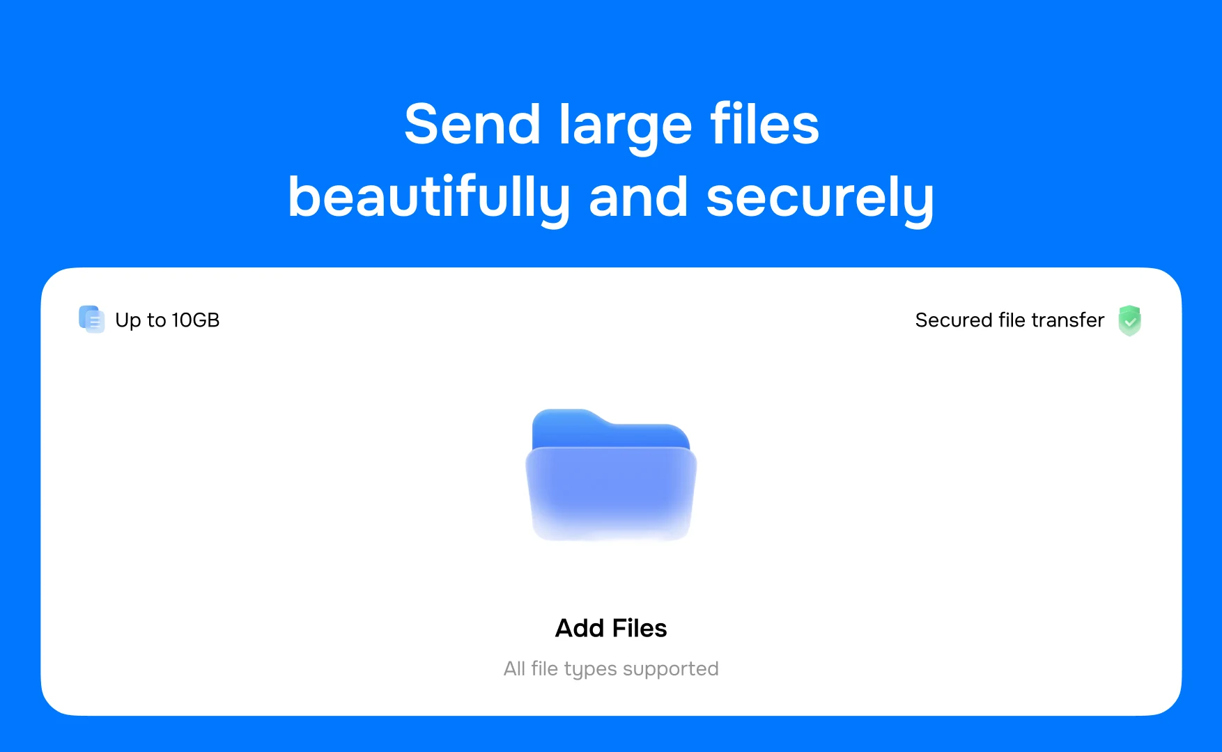
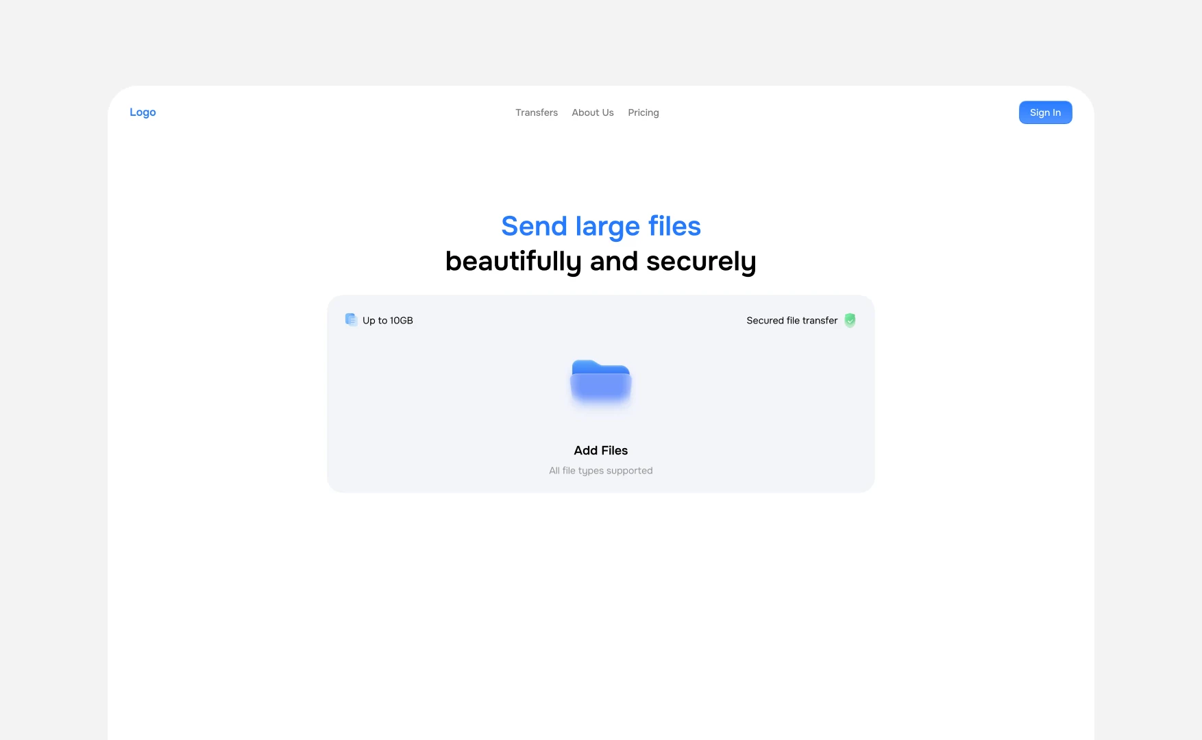
It opens on the one thing you came to do, with the two facts that decide whether you stay: how much it will take, and whether it is safe.
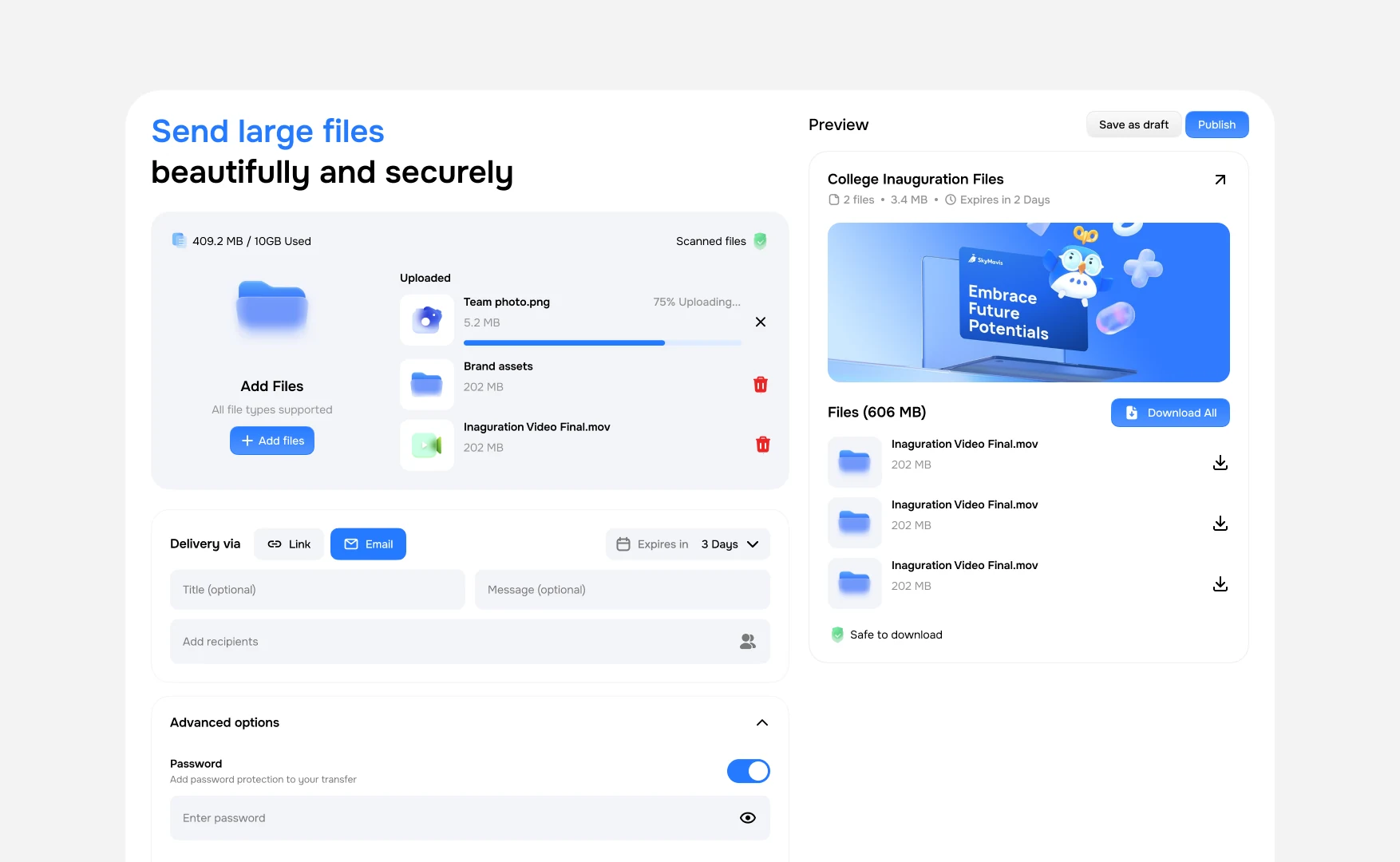
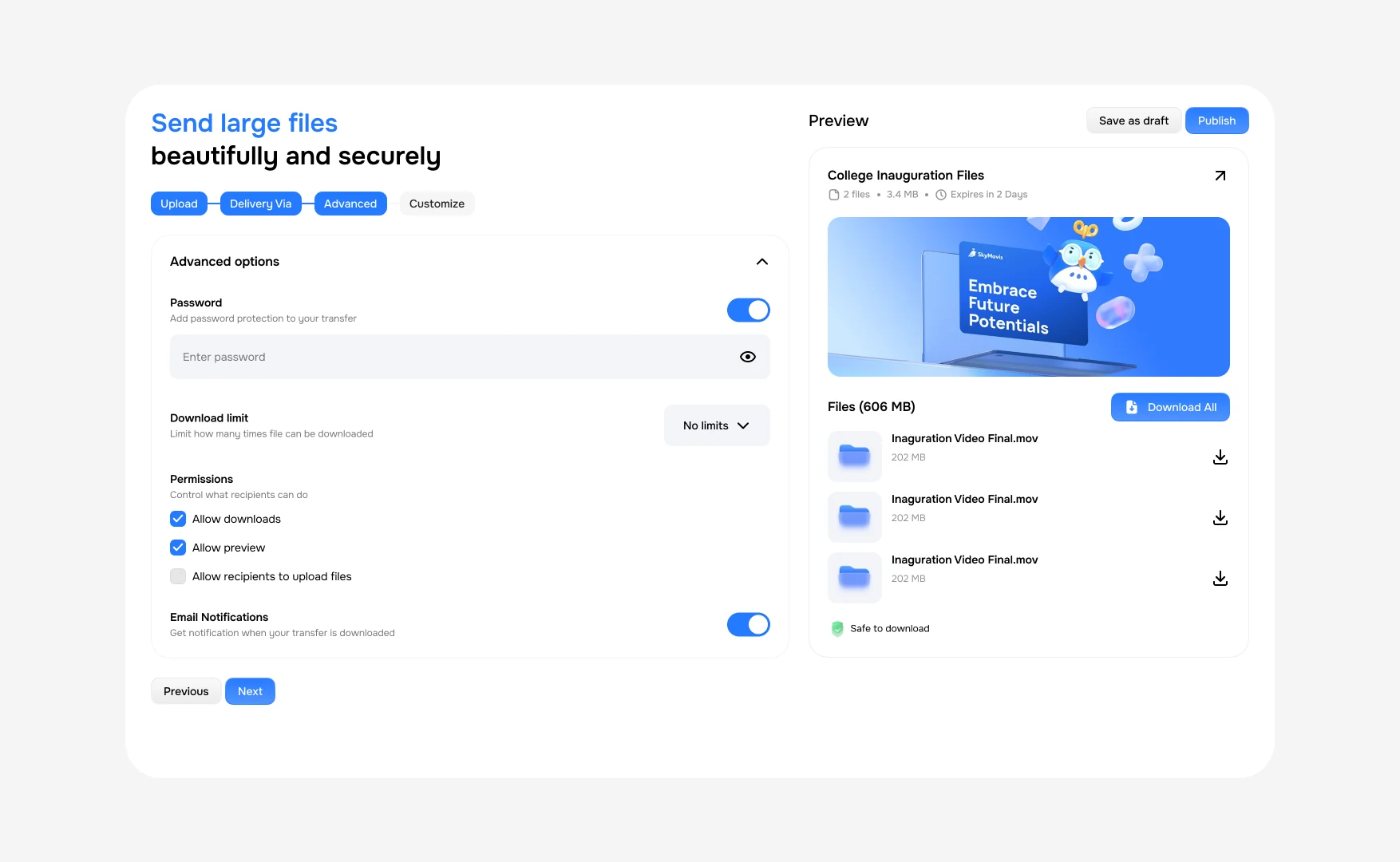
Then sending is one screen split in two. Files, delivery and options down the left; on the right, the page your recipient will open, filling in as you go.
Building it
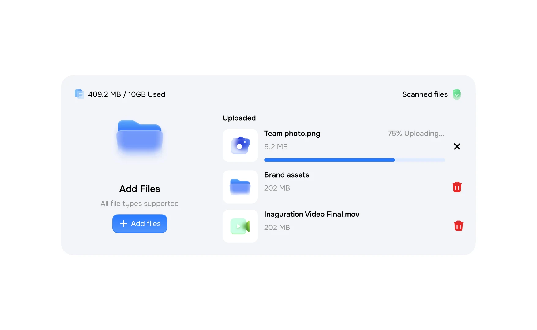
The upload is honest about two things at once: how far along each file is, and that they have been checked.
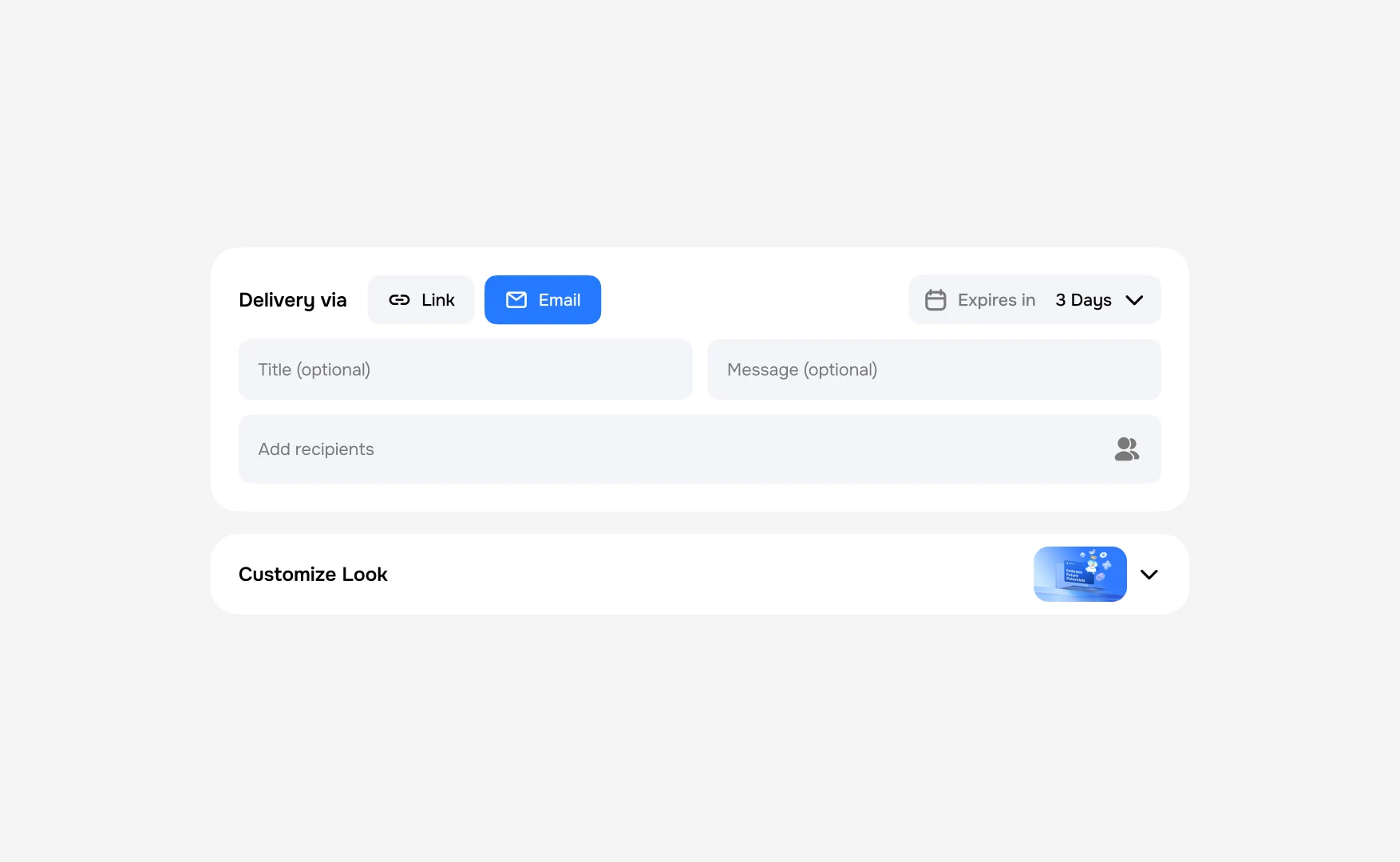
A link or an email, something to say, and how long the whole thing lives.
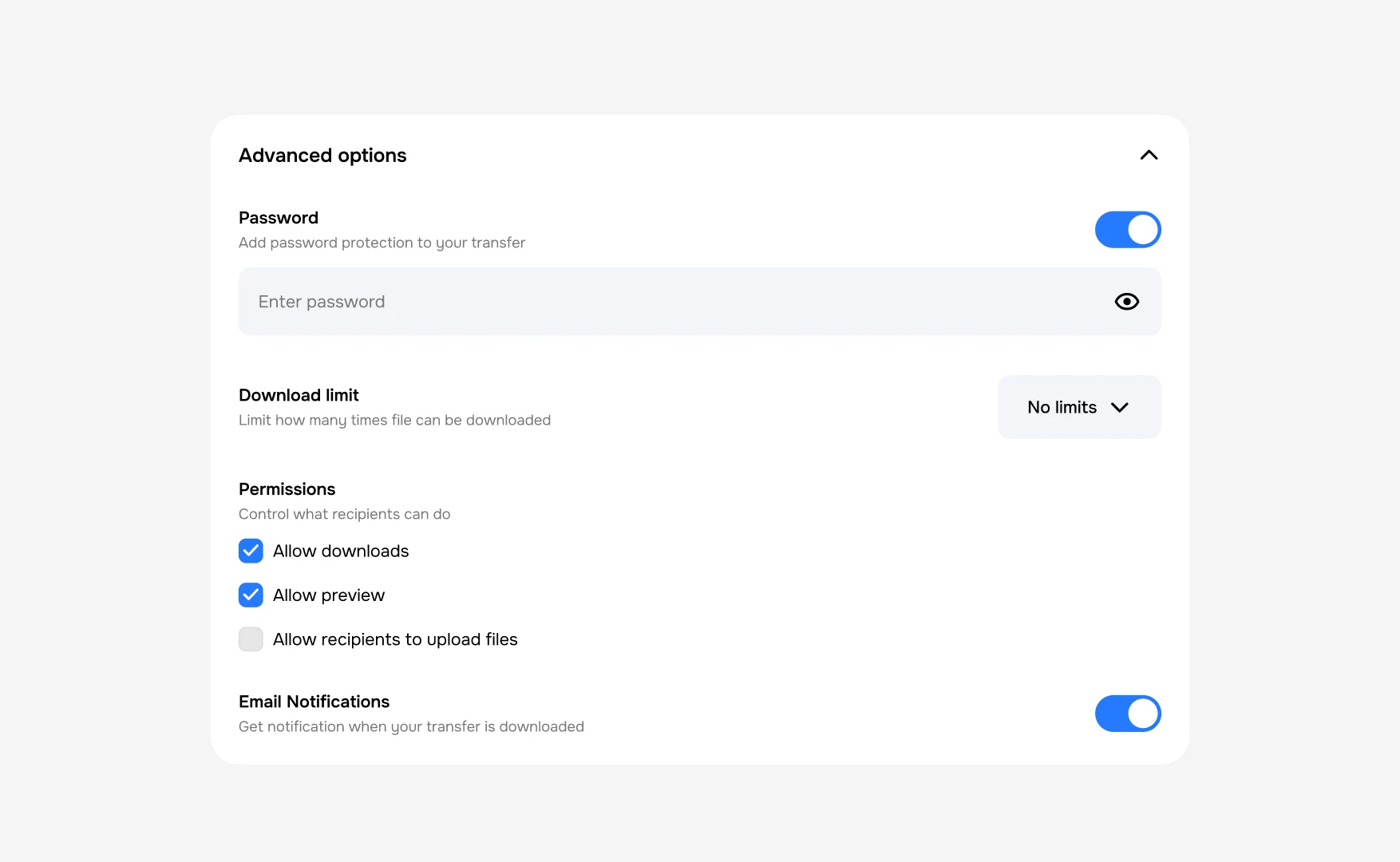
Then the things a sender actually worries about: who can open it, how many times, and whether they can put something back.
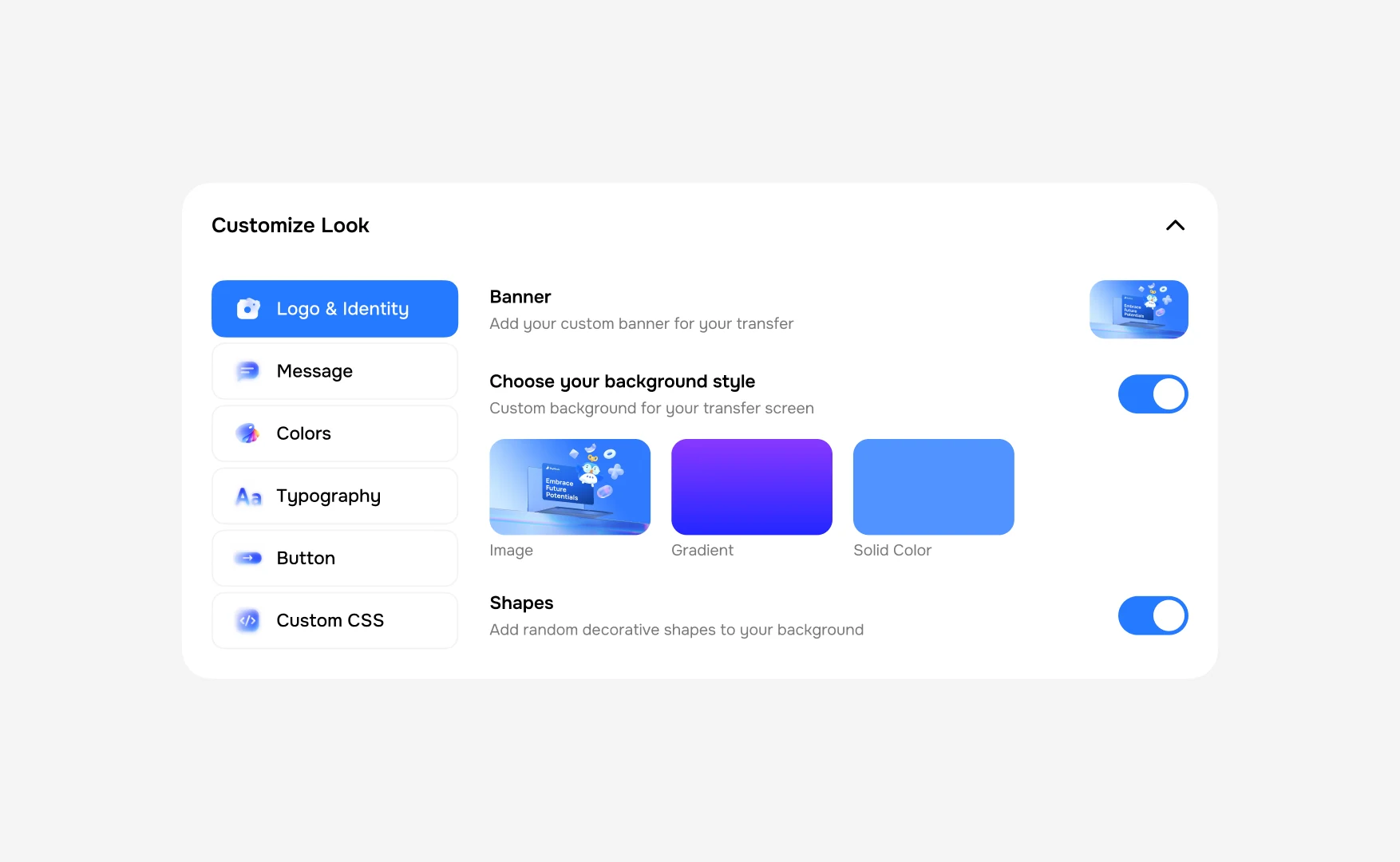
And the part the product is really selling: a logo, a banner, colours, type, a button, down to custom CSS for anyone who wants it.
The four of them are steps, so the screen never asks for everything at once.
What the other person opens
The sender’s banner, what is inside, how long it has left, and one button that takes all of it.
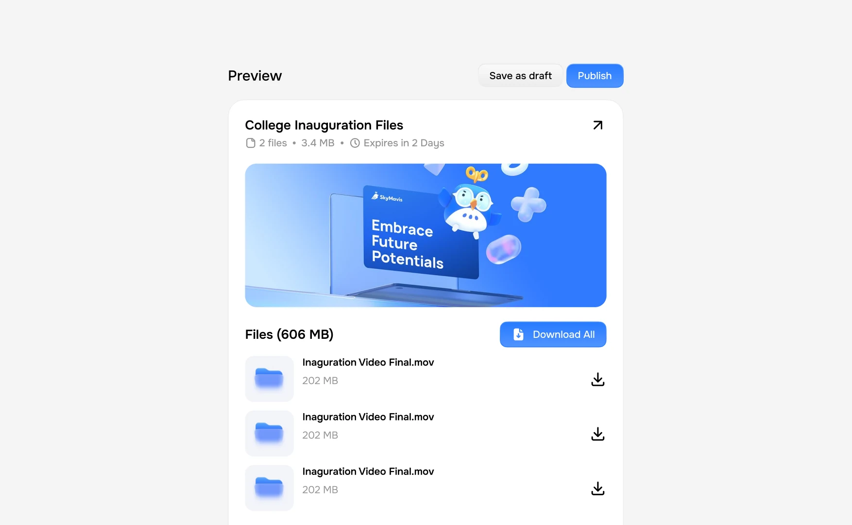
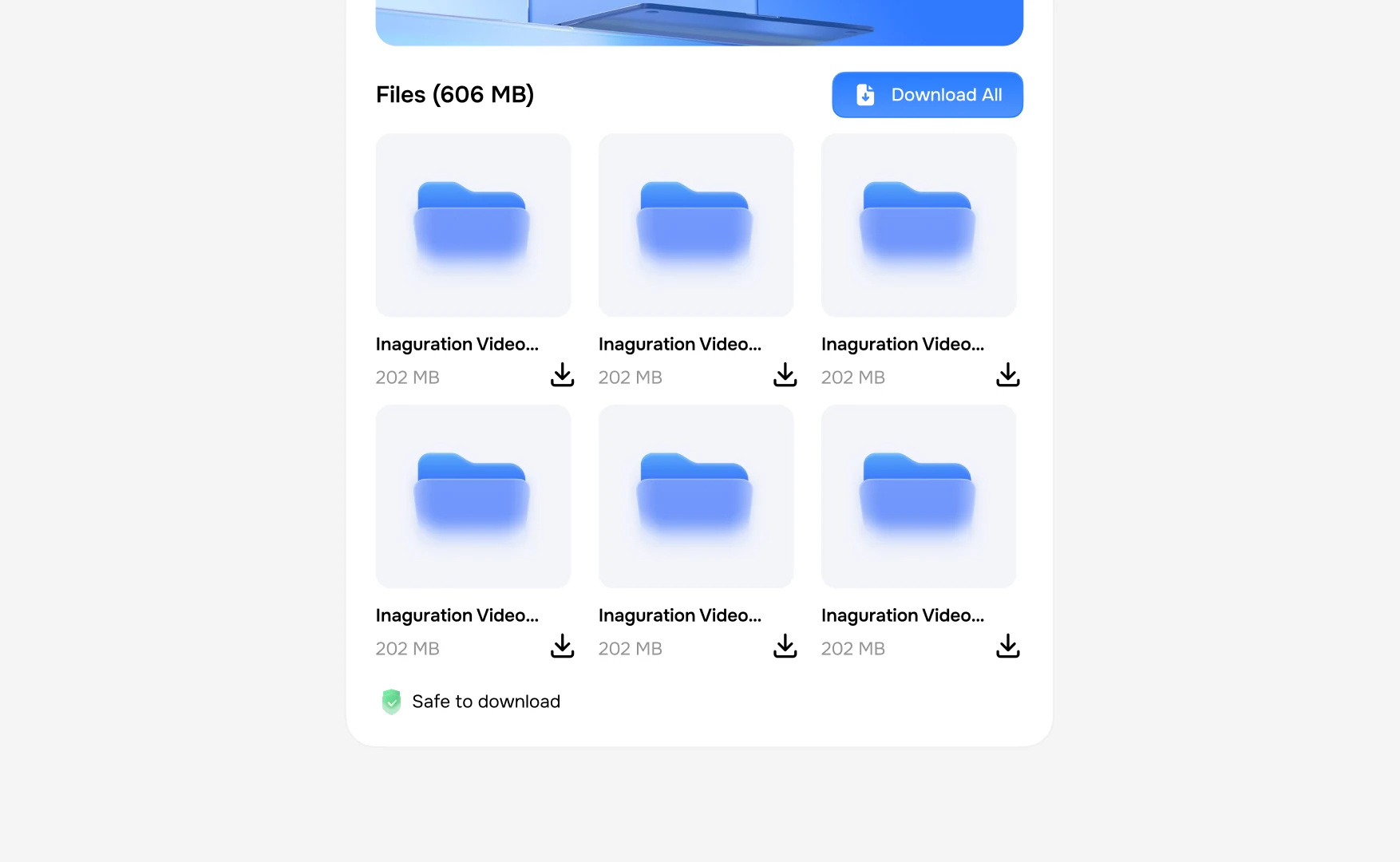
A grid once there are more files than a list wants to hold.
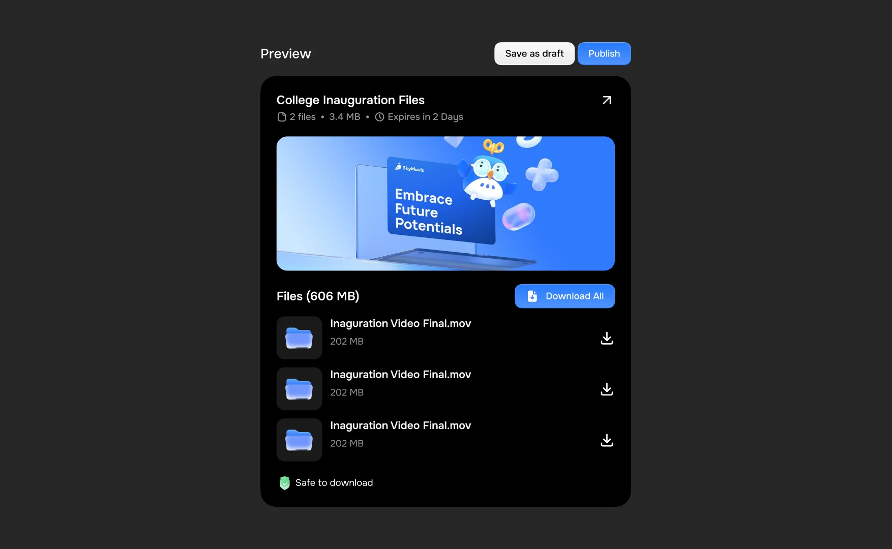
Dark, because it is a page that gets opened at every hour.
And with a colour behind it: the screen the sender started on, wearing what they chose.