ShipFlow Shipment Operations Dashboard
A dashboard for a team moving parcels across several carriers at once. The job is not managing shipments. It is finding the few going wrong before somebody phones about them.
A prototype build, and this one is online: plain HTML, CSS and JavaScript, no framework and no build step.
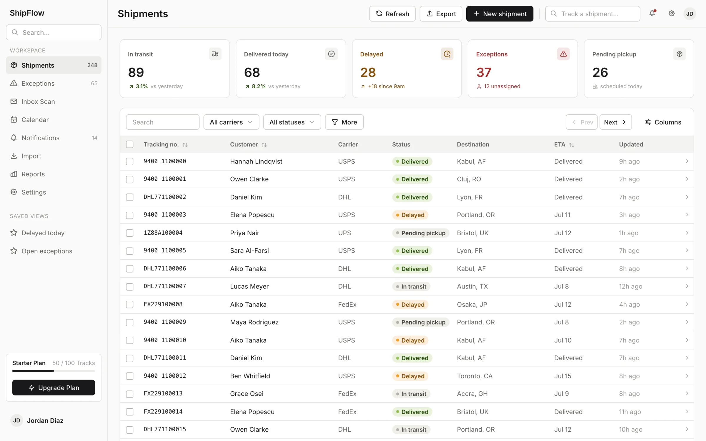
Severity first, then who owns it. An exception nobody owns is the one that turns into a phone call.
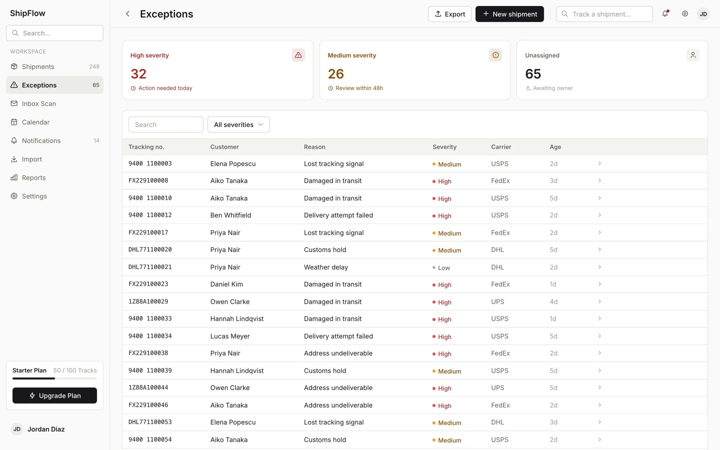
One shipment, one timeline. Everything above it is ShipFlow’s vocabulary rather than the carrier’s.
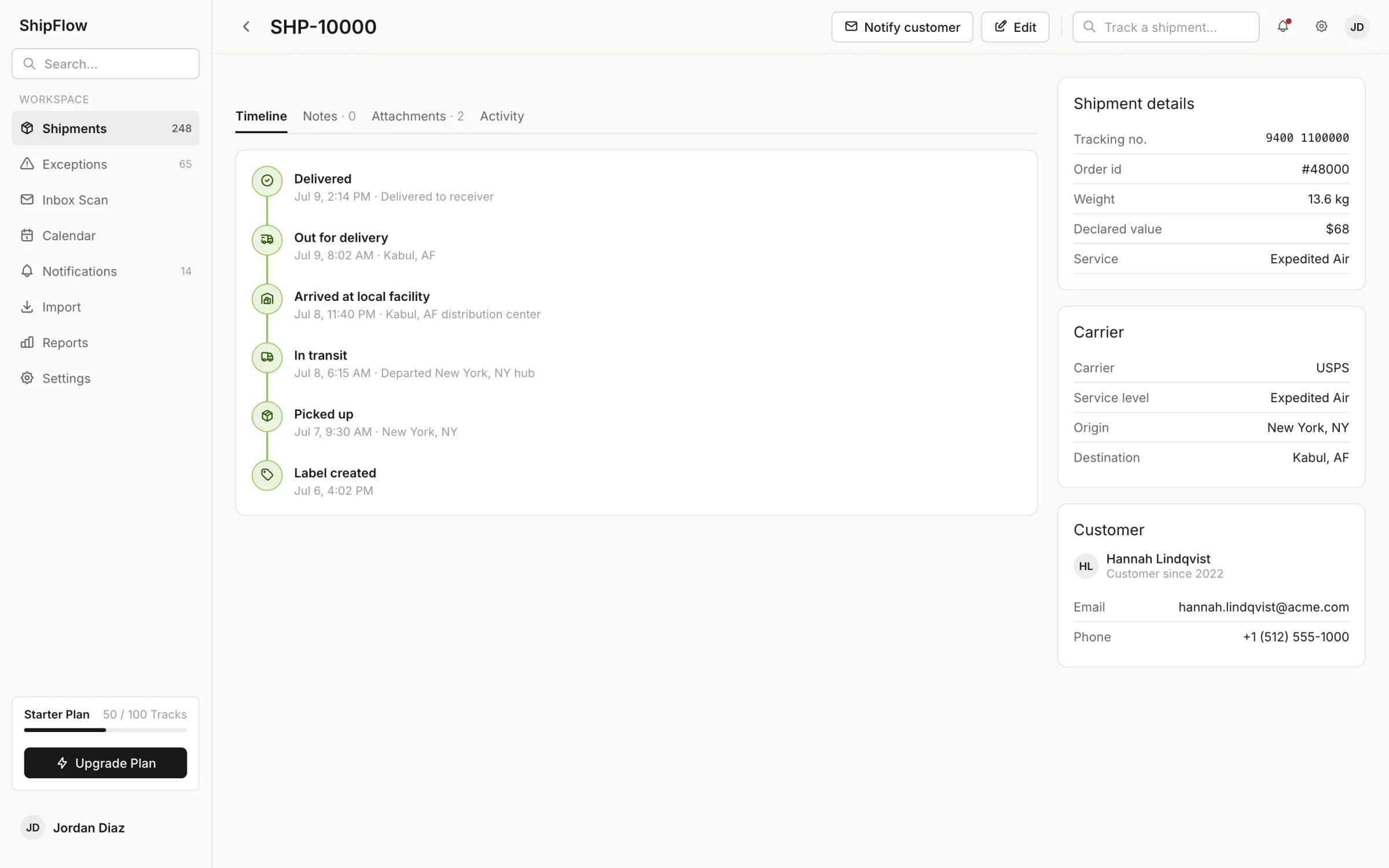
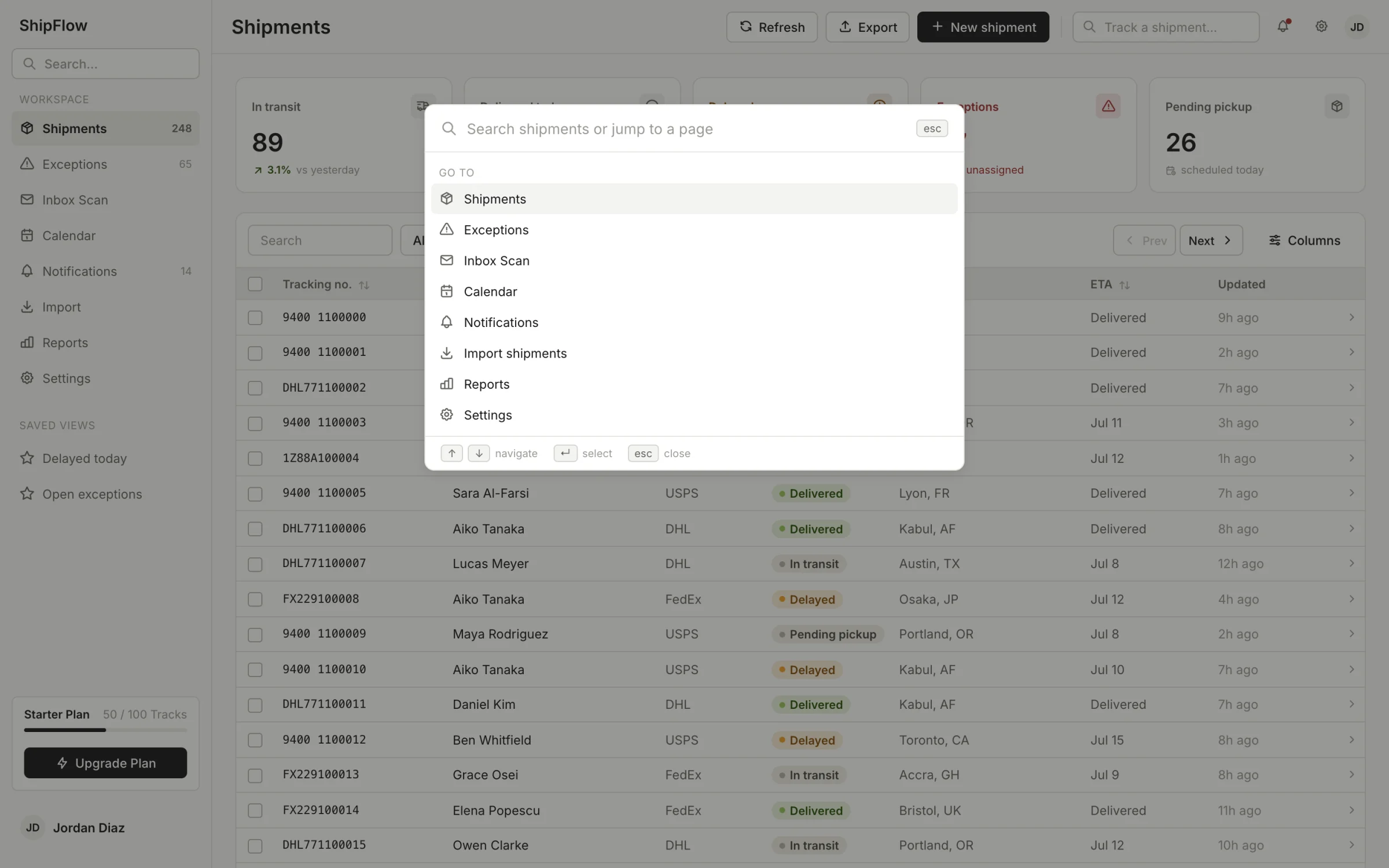
Pages and shipments sit in one list, because an operator does not think of them as different things.
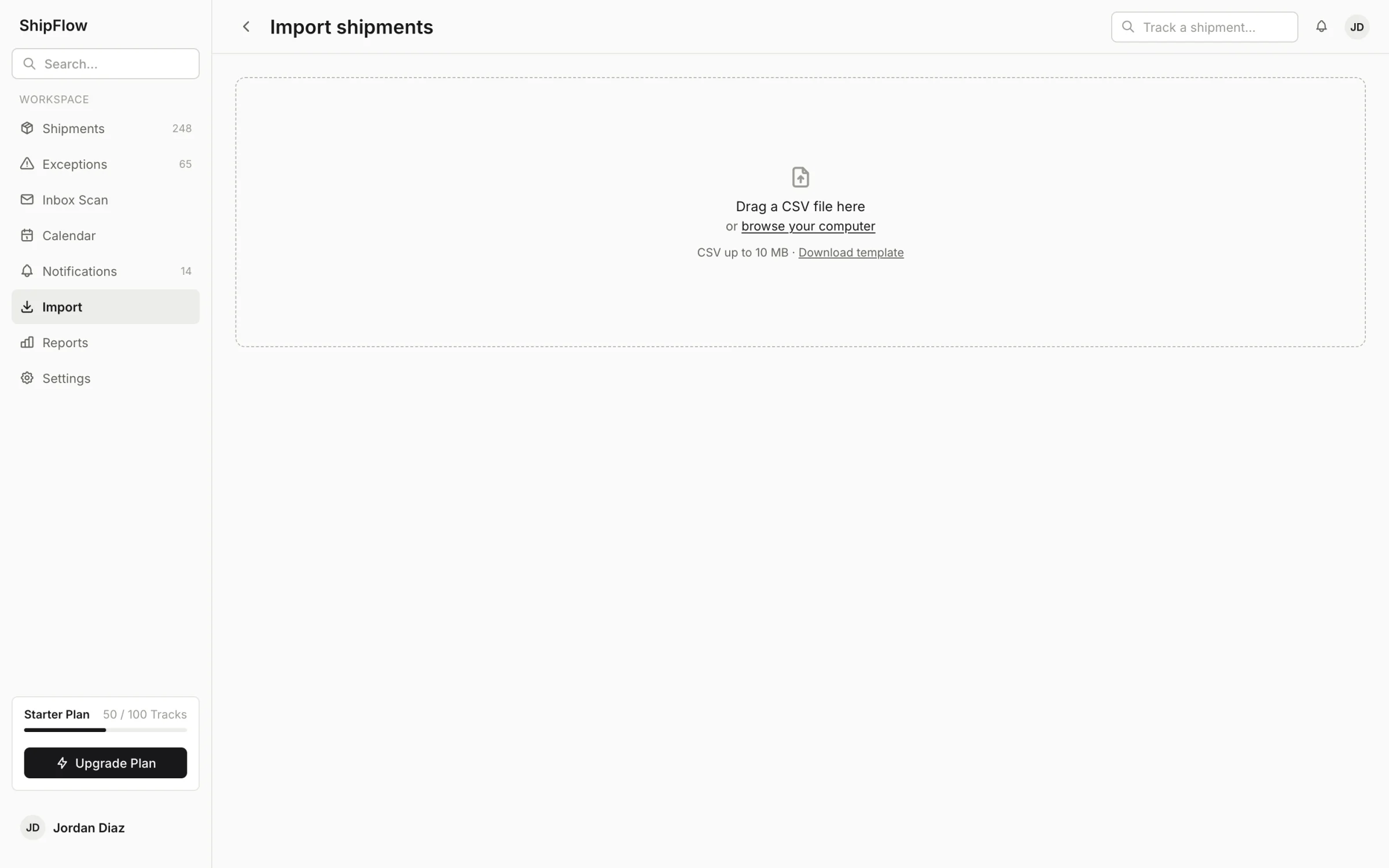
An import that half-works is the normal case, so the failures are rows with reasons rather than a count.
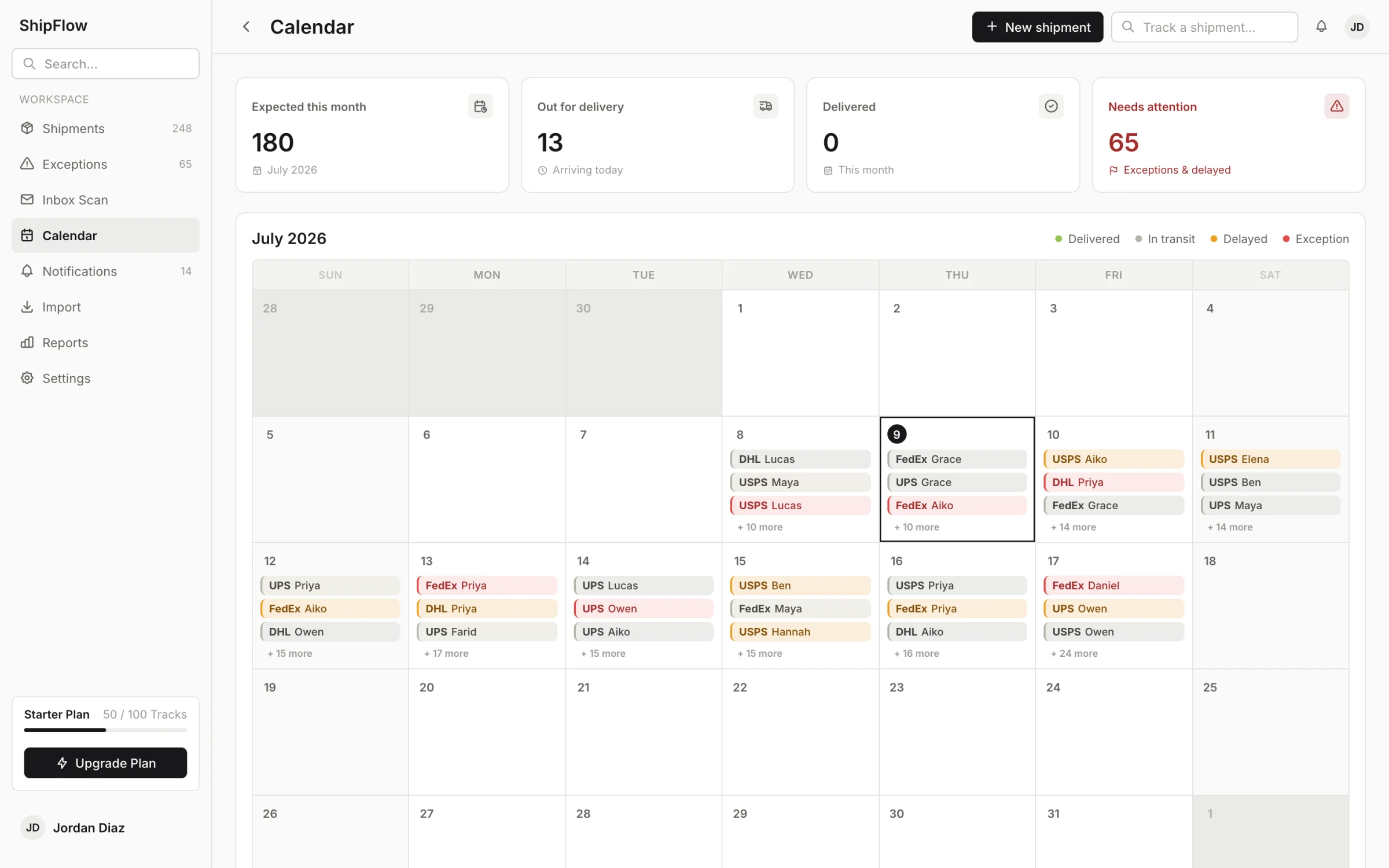
The calendar answers a different question from the table: not what is wrong now, but what is landing and whether the week can absorb it.
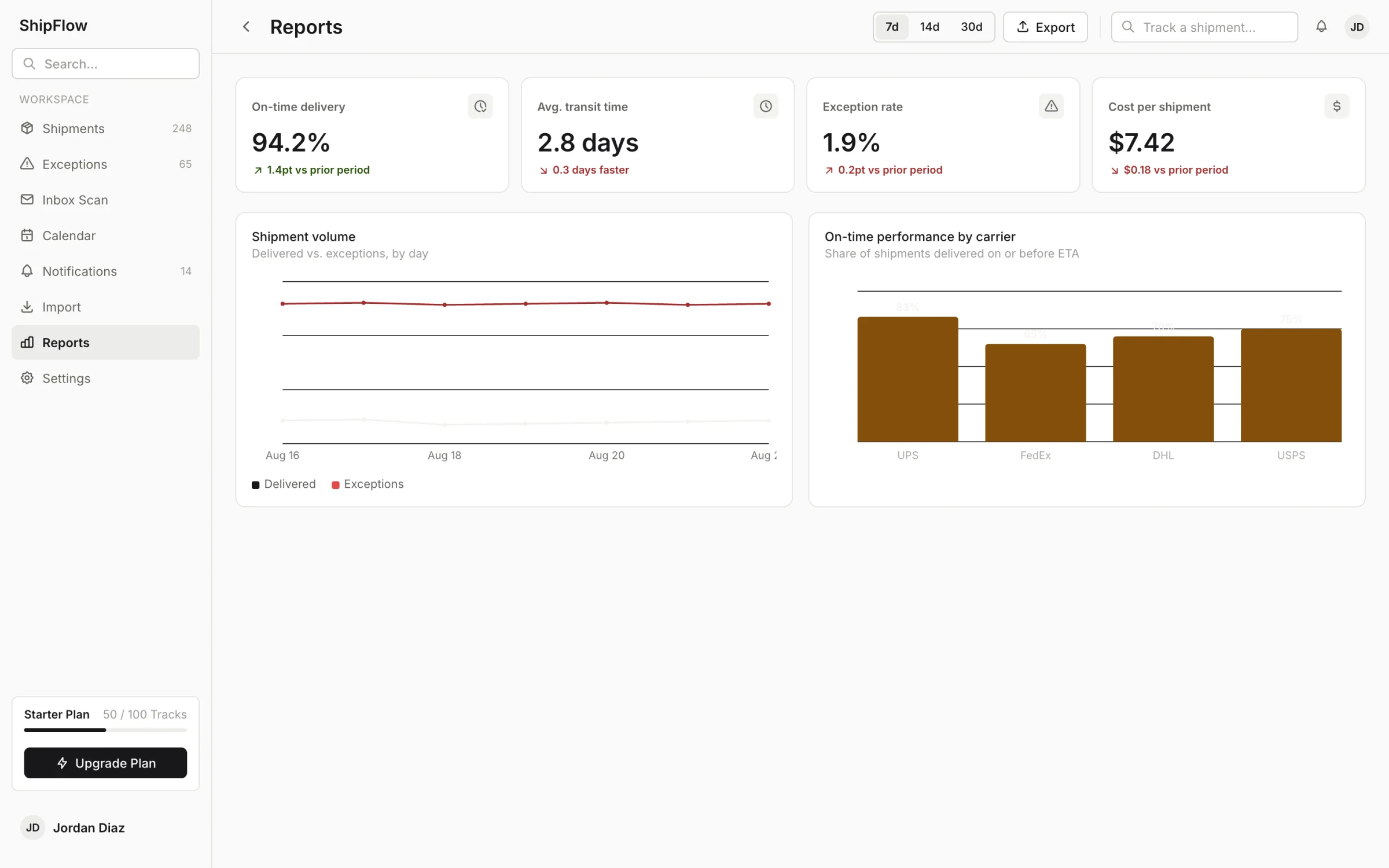
Trends drawn on a canvas: on-time percentage, transit time, and which carrier is quietly slipping.
The style guide is a route inside the app. Checking it before inventing a new pattern is what keeps twelve pages looking like one product.
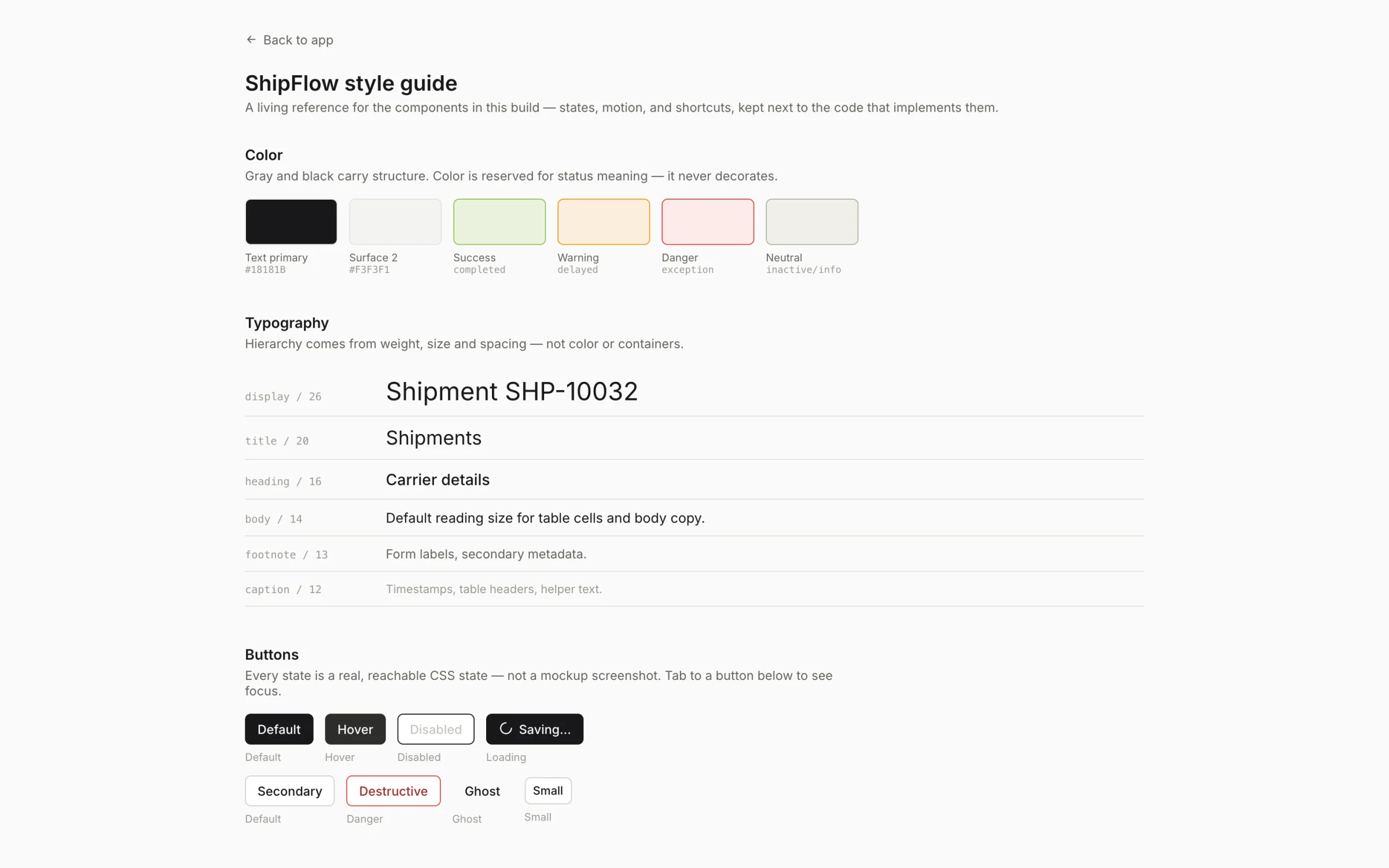
The five status colours had to survive the switch without any of them turning into another one.
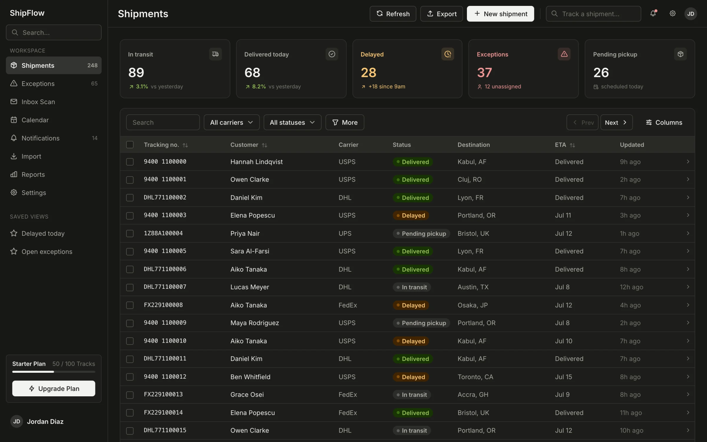
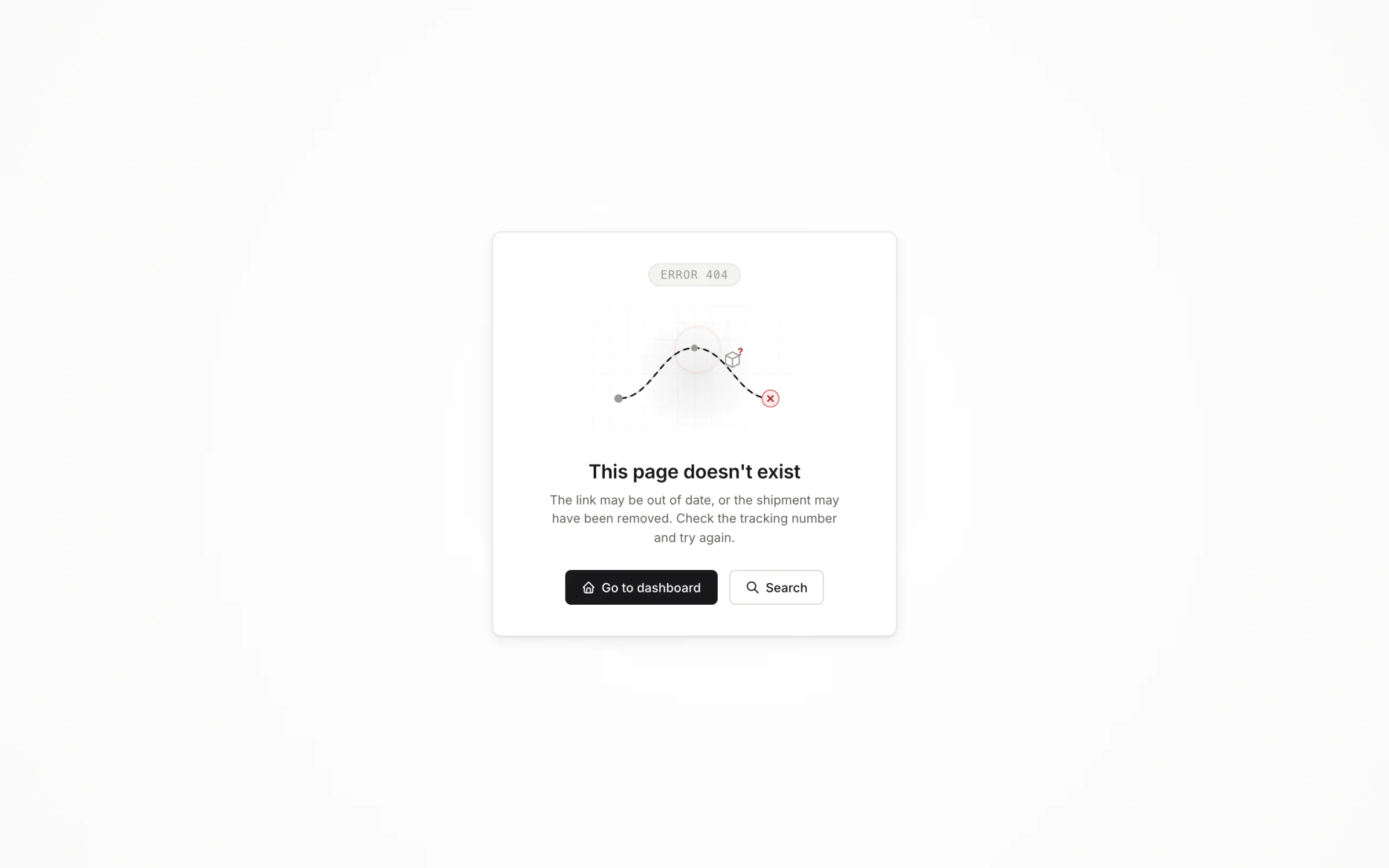
A dead end, designed. Small thing, and it is most of the difference between a prototype and a product.