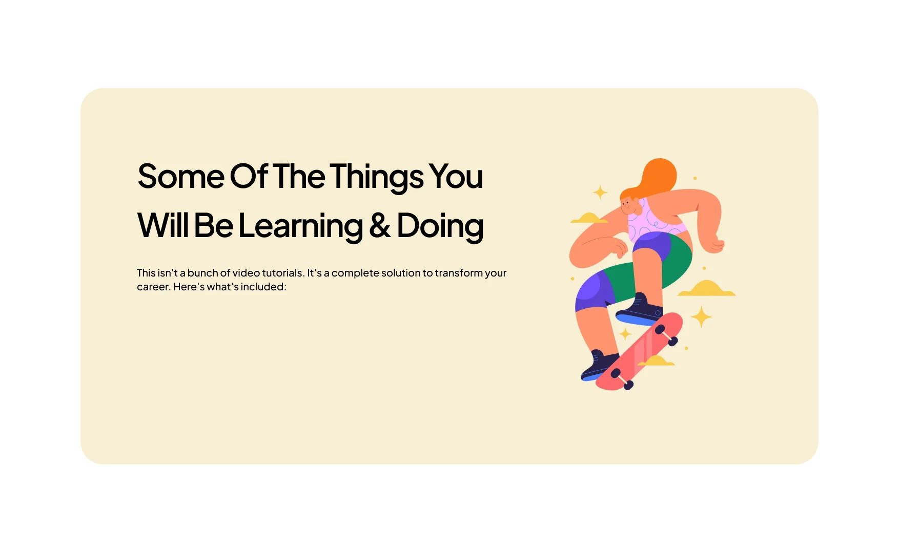
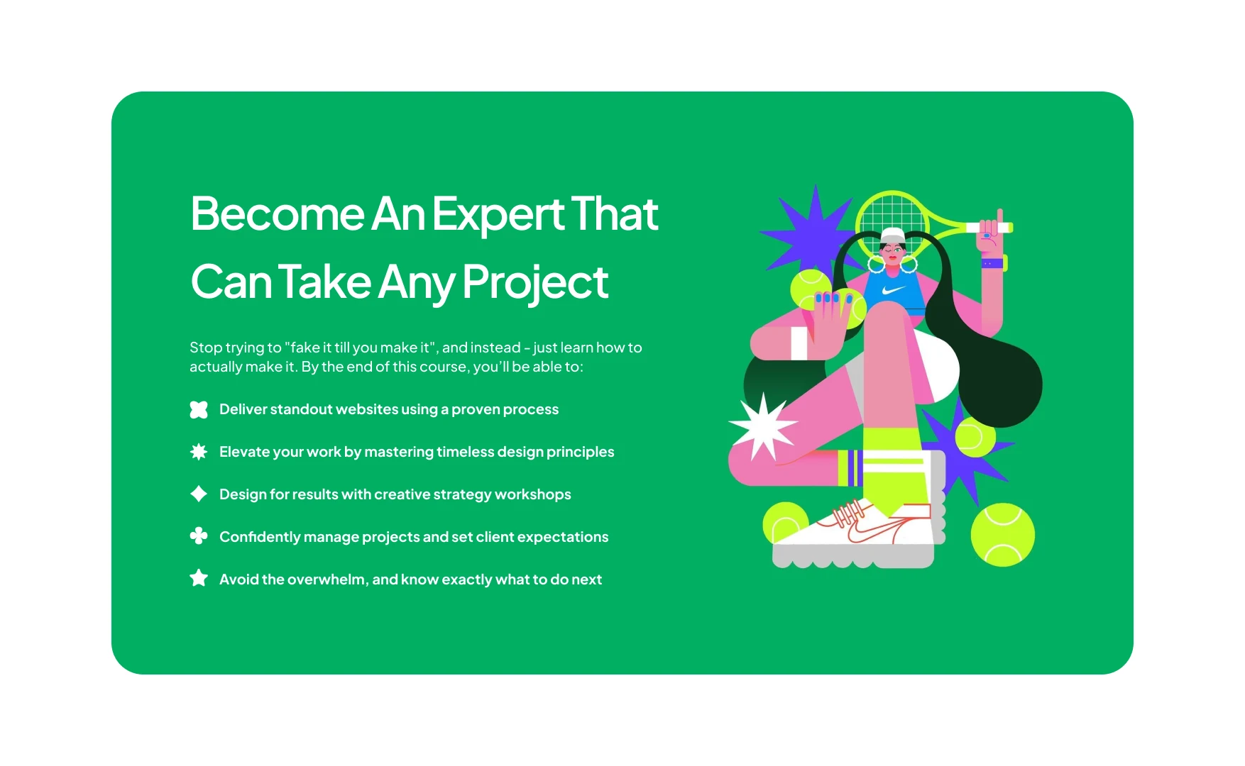
HACA Design School The Page That Sells the Course
A landing page for a branding course. The argument was already settled by the first pass; what this one adds is a voice: display type, a colour per section, and the parts a design school cannot afford to leave out.
A concept, and not a shipped one: these are the pages as drawn.
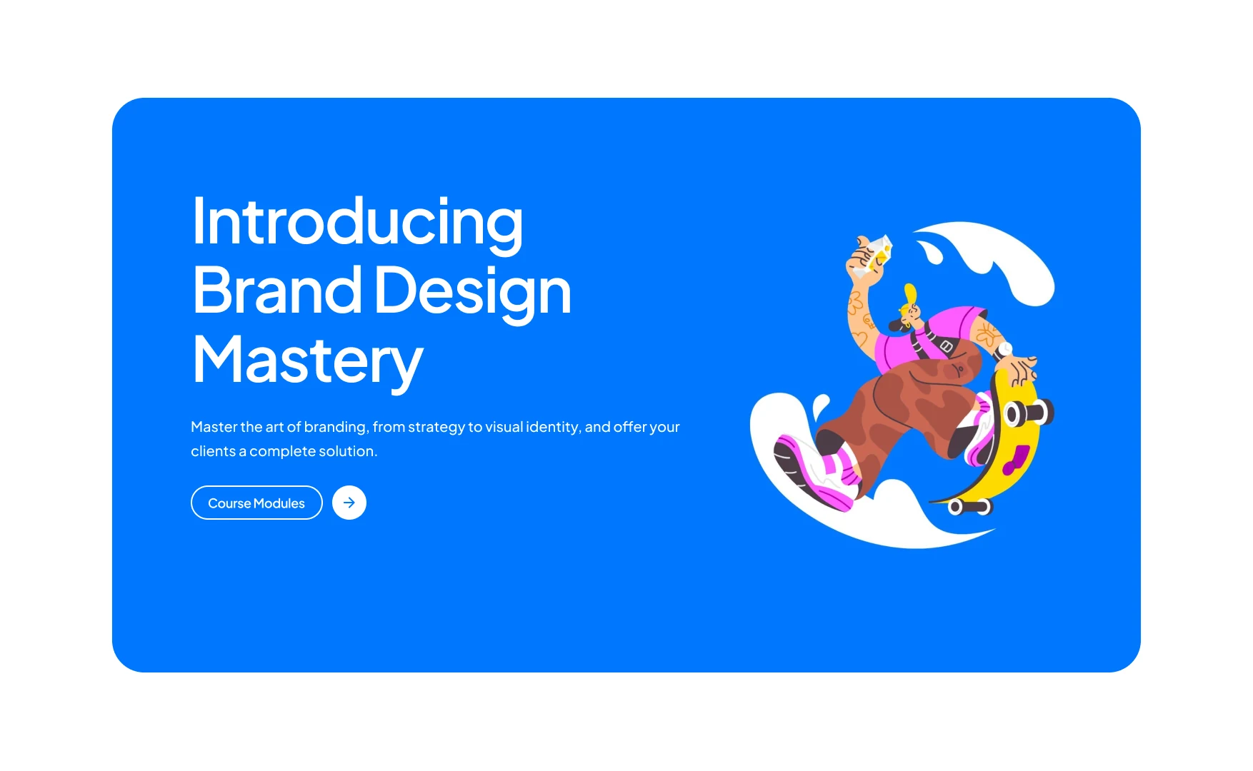
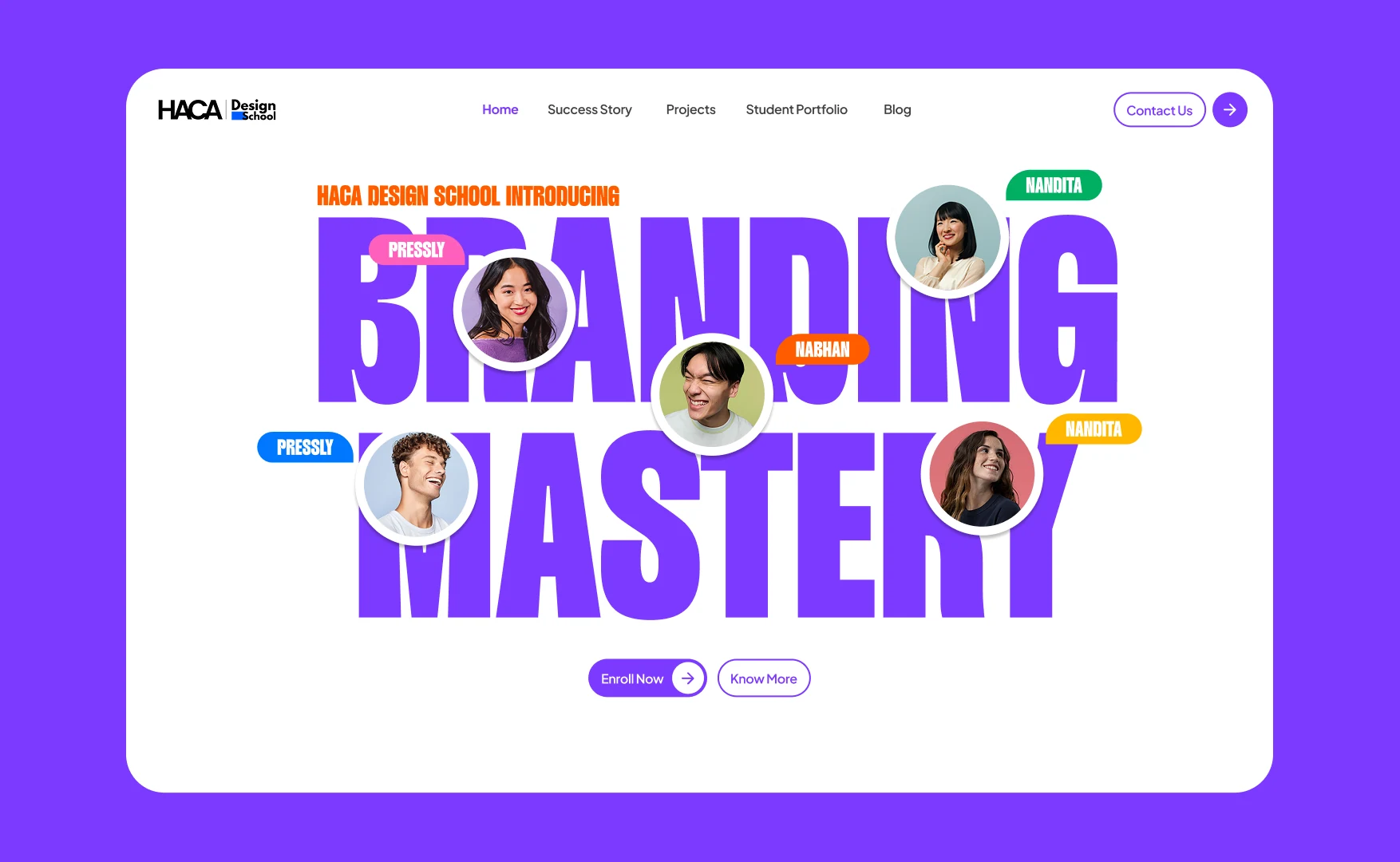
The course name is the picture. Students are set into the letters, so the people and the promise arrive as one object rather than a photograph above a sentence.
Every section takes a colour of its own, so scrolling feels like moving through rooms rather than down a list.
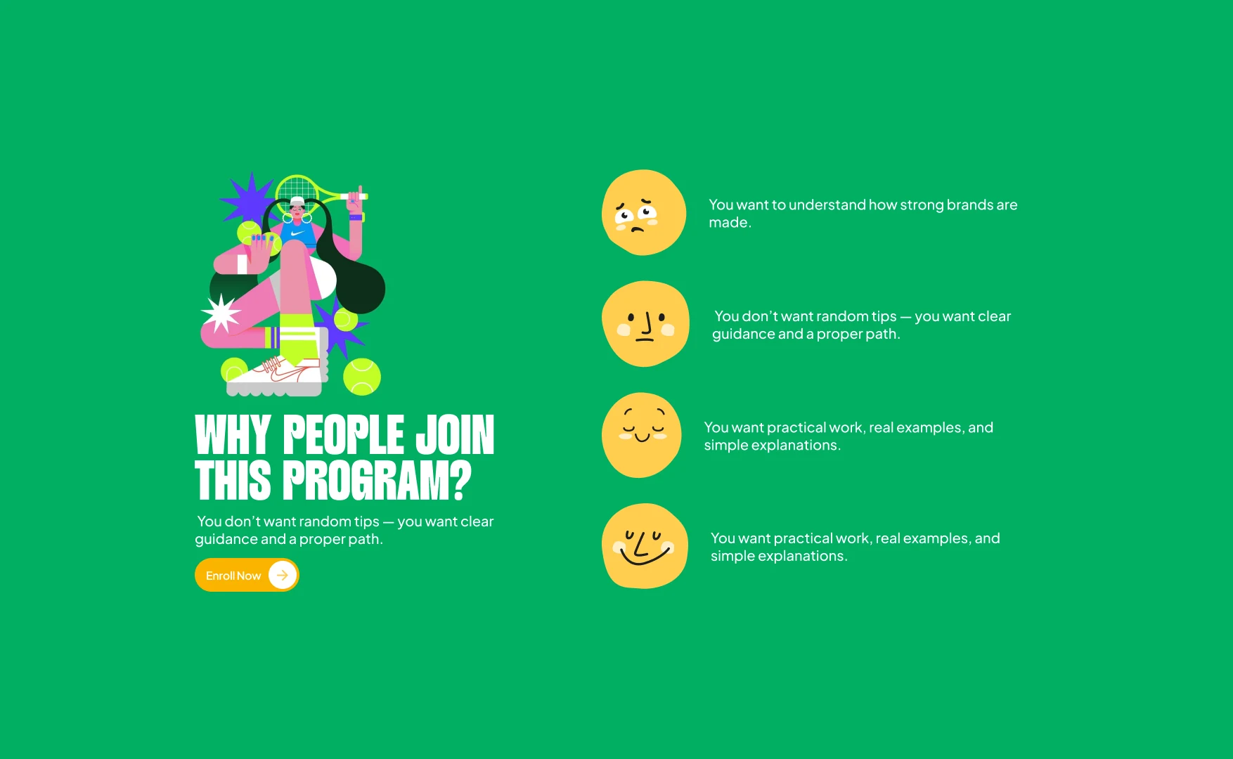
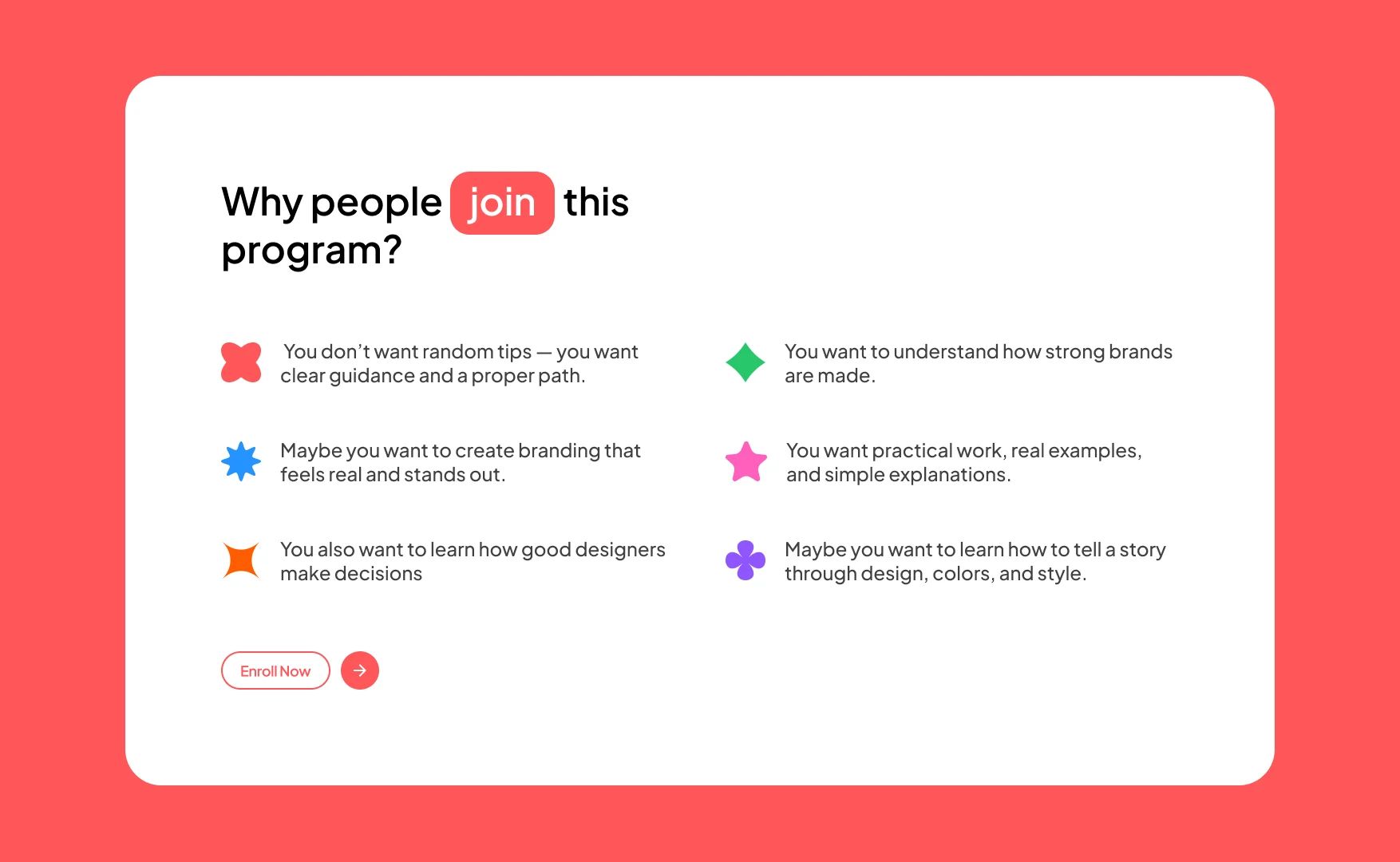
The reasons are faces before they are sentences: the doubt at the top, the ease at the bottom.
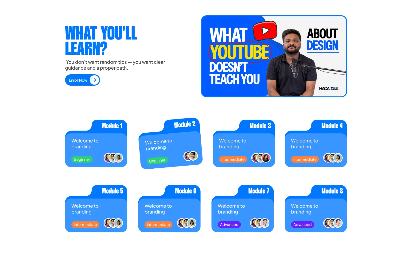
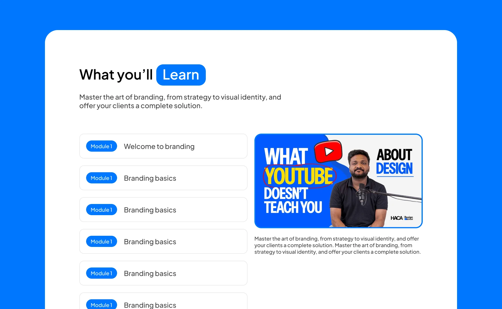
Eight numbered cards, each showing its level and who teaches it, so the shape of the course is visible without reading a word of it.
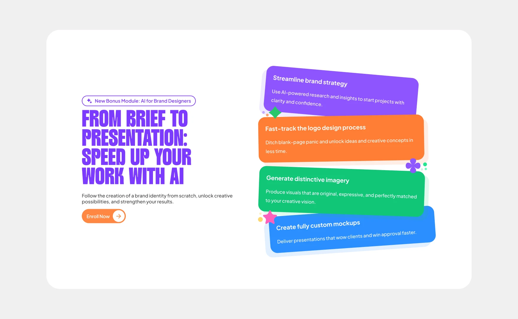
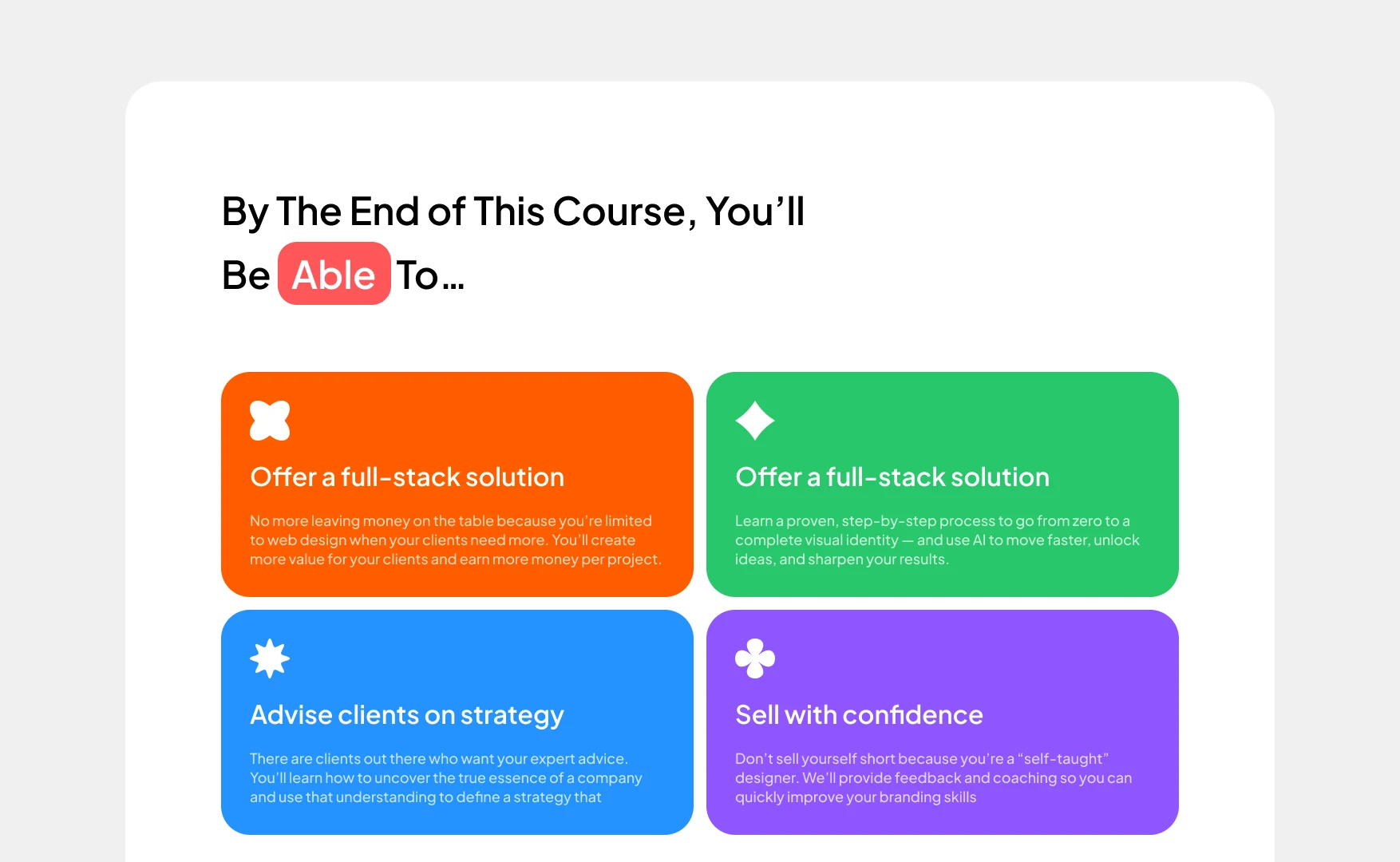
Four claims given the weight of objects rather than bullet points.
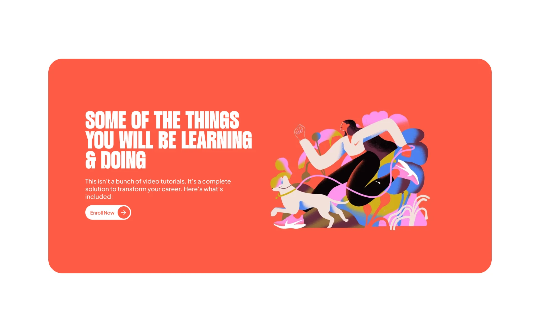
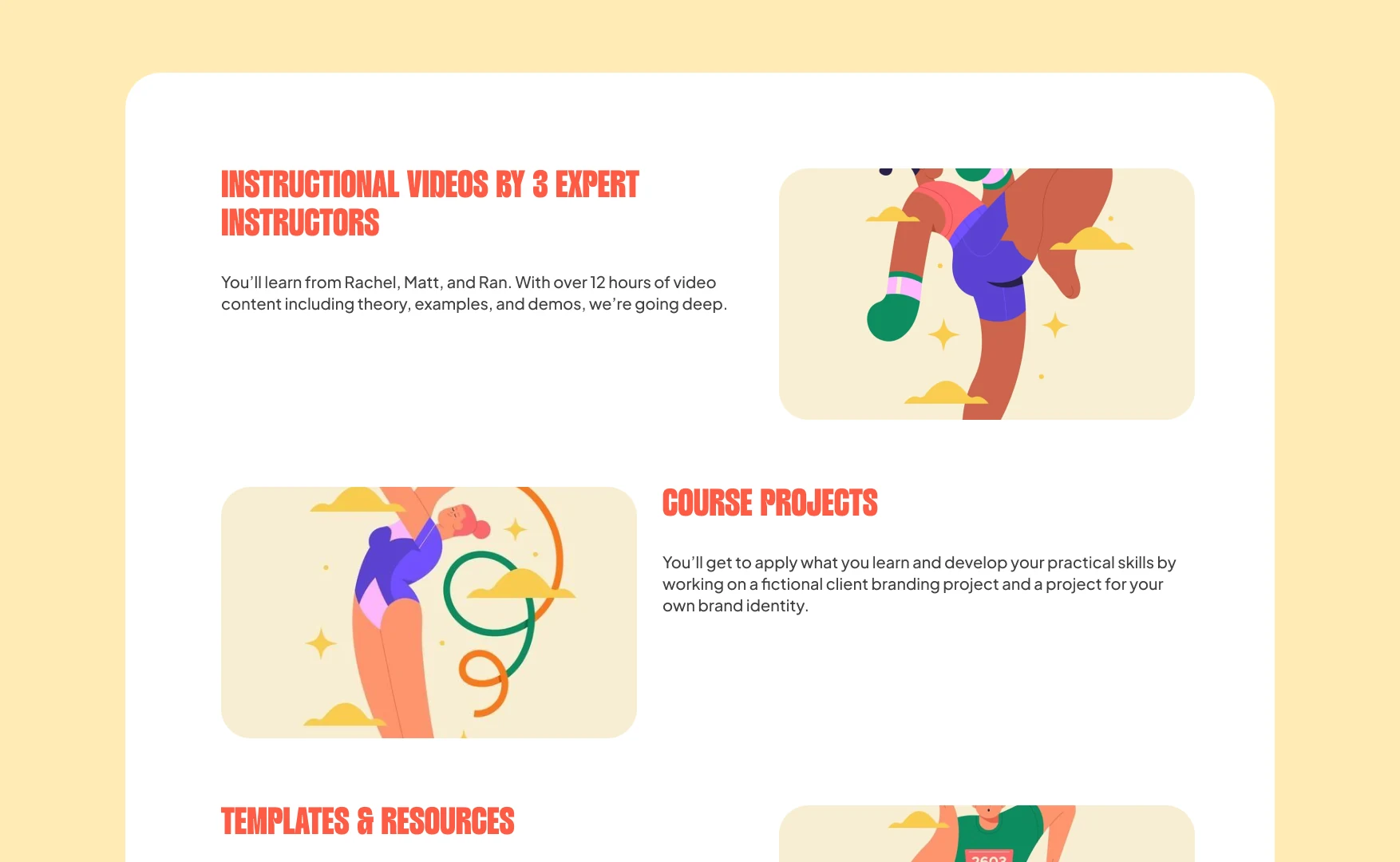
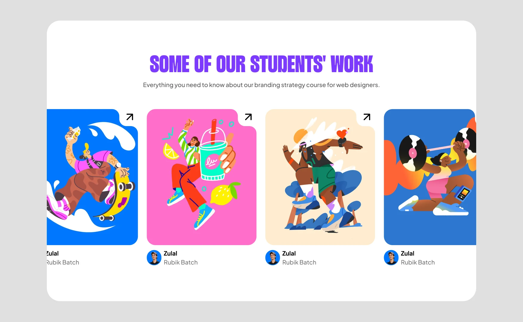
A branding school cannot afford to leave out the work its students make. This is the section that was missing.
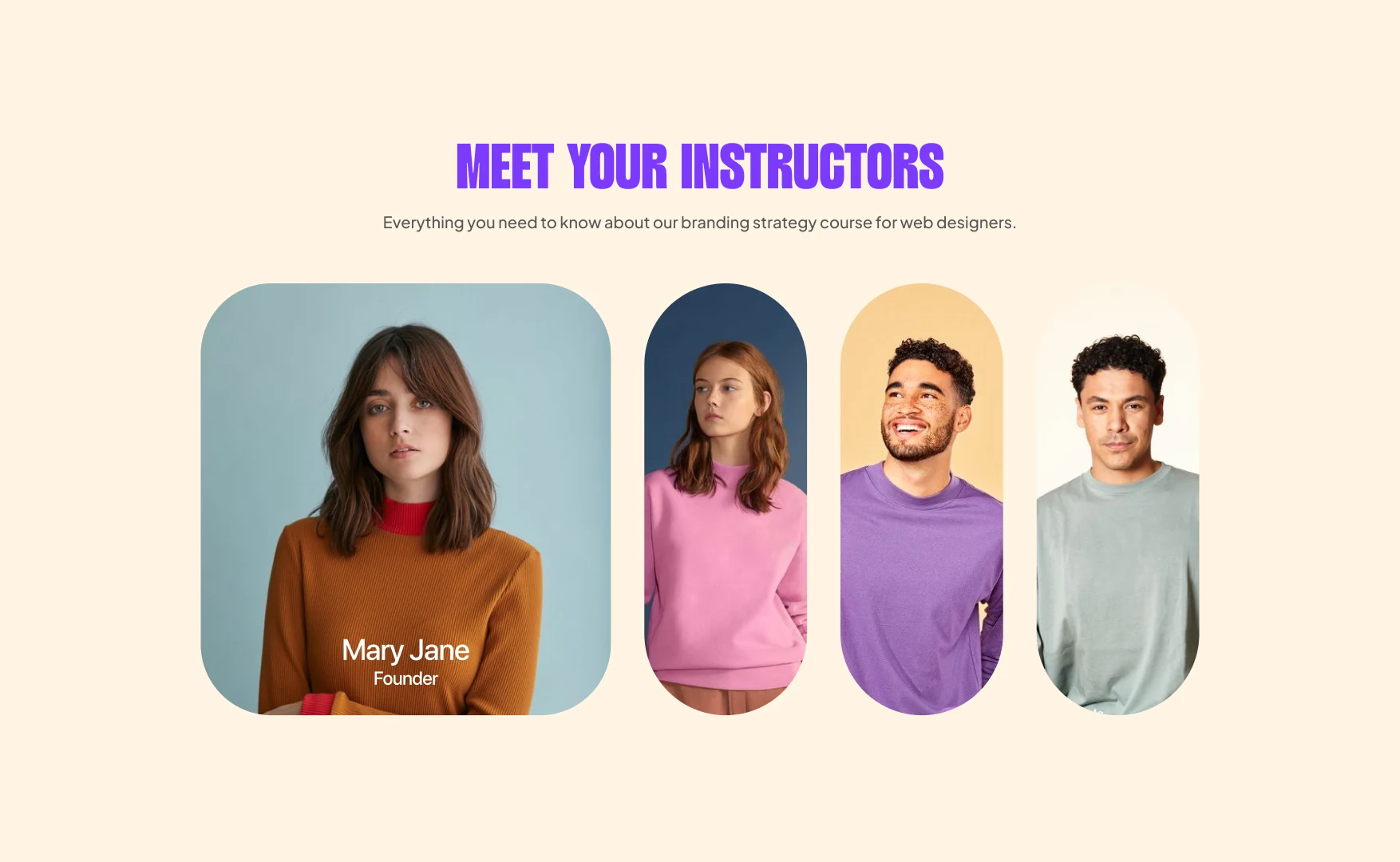
So were the people teaching it, when part of what is being paid for is access to them.
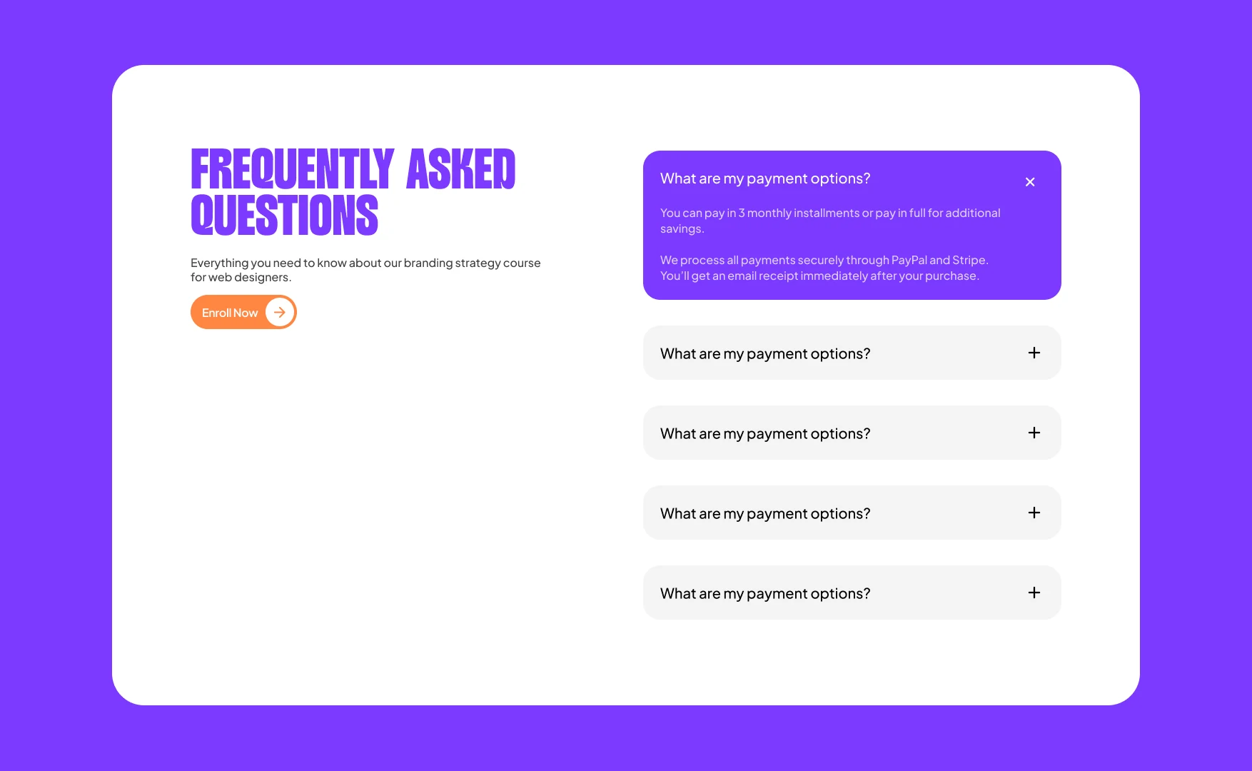
And the awkward question of how you pay, in how many instalments, answered on the page rather than in a message to the team.
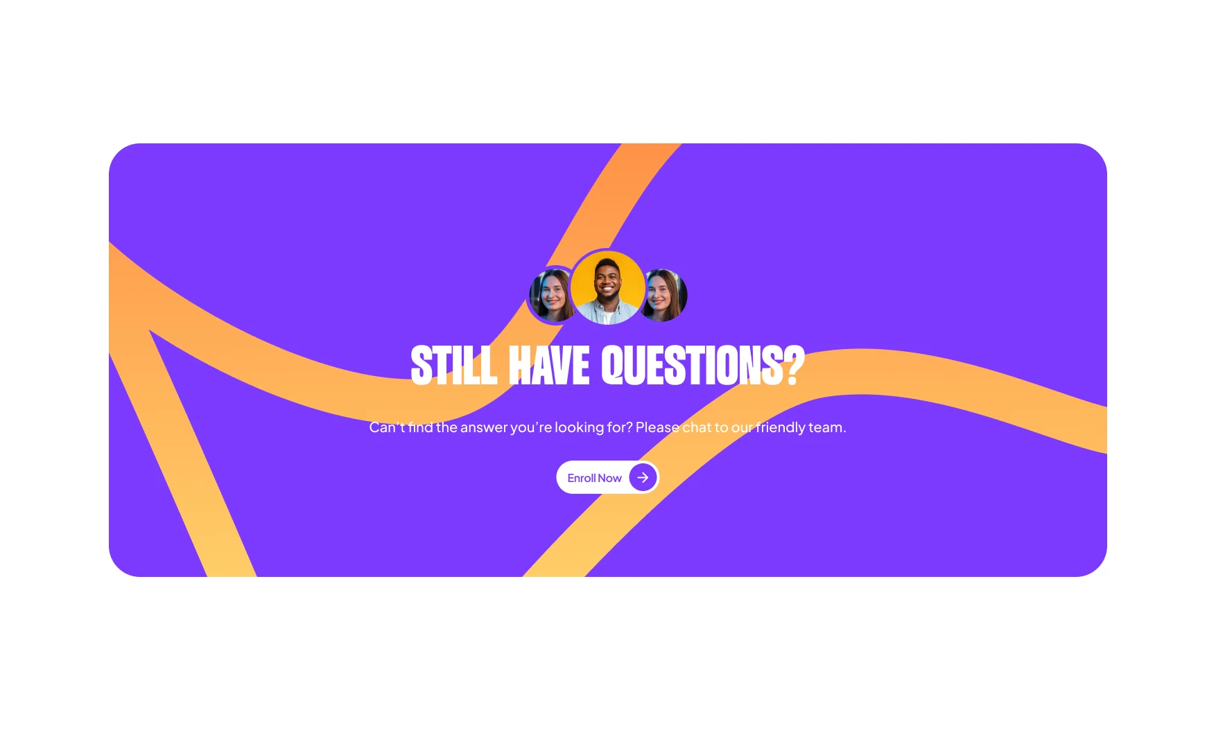
The last thing on the page gets a shape of its own.
The first iteration
The pass this came out of. Every section is already here. The argument was settled, and only the voice was still missing. Light sans headlines, flat blocks of colour, and a module list that says Branding basics eight times.