Oppam Designing the Minutes Before Someone Asks for Help
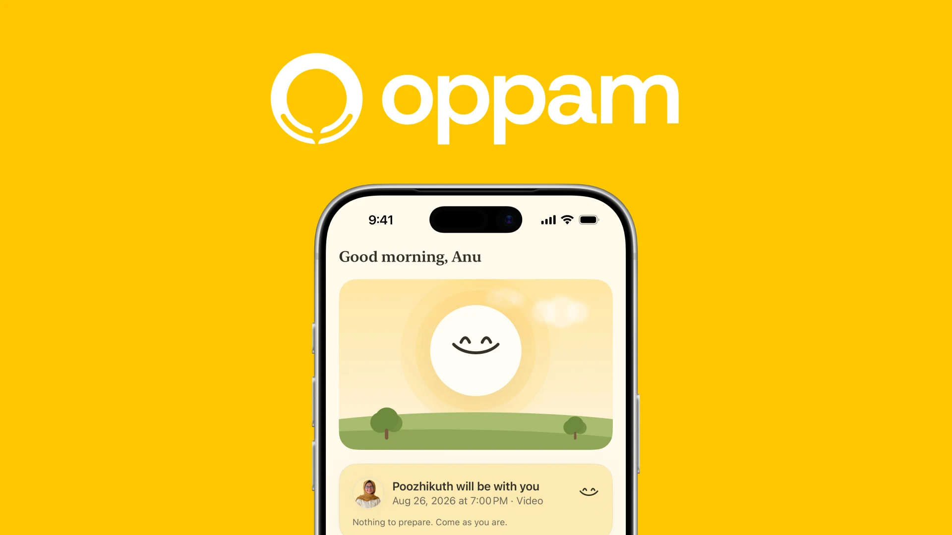
Oppam is a real counselling service in Kozhikode, and today it is a website and a phone number. Kerala has more psychiatrists per person than any state in India and still leaves most people untreated, so the wall is not supply. It is the walk to the door. This is the app built for that walk.
This is a long one, so here is its shape. Why people in Kerala do not come. What the apps in this category already do, and where they stop. What Oppam has today, which is a website. Then the app I designed for it, screen by screen, and the reasons behind each part of it.
Kerala, and the walk to the door
Kerala has more psychiatrists per person than any other state in India. About 1.2 for every 100,000 people, where the country as a whole manages 0.75.
It also has one of the highest suicide rates in the country. 30.6 for every 100,000 people in 2023, against a national average of 12.3. Third highest of any state or union territory.
And the National Mental Health Survey still puts the treatment gap at 84.5 percent. The best served state in the country, and most people who need help are not getting any.
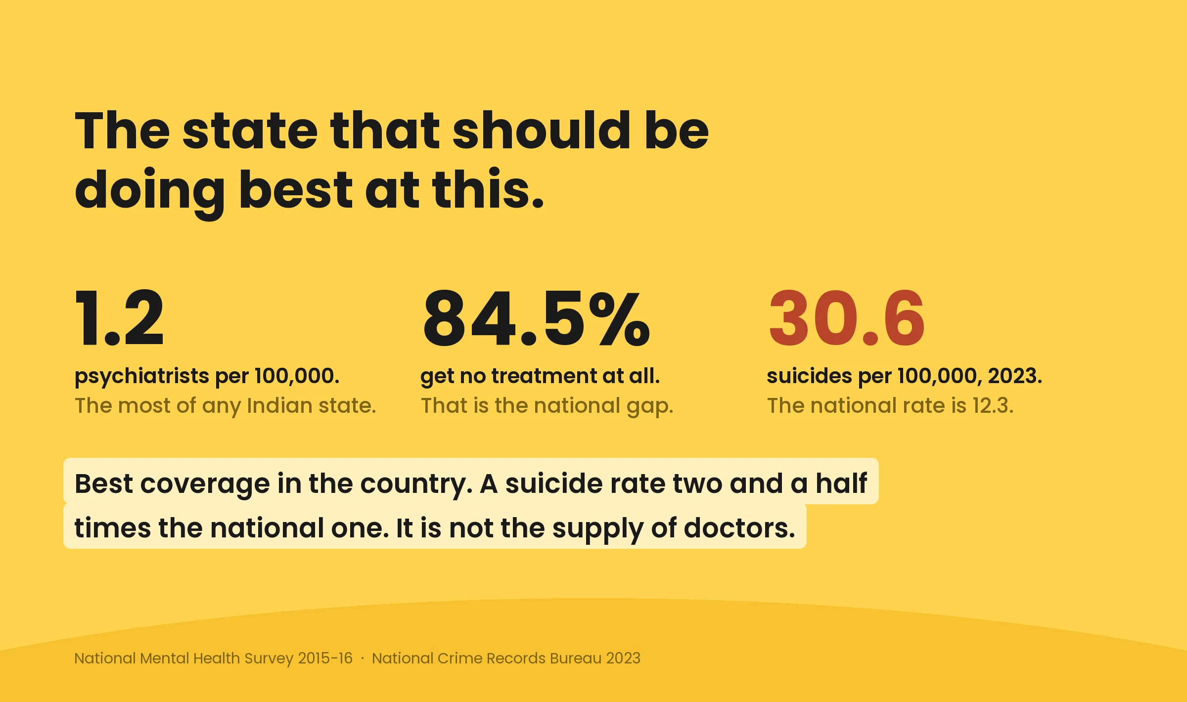
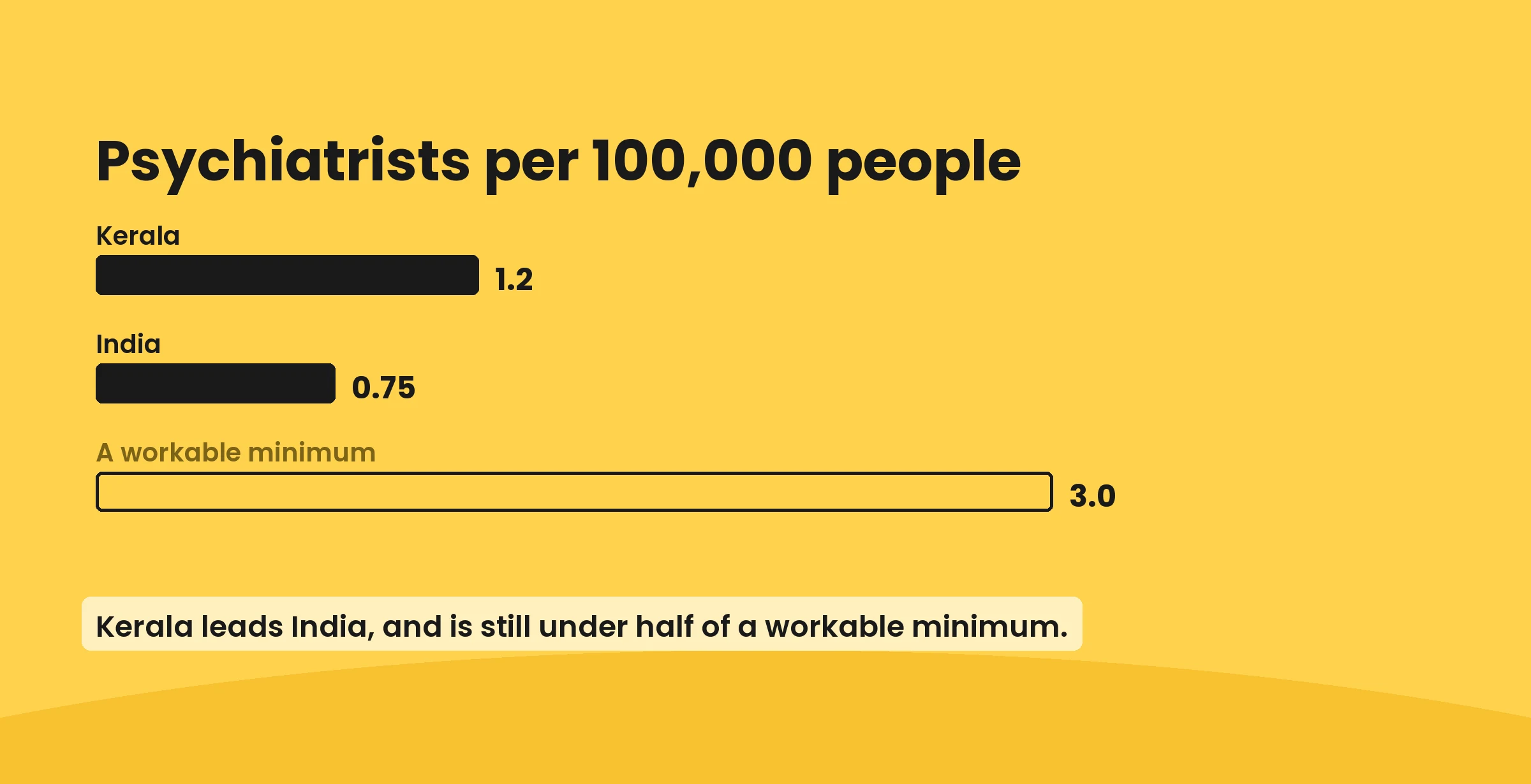
So the wall is not a shortage of therapists. The wall is the walk to the door.
What stops people here is quieter than a waiting list. Therapy is whispered about. A clinic is a building other people can watch you walk into. Phones get shared with a sibling or a parent. And nobody knows what actually happens in a first session, so the imagination fills it in with something worse than the truth.
I should say plainly what this is built on. There are no user interviews behind it. It is the National Mental Health Survey and the Kerala paper drawn from it, published work on shared phones in Indian homes, a read of the live oppam.me service, and a walk through every competing app from first open to booking, marking each place I hesitated and why. The people I kept in mind while deciding are archetypes from that reading, not people I sat with. If there were a budget I would replace them in the first week.
What the apps in this category already do
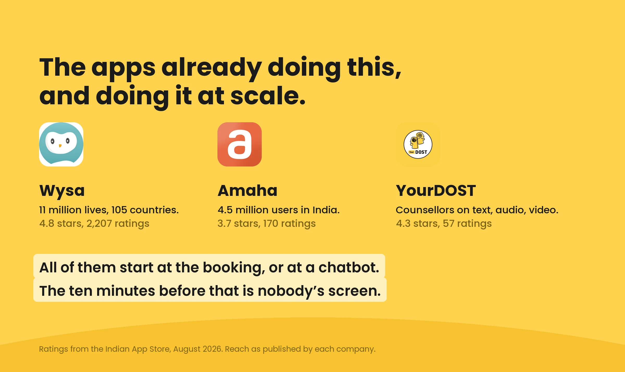
The category is neither empty nor bad. Wysa has reached eleven million lives across a hundred and five countries and sits at 4.8 stars. Amaha has served four and a half million users. YourDOST puts counsellors on text, audio and video. These are real products with real reach.
They are also open about their hardest problem, which is that people leave. Retention is the known weak point of the whole category. Language is the other one. An app that only speaks English is asking somebody to describe their worst week in their second language.
But look at where they all begin. Open each one and the first screen is a chatbot introducing itself, a pitch for your wellbeing, or a logo followed by a sign-up.
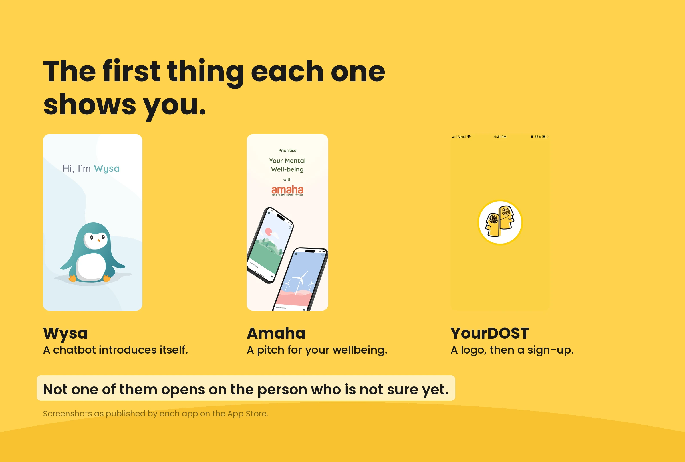
The ten minutes before a person decides to ask for help is nobody’s screen.
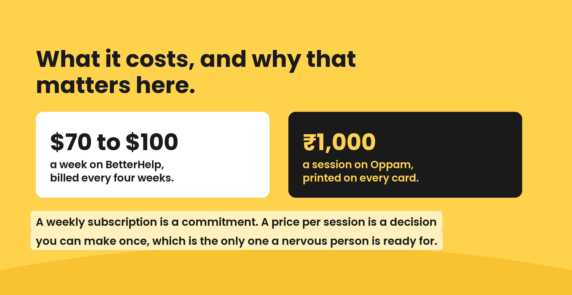
Price is the other thing worth looking at, because most of this category was built for a different economy. BetterHelp runs 70 to 100 dollars a week, billed monthly. A subscription is a commitment, and a commitment is the exact thing somebody unsure is not ready to make.
That is the gap this app is built into.
What Oppam has today
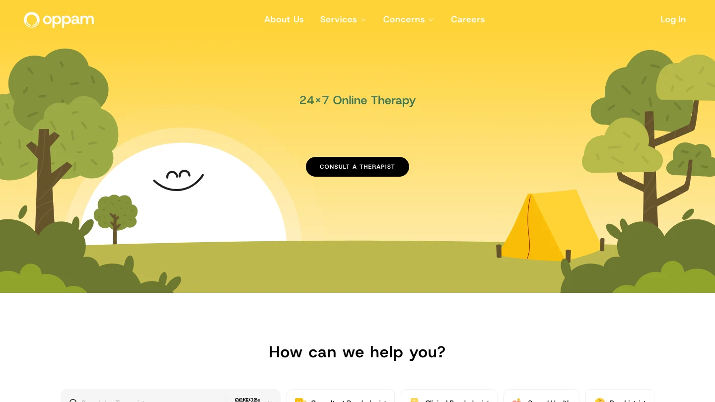
Oppam is Kerala’s first 24/7 online counselling platform, run out of Kozhikode. The site counts more than 50,000 therapy hours and a 4.8 rating on Google. Individual, couple and follow-up sessions, plus corporate and campus programmes, across the things people actually arrive with: anxiety, stress, depression, trauma, grief, anger, work burnout, parenting, queer-affirmative concerns.
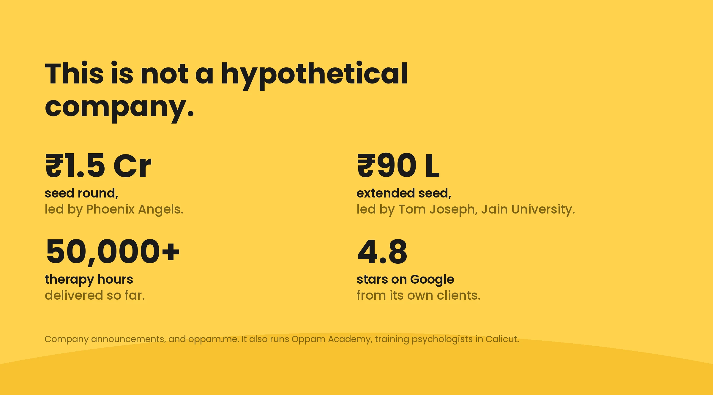
It raised 1.5 crore in a seed round led by Phoenix Angels, then 90 lakh more in an extension. It runs Oppam Academy, training psychologists out of the Calicut office. This is a working company rather than a hypothetical one, and that decides what a redesign is allowed to be: something the people already using it would recognise on the first open.
And the website is already good. That is worth saying plainly, because it changes what the app is for.
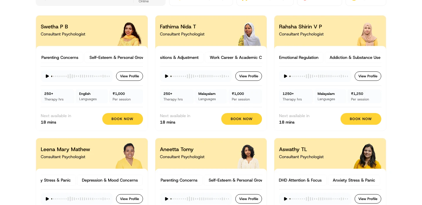
Look at what a card already holds. Her photo and her credential. The concerns she takes. A voice introduction you can play before you decide. The languages she works in. The hours she has done. The price per session in rupees. When she is next free. One button to book her.
Nothing important is hidden, and none of it needs a phone call first. So the app is not here to rescue a broken website. Most of the good ideas in it started here, and it keeps them: a price on every card, a voice before the money, the language named up front.
What an app can do that a page cannot
Three things, and they are the whole reason this project exists.
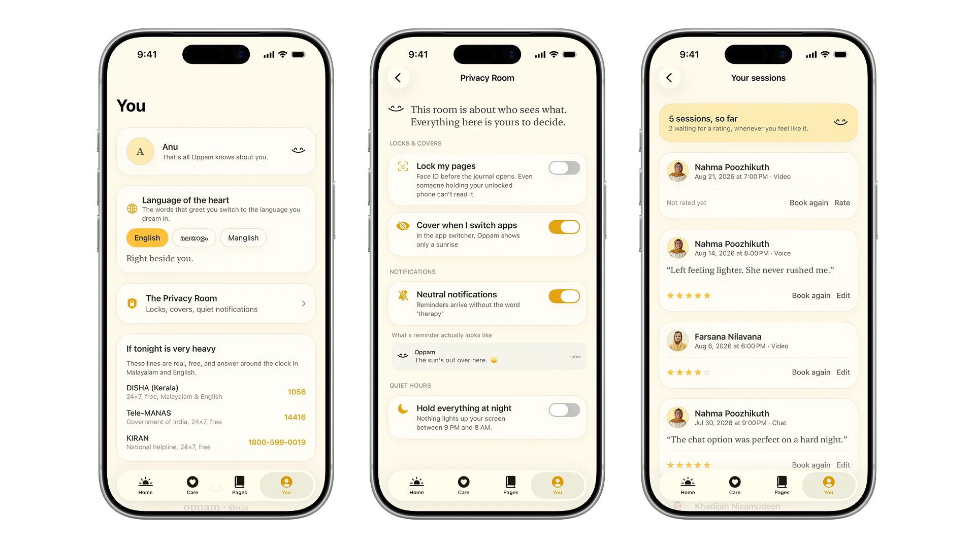
Privacy. A browser keeps history. A tab can be read over a shoulder. A shared phone has no Face ID door, no cover in the app switcher, and no way to make a notification say nothing. That is the barrier the research keeps pointing at, and it is the one a website structurally cannot answer.
It is not a theoretical worry in this category either. In 2023 BetterHelp, the biggest name in online therapy, paid 7.8 million dollars to settle with the US Federal Trade Commission over sharing email addresses, IP addresses and the answers people gave to health questions with Facebook, Snapchat, Pinterest and Criteo, for advertising. Around 800,000 people were eligible for a refund.
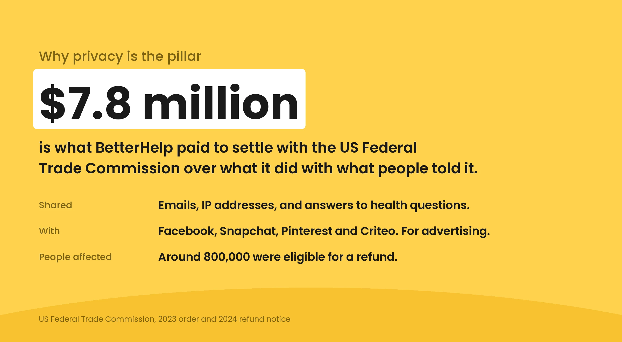
So privacy here is not a policy page. It is the reason the app holds everything on the device and asks for no account at all.
The part before choosing. The website still opens onto a grid of therapists, which asks a person to evaluate strangers while anxious. An app can start from how somebody feels and bring three people forward with the reason for each.
A reason to open it on a day you are not booking. A website’s job ends at the booking. An app can hold a two minute breath, a page nobody else reads, a small win from last week. That is what keeps a person near help long enough to eventually ask for it.
So the app is not the website with a tab bar bolted on. It is the three parts the website was never going to hold.
The sentence everything was tested against
Oppam is not a therapy app. It is the feeling of someone quietly coming to sit beside you, and its real job is the moment before somebody asks for help, not the transaction afterwards.
The one line every decision had to survive
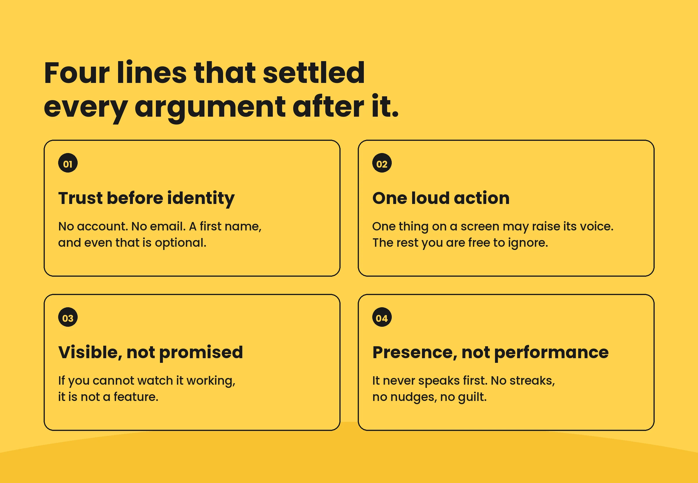
Four rules came out of that, and between them they settled most of the arguments.
The first minutes
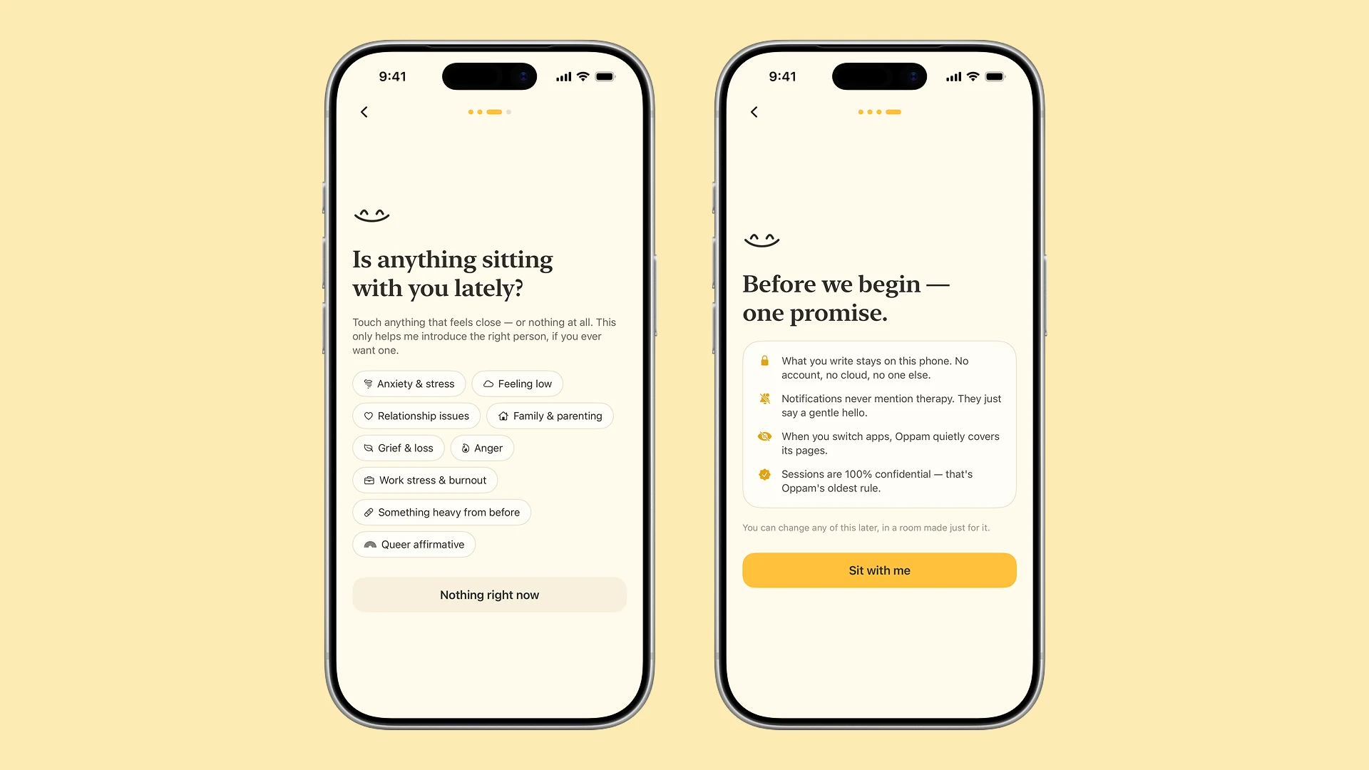
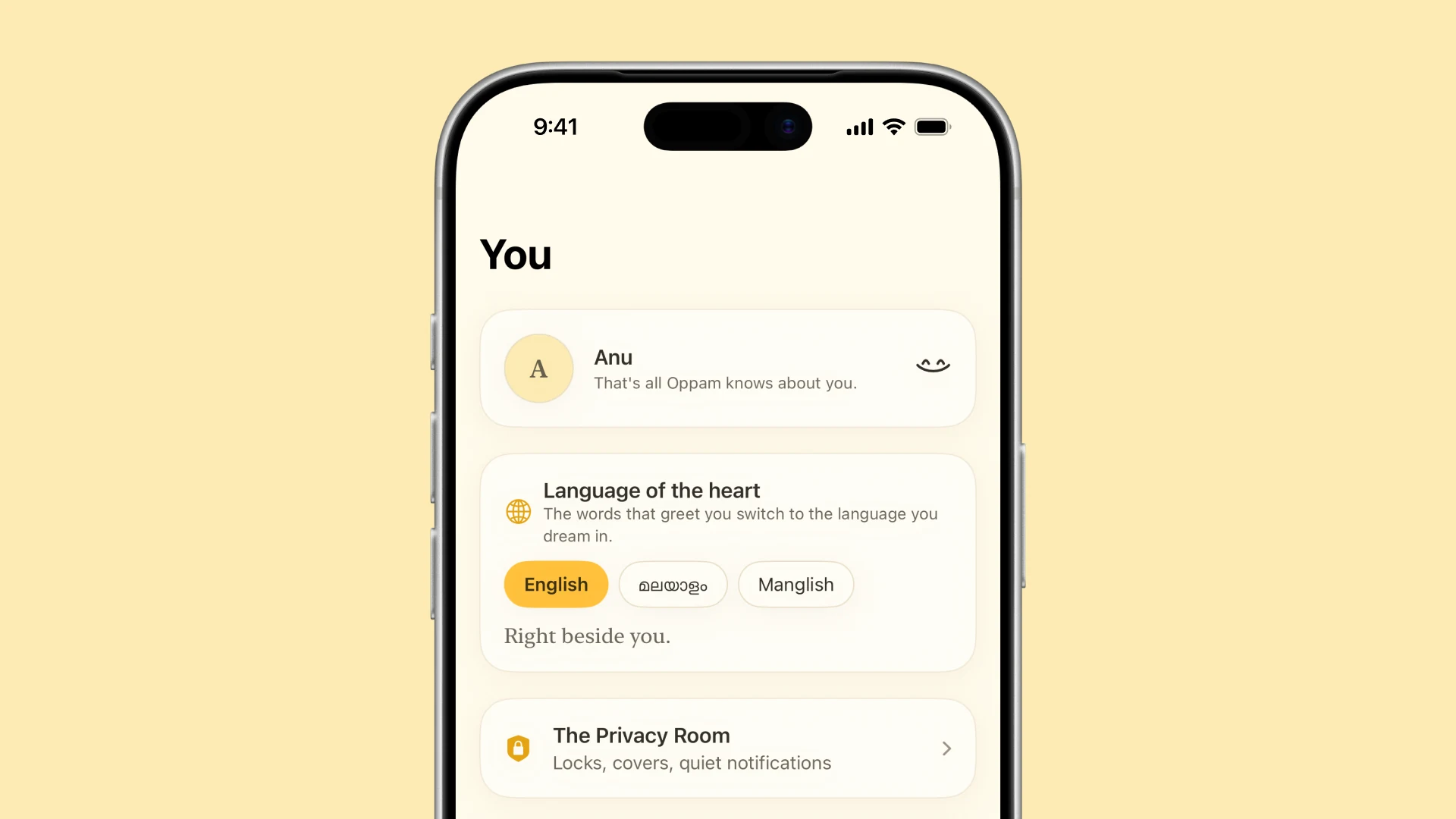
A sign-up wall feels like registering an illness, so there is not one. The app asks what to call you, and accepts any answer, including none.
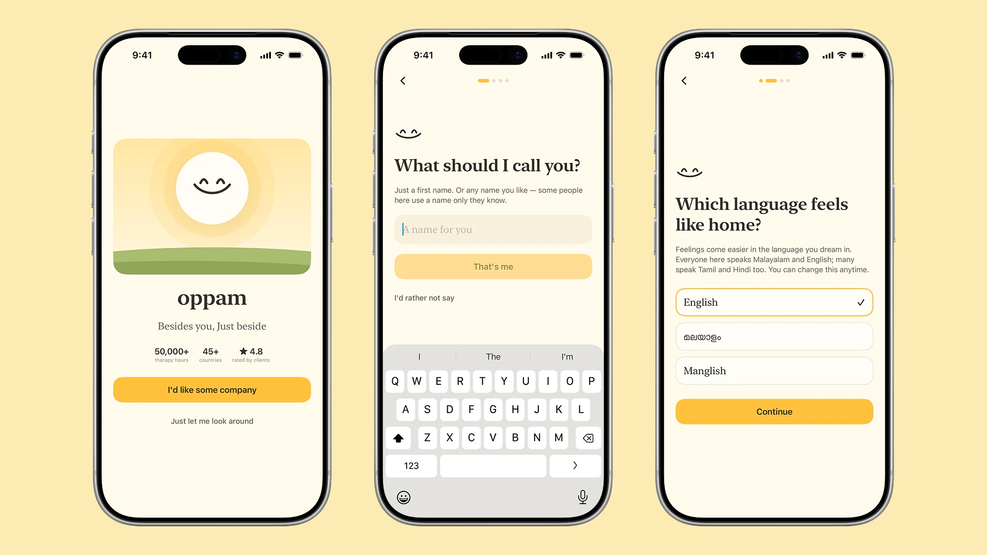
The language question is not a settings toggle here, and it is not only about labels. Feelings do not translate well. Malayalam, English or Manglish switches the lines that carry weight, not the chrome.
Then it asks, gently, whether anything is sitting with you lately. Every answer is optional and one of them is nothing right now. It ends on a promise rather than a permission request.
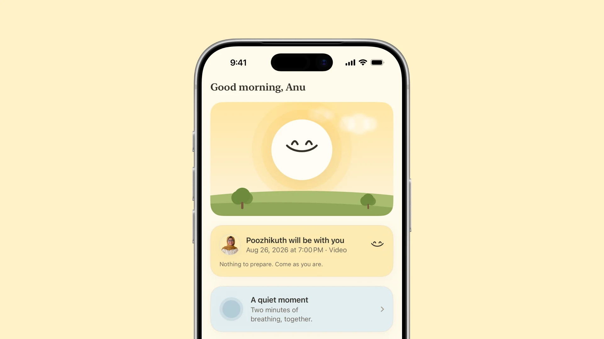
Home is a veranda, not a dashboard
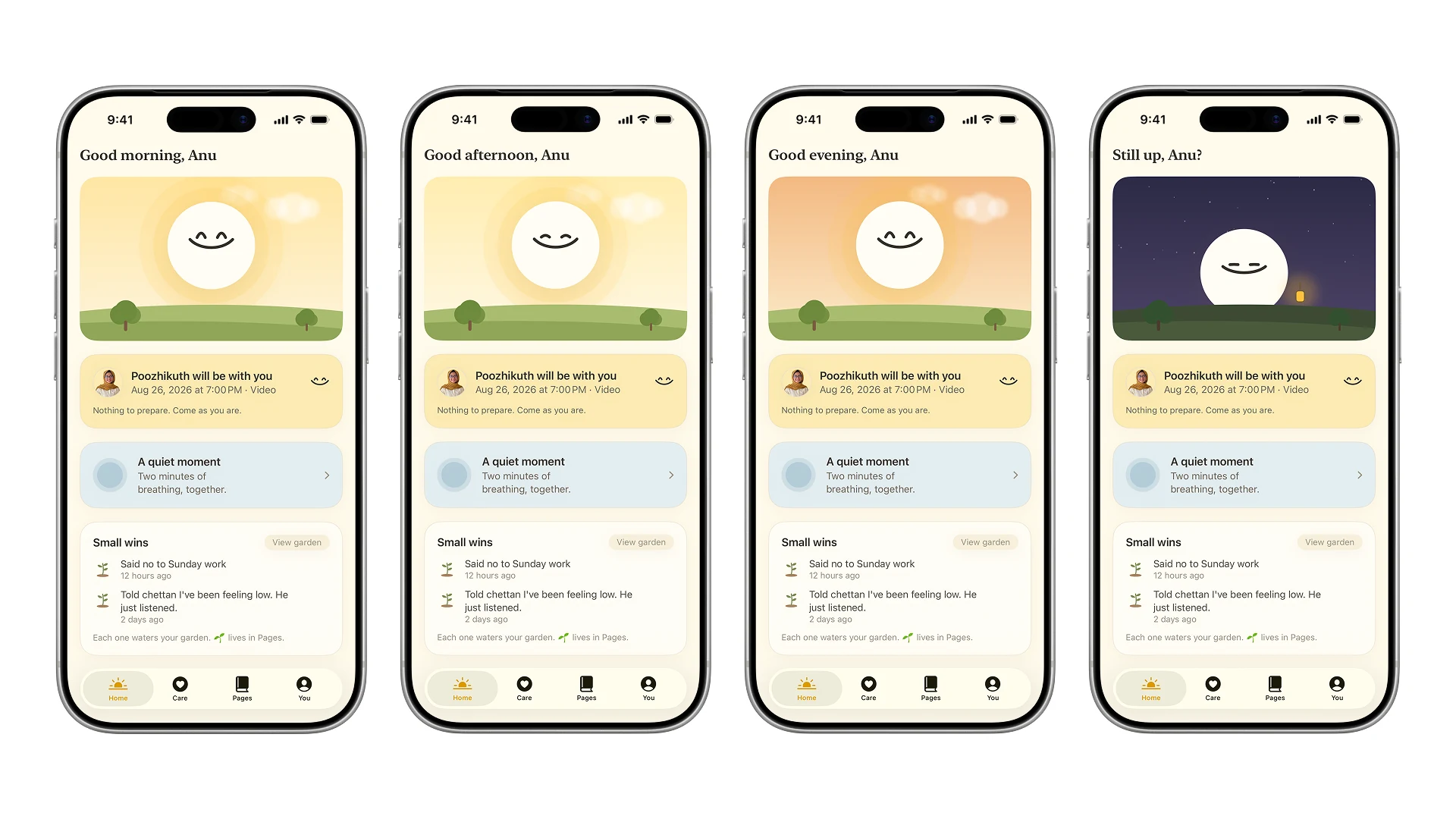
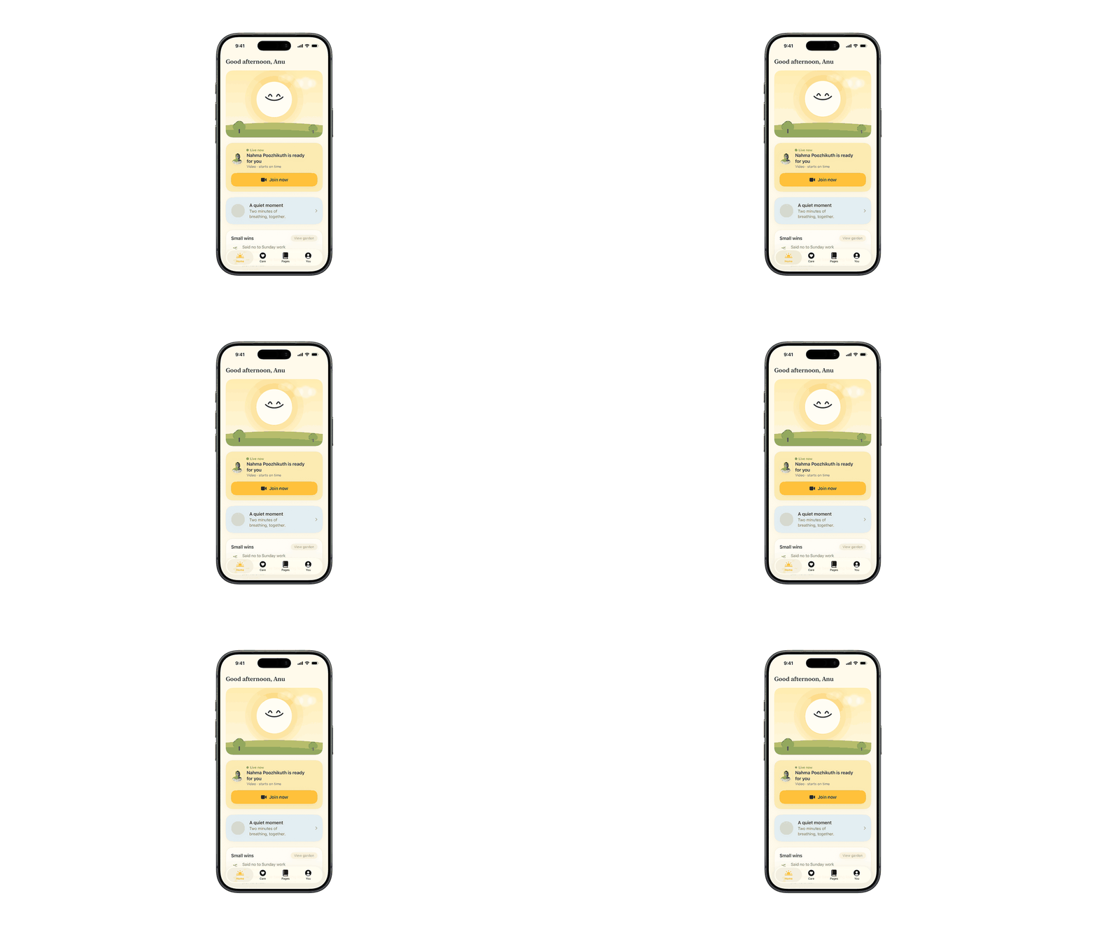
A dashboard asks you to manage something. A veranda is a place you can sit without a reason, which is closer to what this app is for.
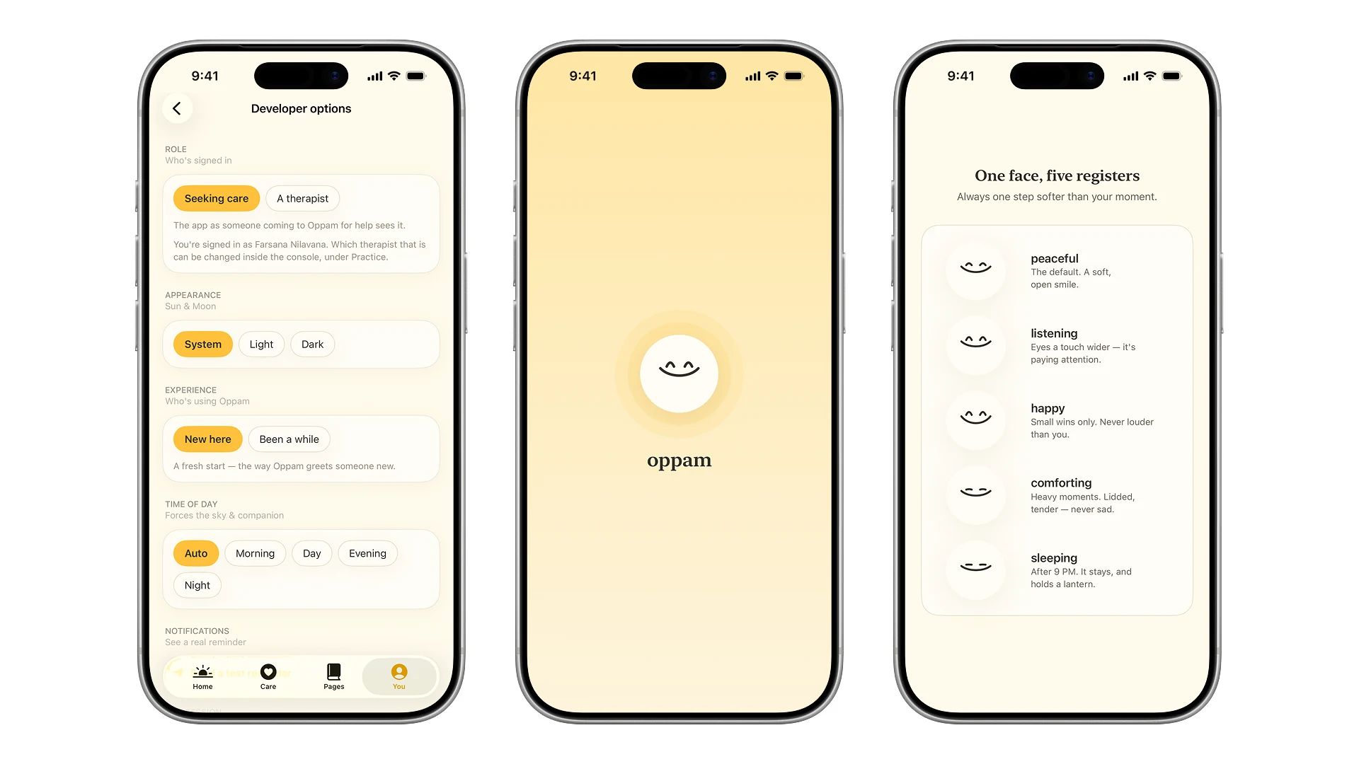
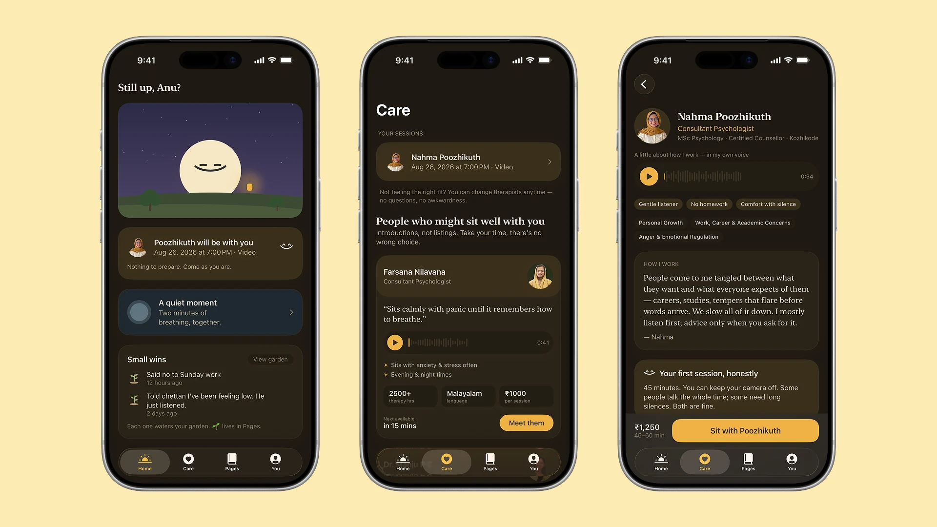
The sky and the companion follow the hour, so the app feels like it is in the same day you are. After nine at night the companion sleeps and holds a lantern.
The check-in asks for weather, not symptoms. Is my problem big enough is one of the questions that keeps people out, and a symptom checklist answers it badly. Weather has no threshold to clear.
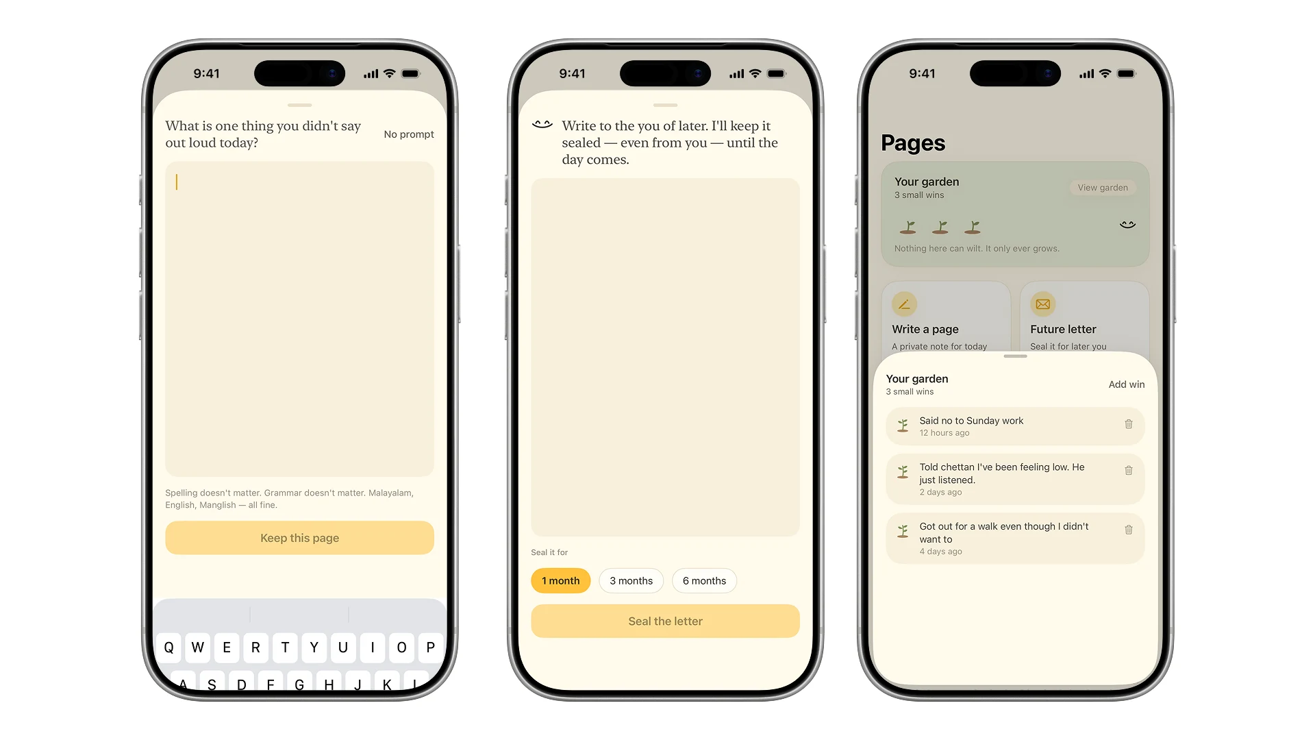
Small wins collect underneath, and they only ever grow. Nothing here can go down, because a number that falls is a reason to stop opening an app.
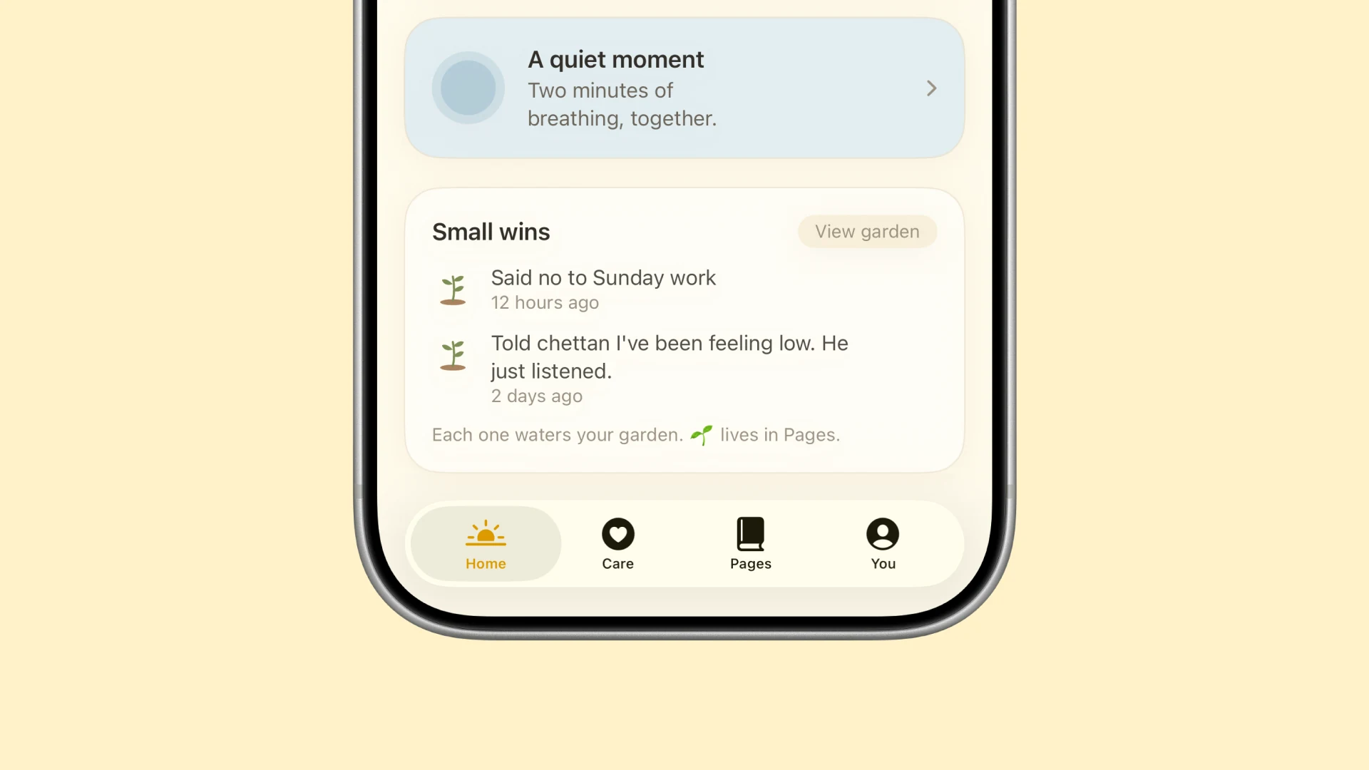
The quiet moment is a two minute breath on a 4-2-6 count. It is the one thing in the app you can finish.
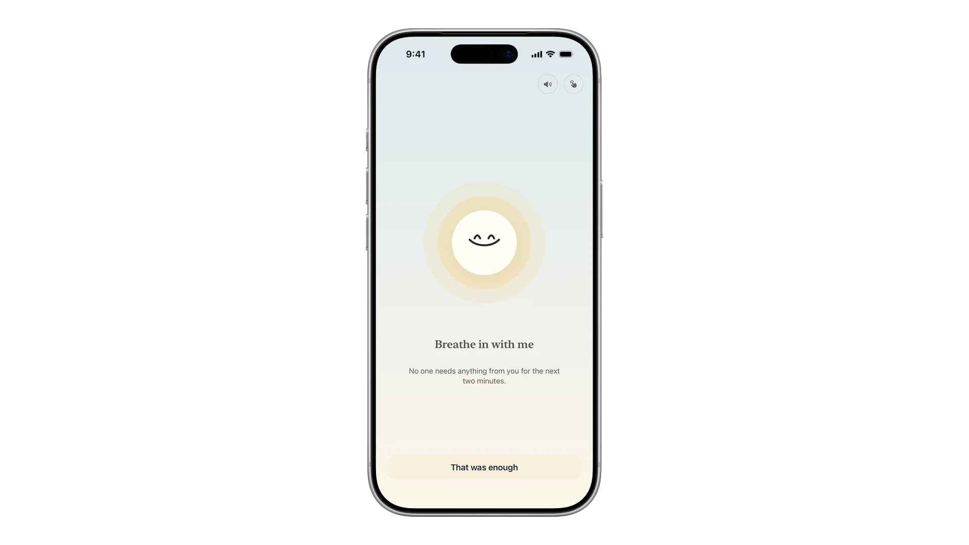
Most of this part only exists in motion, so this one is the app running rather than a screenshot of it.
Finding a person
A directory asks the hardest question first: evaluate a screen full of strangers and choose correctly, while anxious. So Care starts from a feeling instead.
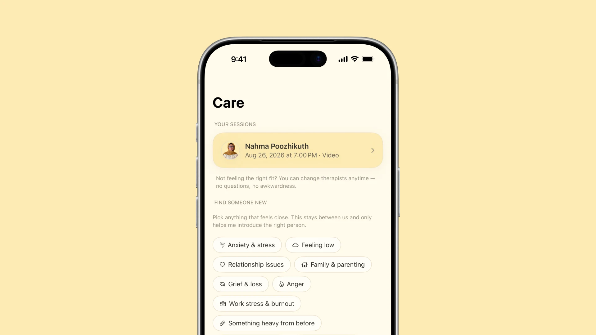
Then it brings three people forward and says why each of them. Three is a number you can actually decide between. The full list is one tap deeper for anyone who wants it.
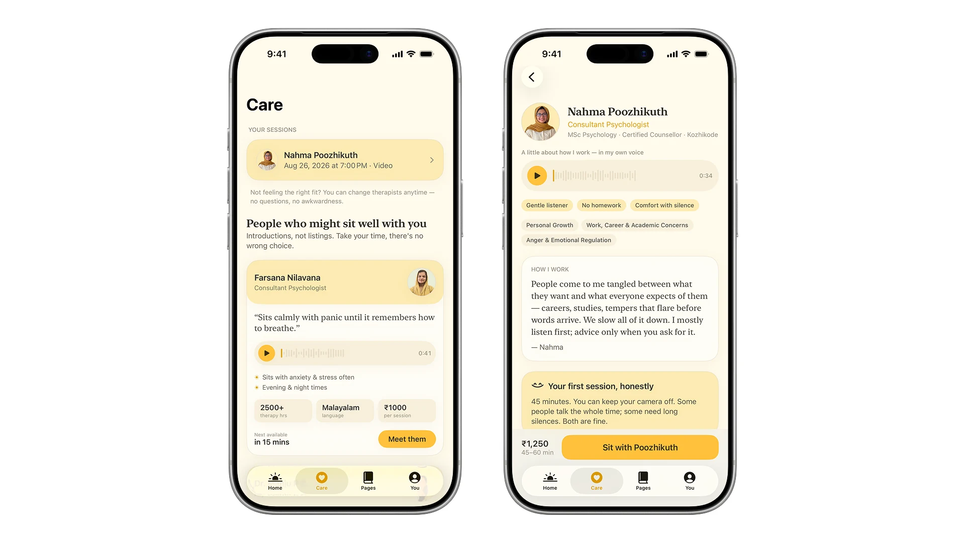
Every therapist answers the same question in their own recorded voice: what your first session is honestly like. The unknown first session is the tallest wall in this whole thing, and a voice gets over it in a way a paragraph does not.
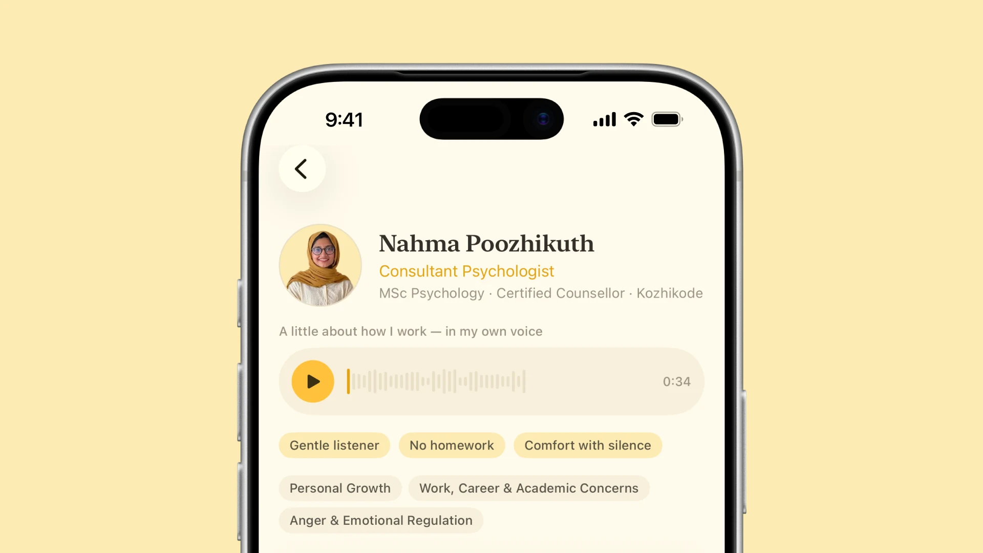
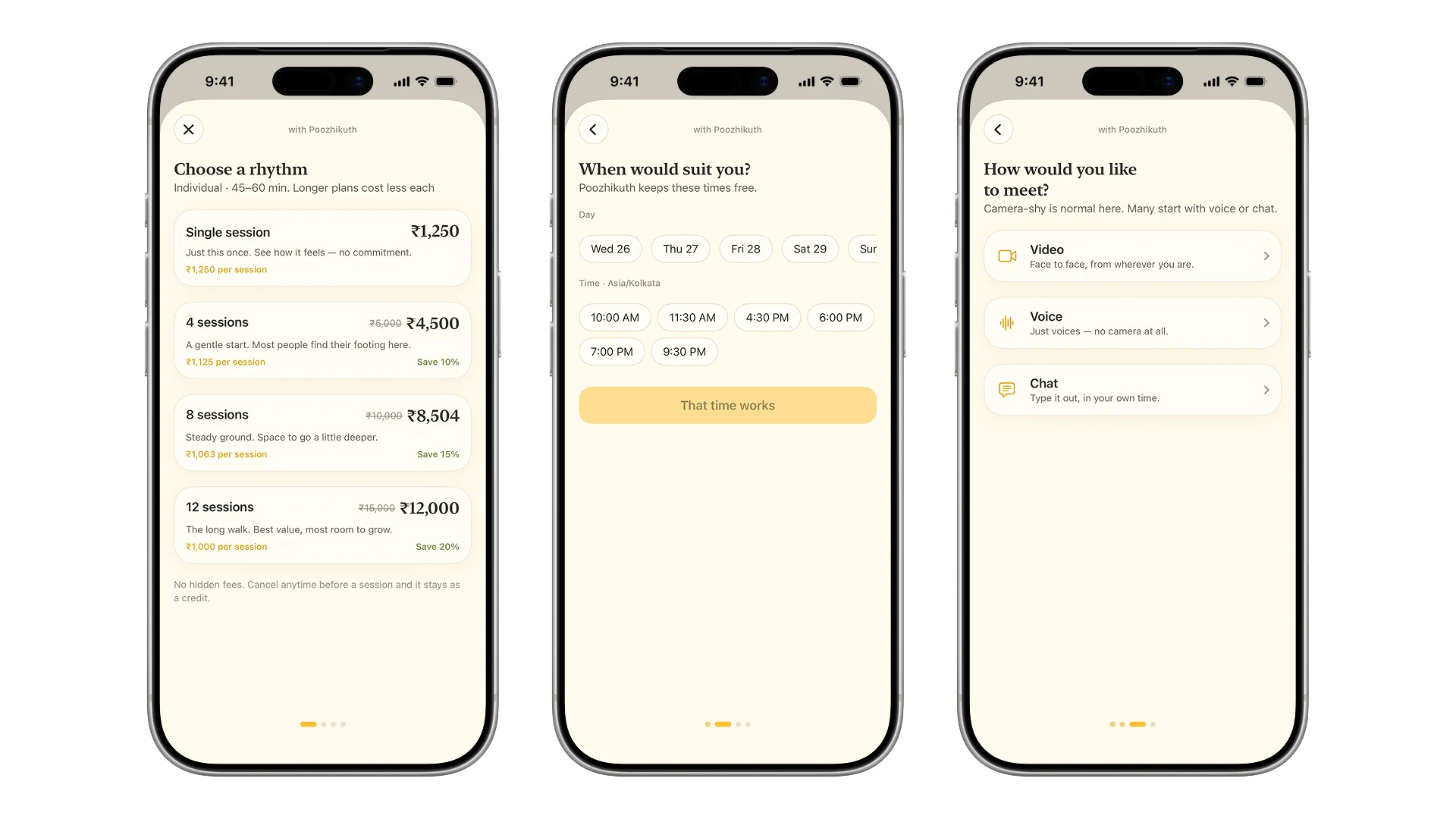
The price is on the card. Per session, always, no packages. Cost opacity is its own barrier, and the answer to it is a number you can see before you are invested.
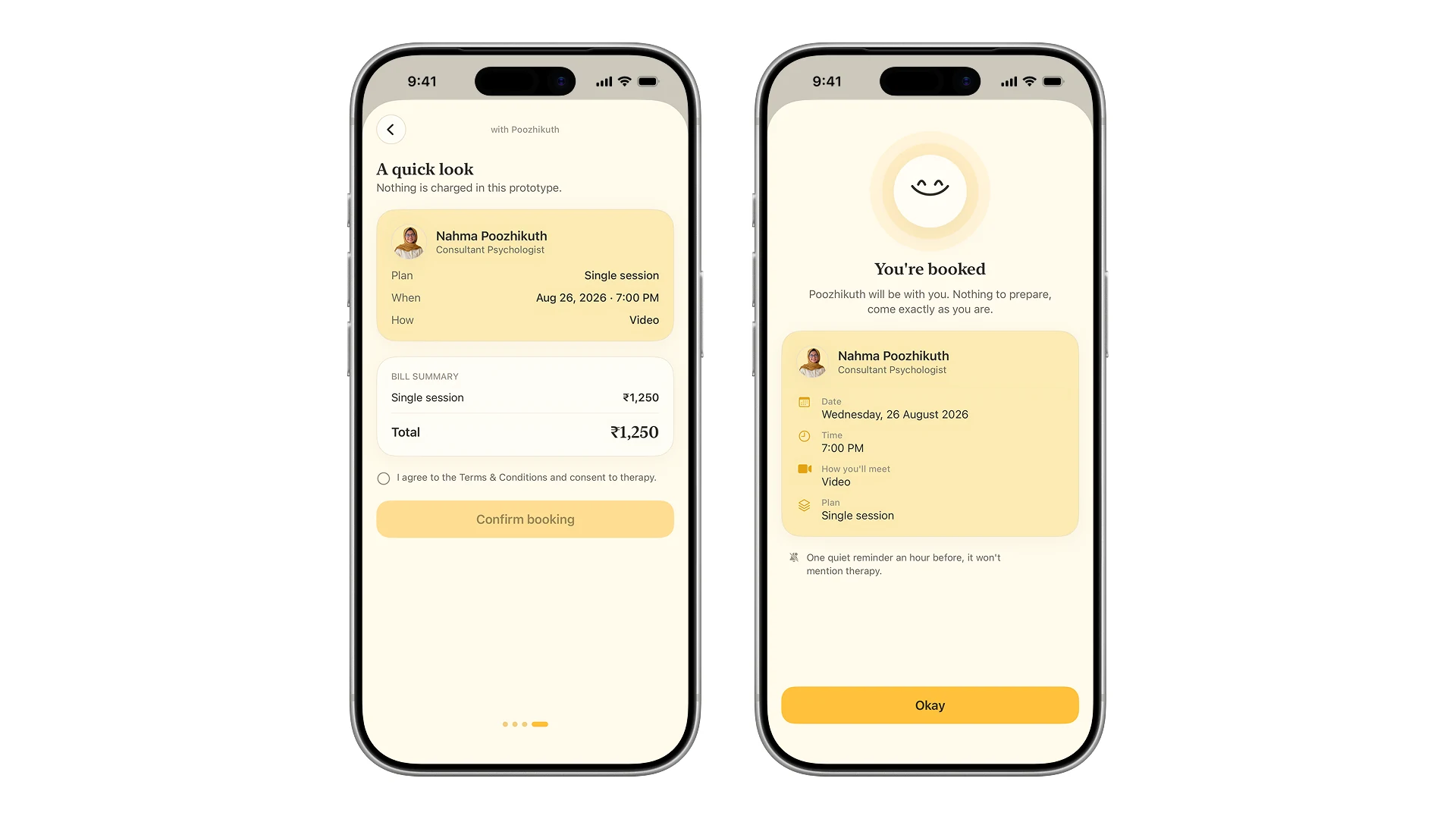
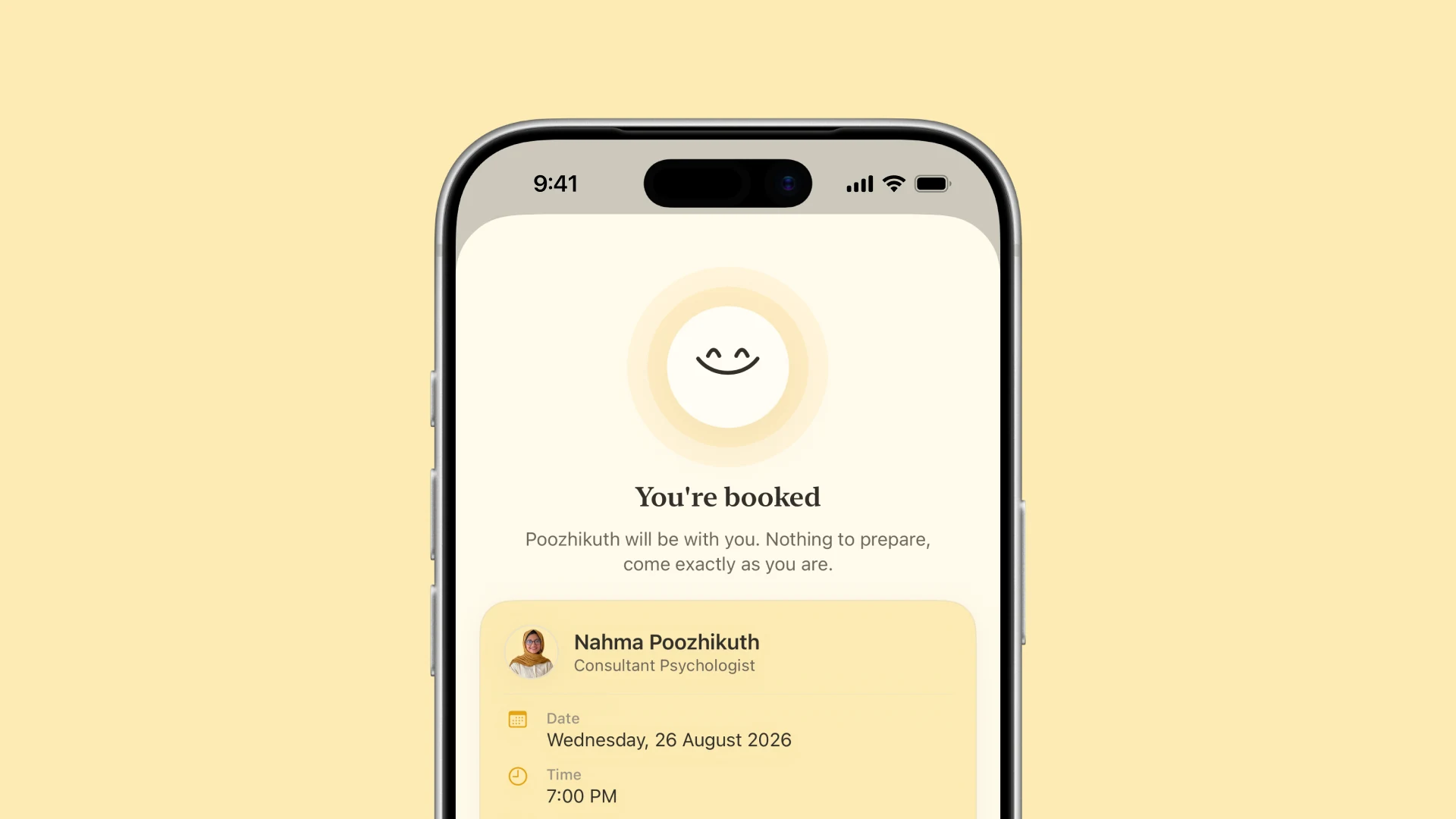
The confirmation ends on the thing people are actually anxious about, which is not the calendar entry.
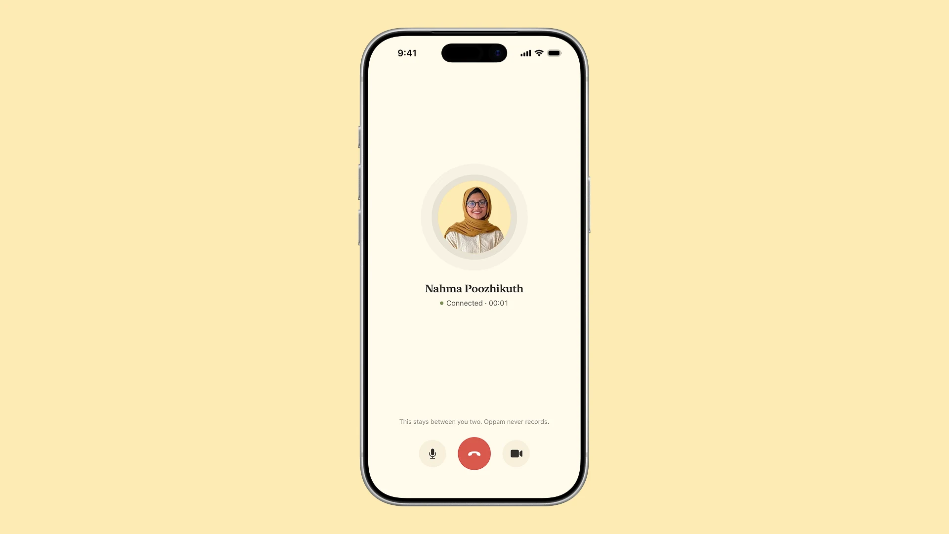
The room itself says what it does with the session, which is nothing. Video, voice or chat, and camera off is a normal choice rather than a failure.
Pages, which nobody else sees
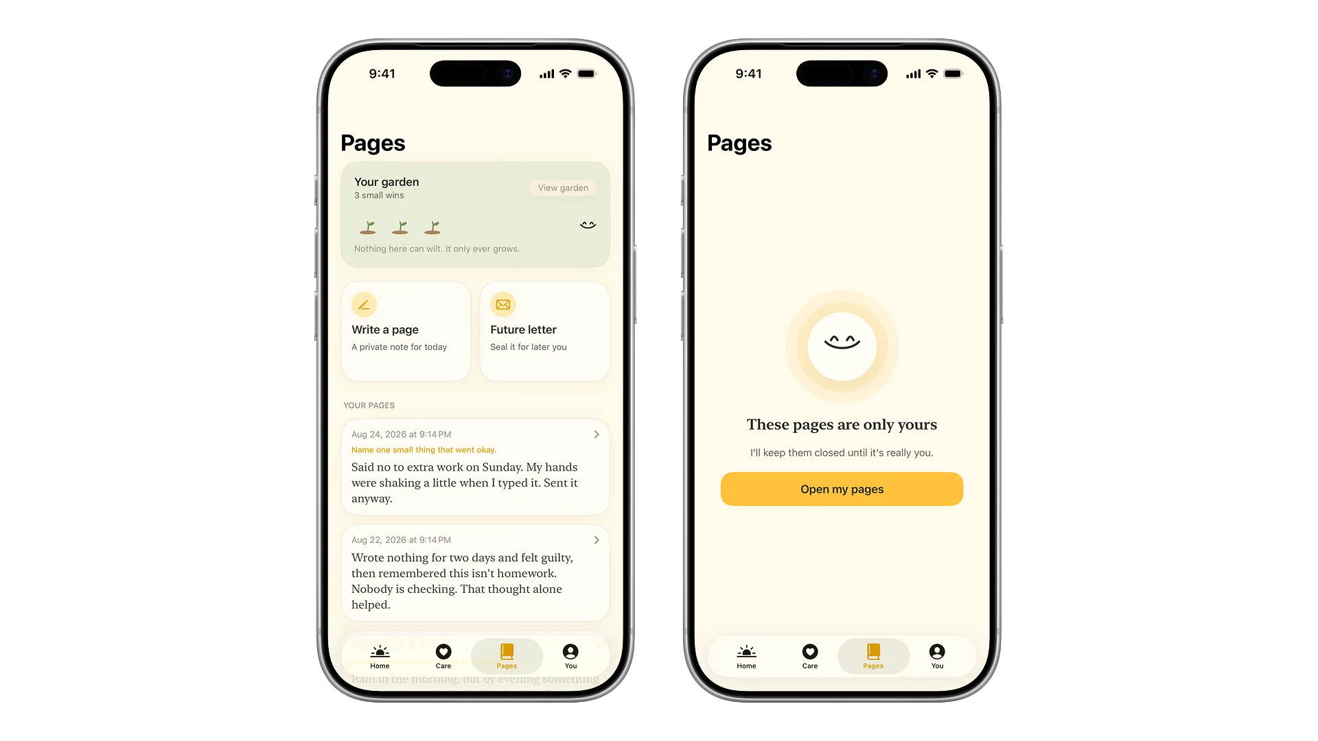
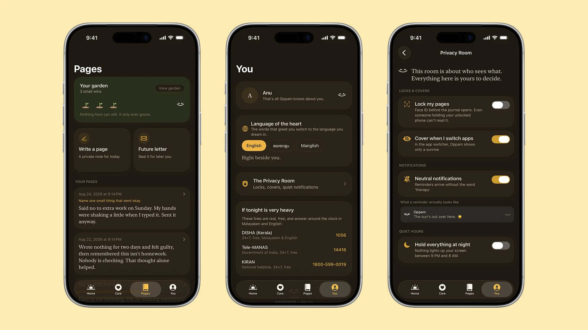
Writing is the cheapest first step there is, and it does not need a therapist or a payment. Pages is a journal with the prompt turned off by default, because a prompt is a small exam.
Letters can be sealed until a date you pick, which turns writing into something you do for a version of yourself that does not exist yet.
Privacy you can watch working
A privacy policy is a promise. A shared phone needs proof. So every protection in here is something you can see doing its job.
Face ID on the journal door. A sunrise that covers the app in the switcher. Notifications that show you the exact text somebody else would see on your lock screen. One tap turns Pages into a grocery list.
The companion
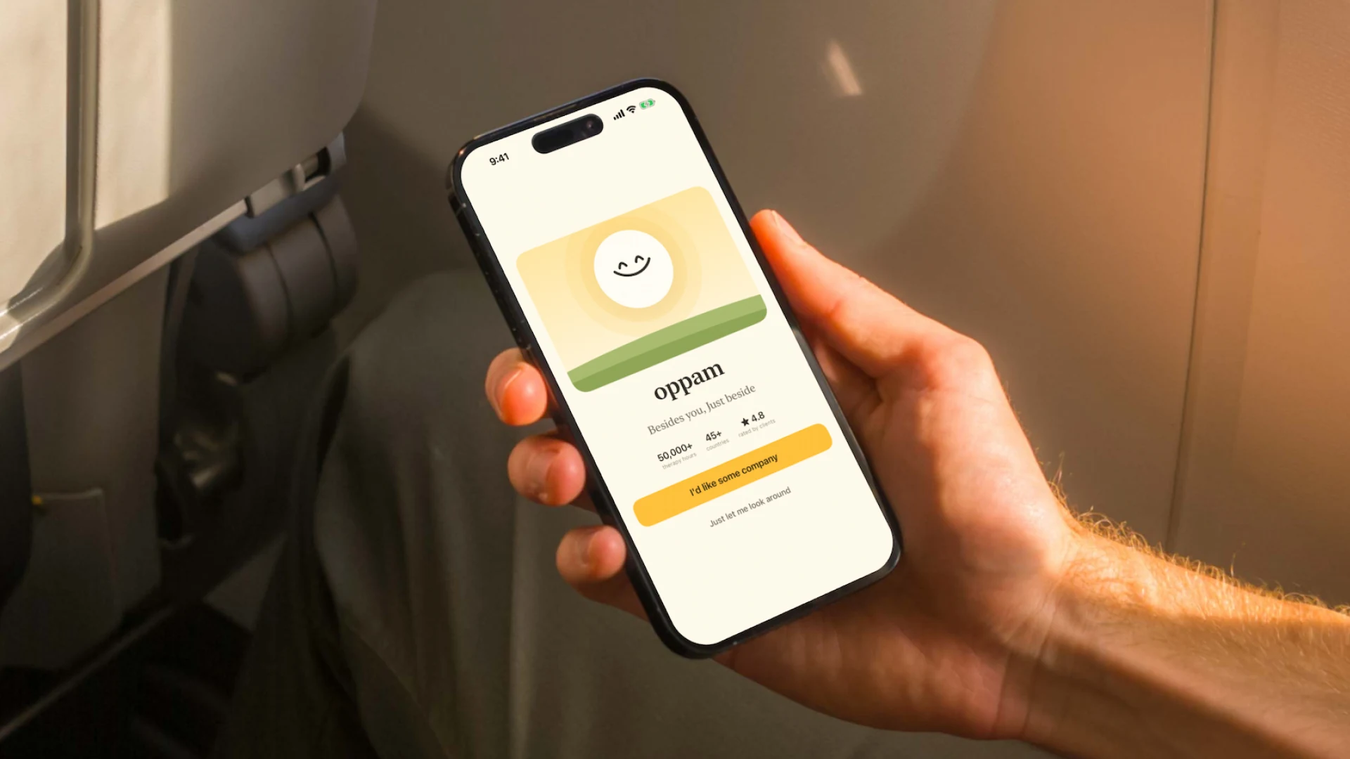
The mark in the logo is a smile, and the companion is that smile alive. It is drawn as animated geometry rather than an image, so it can breathe, blink, and sit one register softer than whatever you are feeling.
It never mirrors distress and never celebrates louder than you do. It never speaks first. When it does speak, the words are set in a serif, like a letter rather than a chat bubble.
The other half, which is the therapist
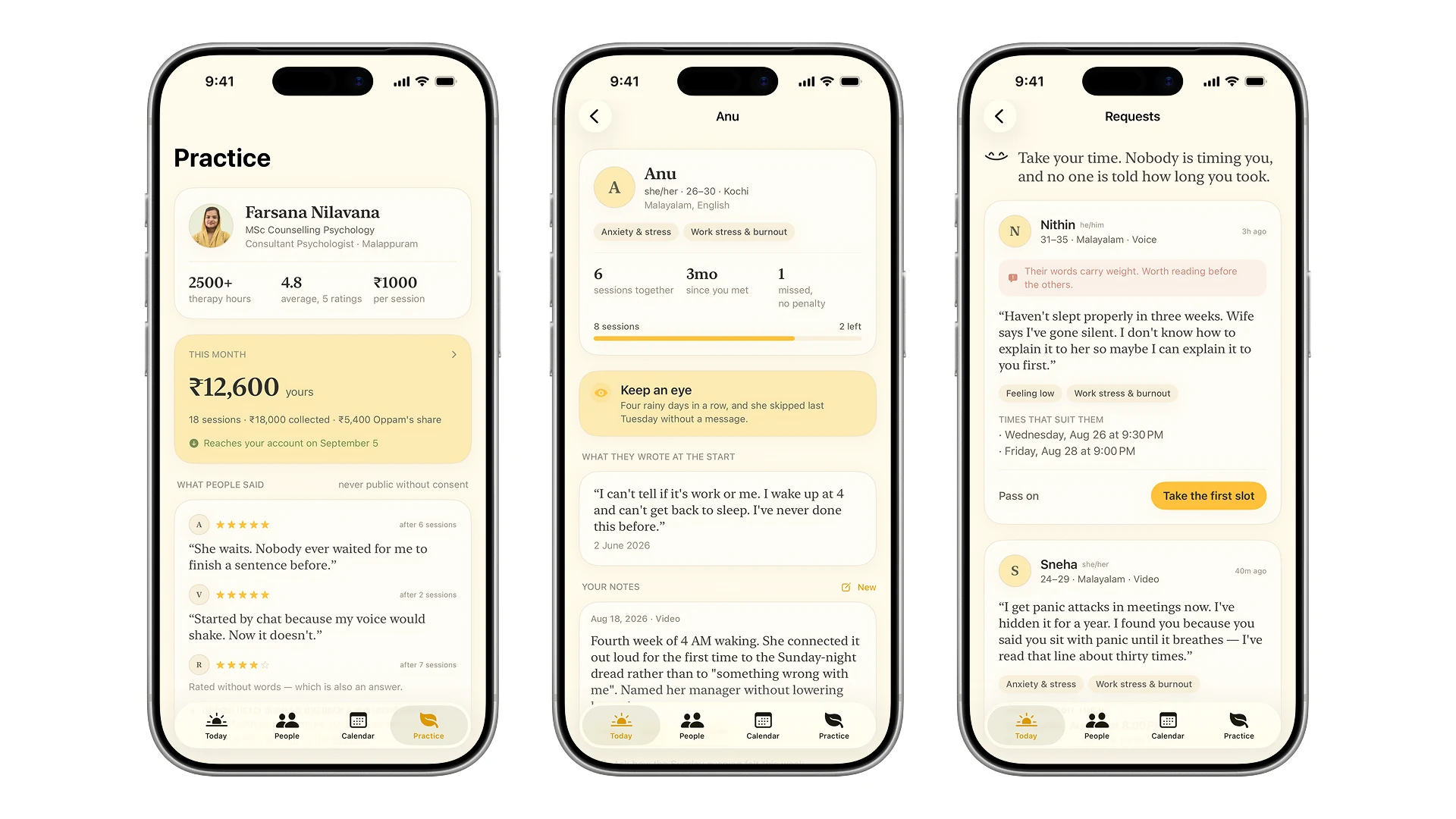
A marketplace that designs only the buyer’s side quietly decides that the supply side does not matter. Therapists are the supply here, and burnt out therapists are how a service like this fails. So the console is built too.
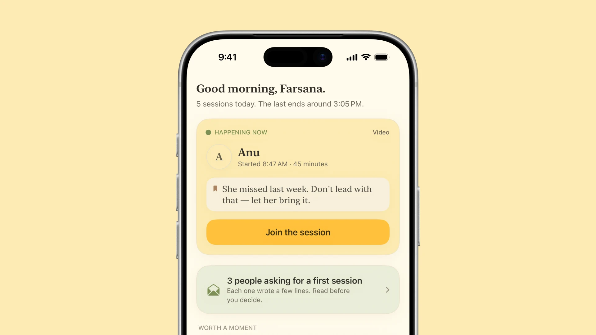
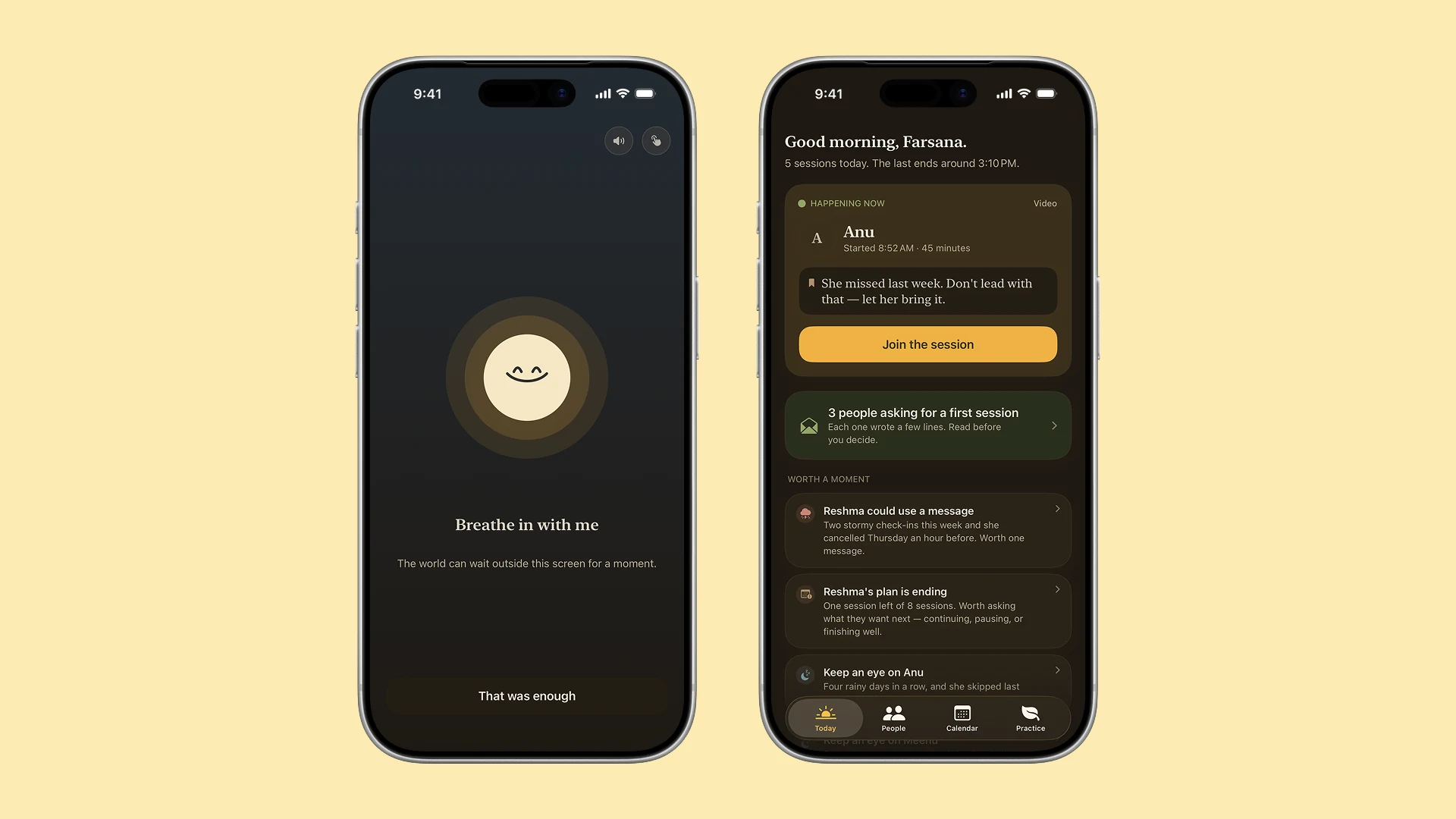
People rather than cases. A file shows a first name and only what that person chose to share, including the words they typed on day one.
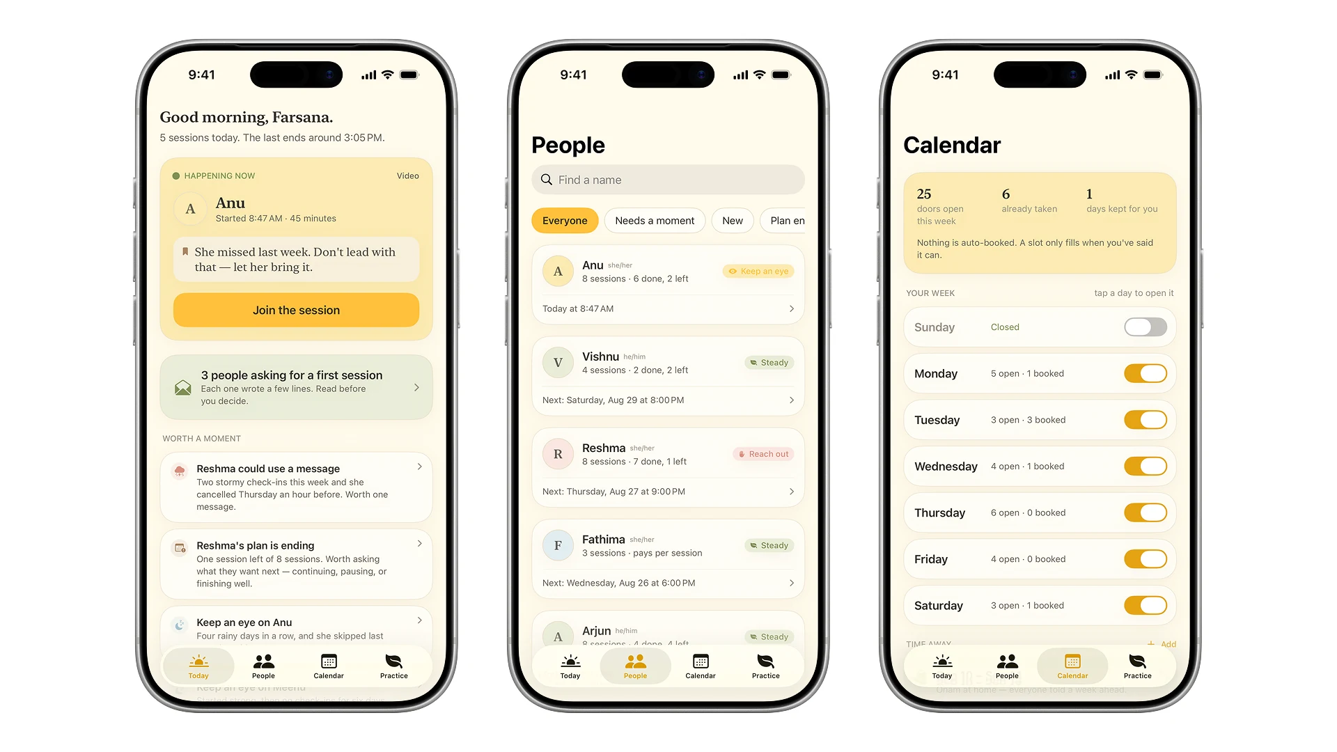
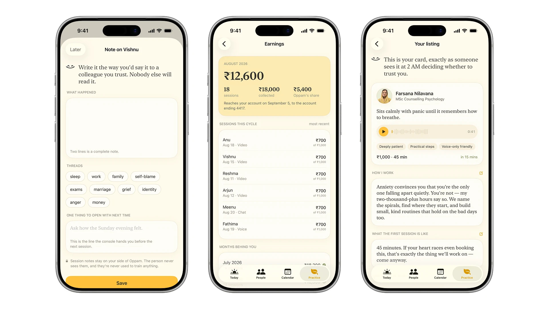
Hours are opened by the therapist, not assigned to them. Earnings show the split written out rather than a net figure that needs trusting.
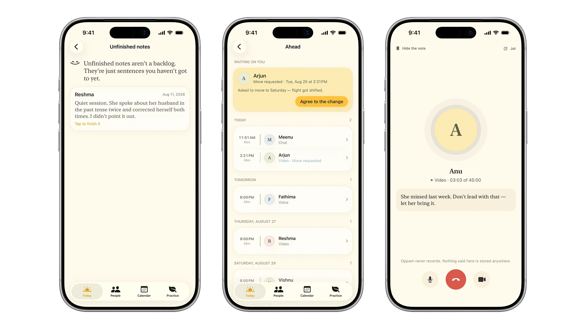
Notes are written the way you would say it to a colleague you trust, and an unfinished note is not a backlog with a badge on it.
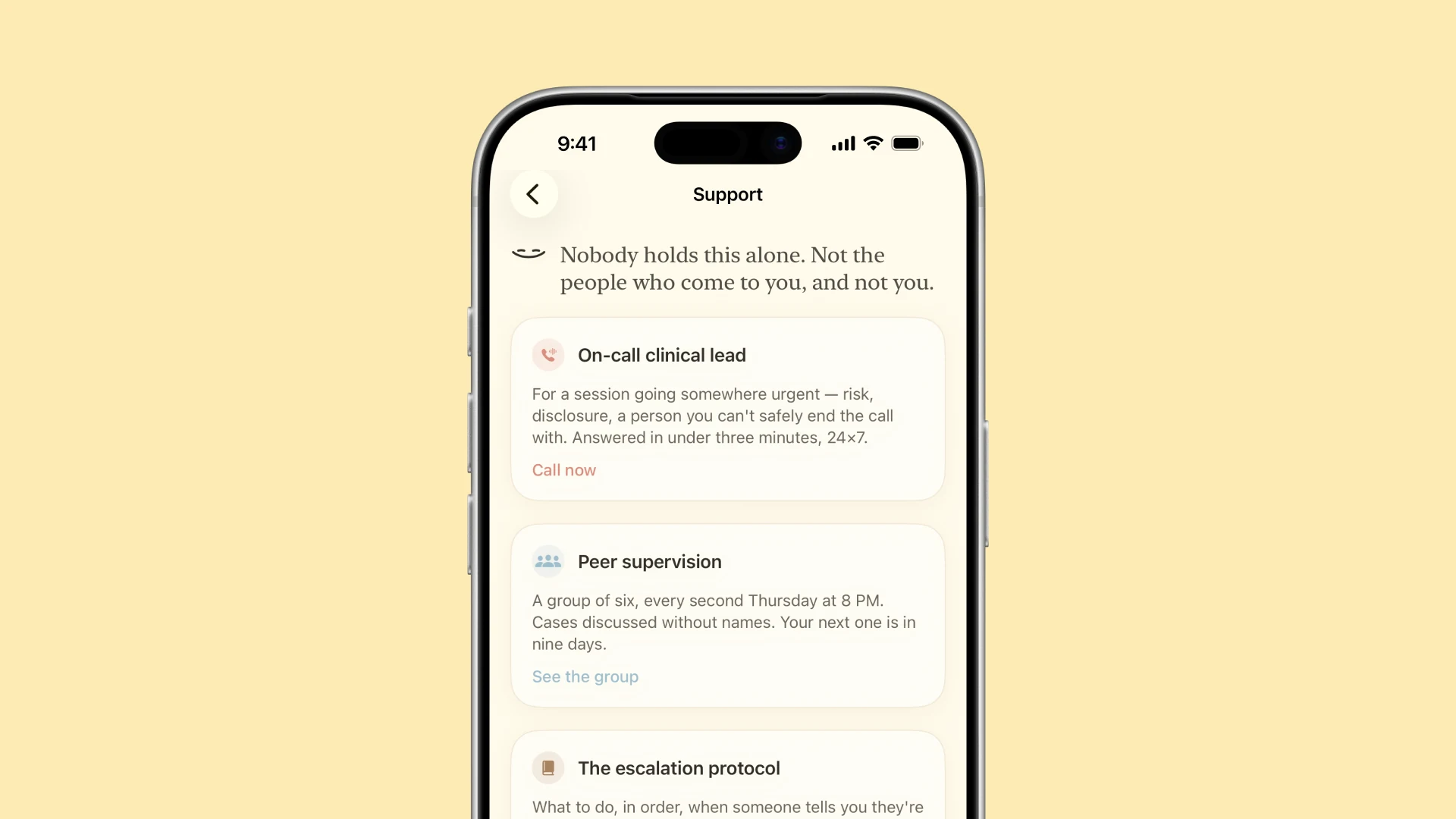
And the part nobody puts in a marketplace: an on-call clinical lead, peer supervision, and an escalation protocol that says what to do when somebody is not safe.
The bad days are designed too
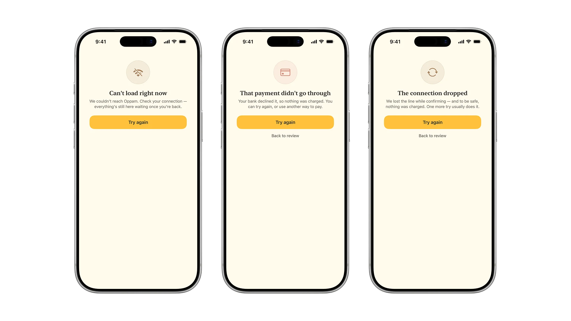
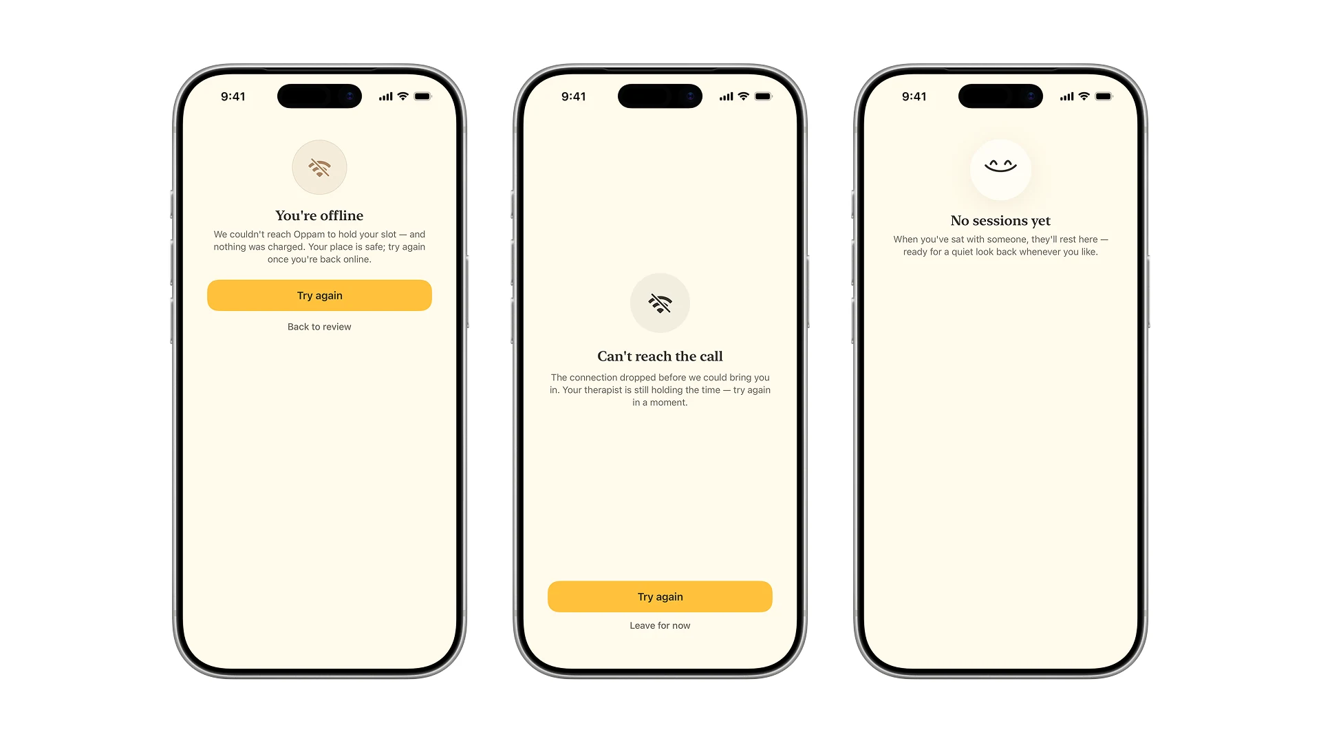
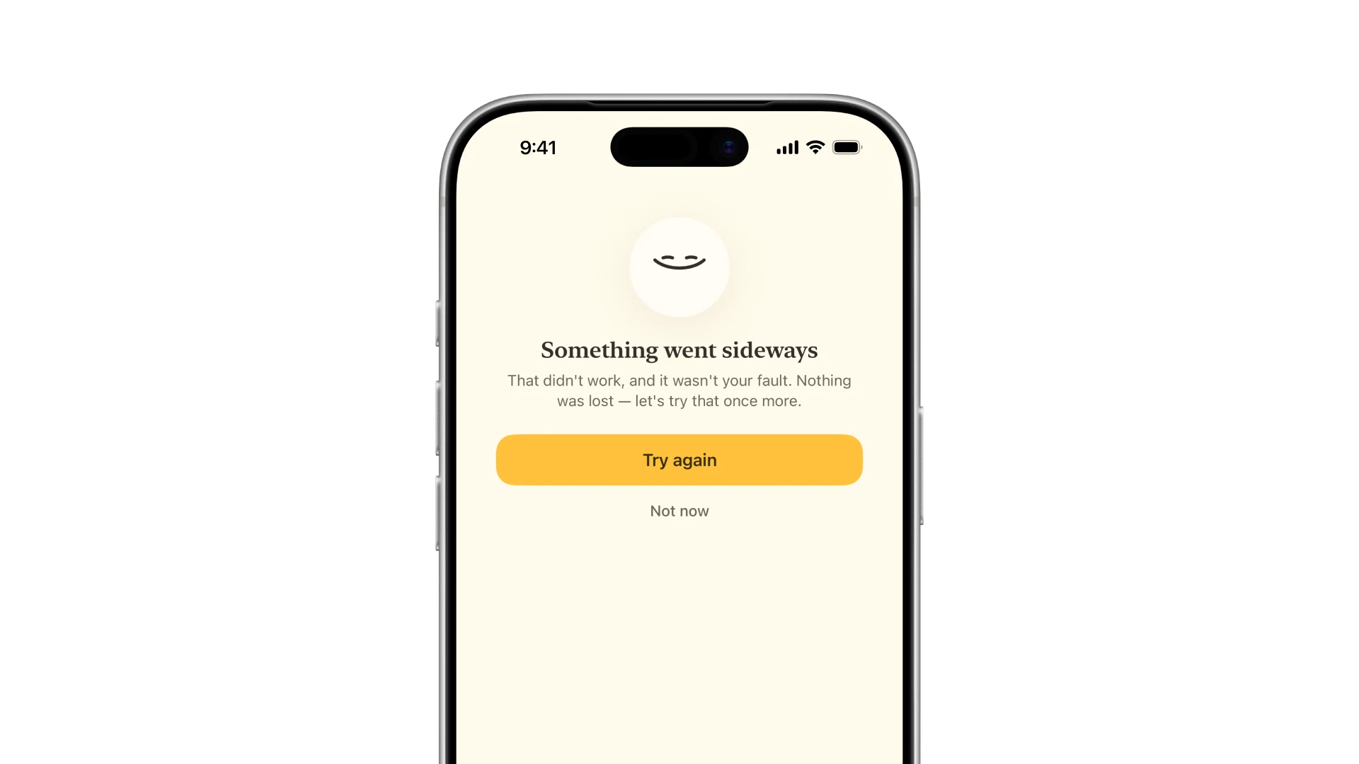
Anything that only works when the network does is a prototype. These are the screens the app spends its worst minutes on.
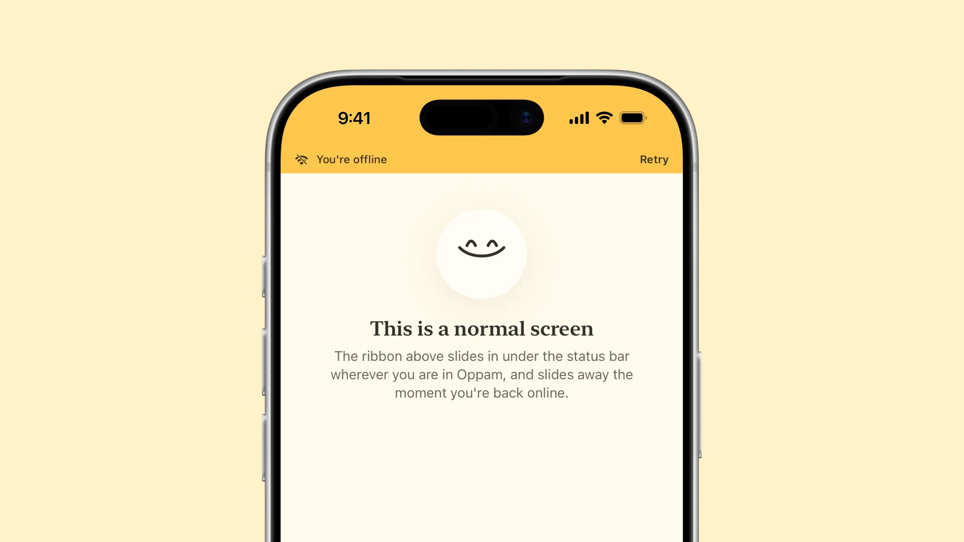
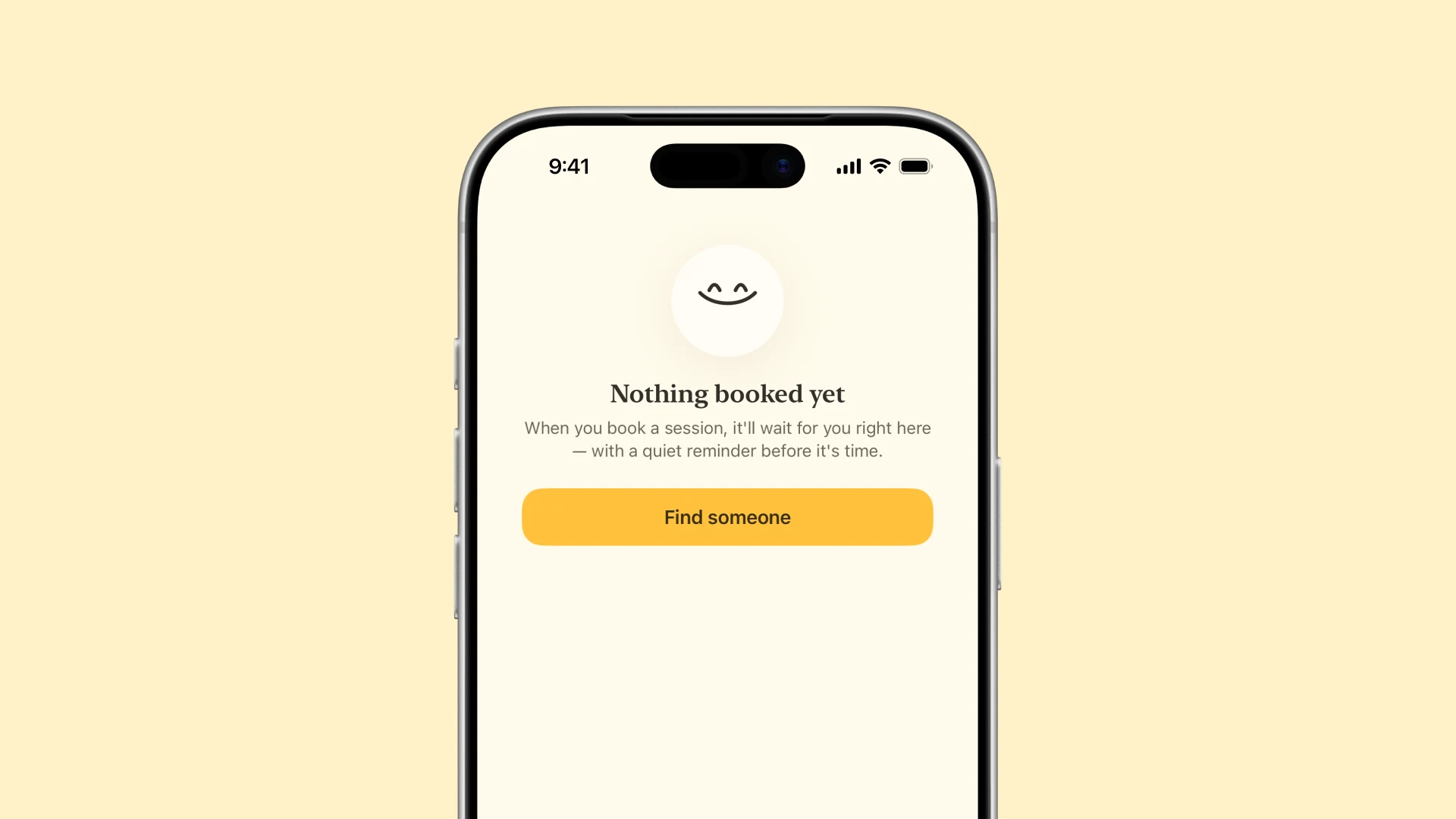
An empty screen is never a dead end. The companion waits in the blank space with a line and a way forward.
Lamplight
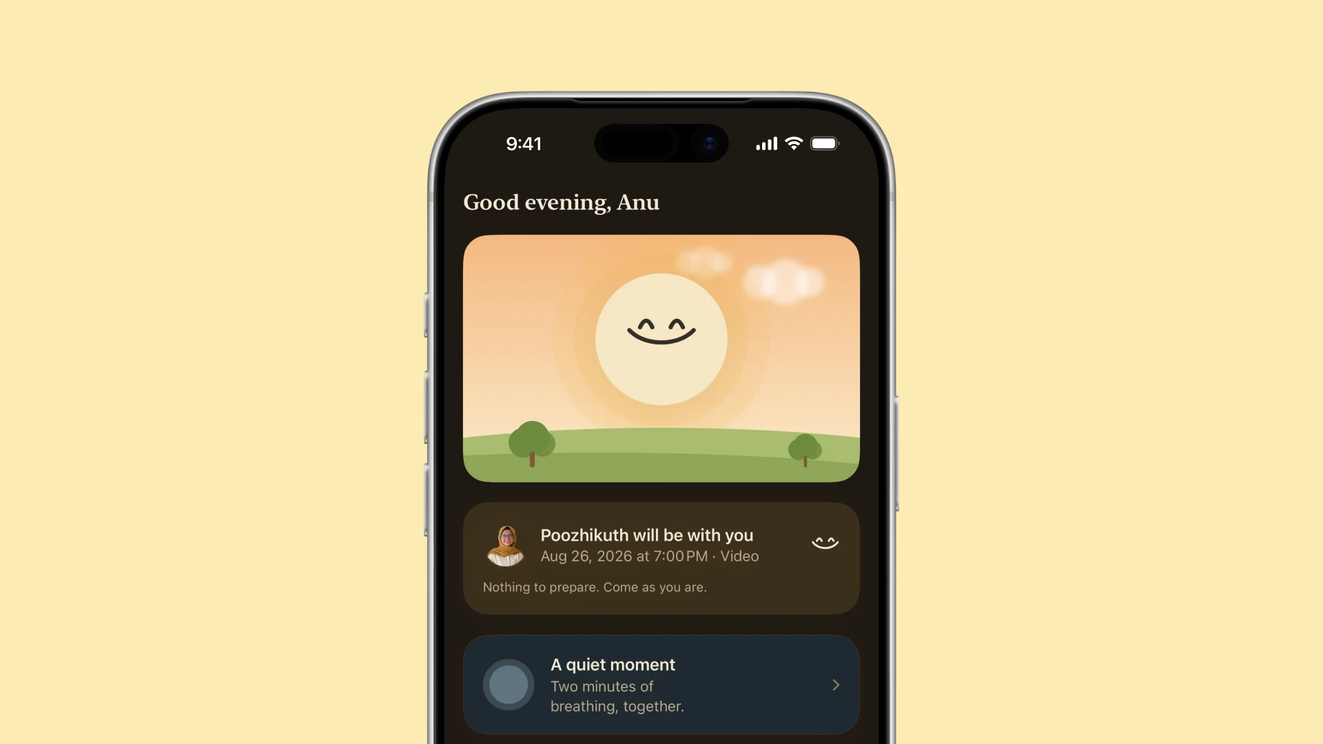
Dark mode here is not a grey inversion. It is lamplight: warm browns and amber, because this app gets opened late at night by people who are not having a good one, and cold grey at 2 AM is a worse room to sit in.
What this is, and what it is not
It is a running SwiftUI app on iOS 18, with the data on the device and nothing in a cloud. Every figure above is a capture of it, taken by launch argument so the same screen comes back the same way each time.
What it is not is validated. The archetypes are mine, the priorities are mine, and no part of this has met a person who came looking for help. That is the honest limit of a self-initiated project, and it is the first thing I would fix.
Deliberately left for later: the home screen widget, a live activity for the session countdown, Apple sign in, and a night companion that knows how badly you slept. The first of those is a weekend. The last one needs a conversation about health data that this prototype has not earned yet.